One of the key benefits of using a horizontal bar chart is the ability to display statistics for each bar. This is a popular feature for the HBAR statement with the SAS/GRAPH GCHART procedure. So, let us review the options available to us to create such graphs using SGPLOT.
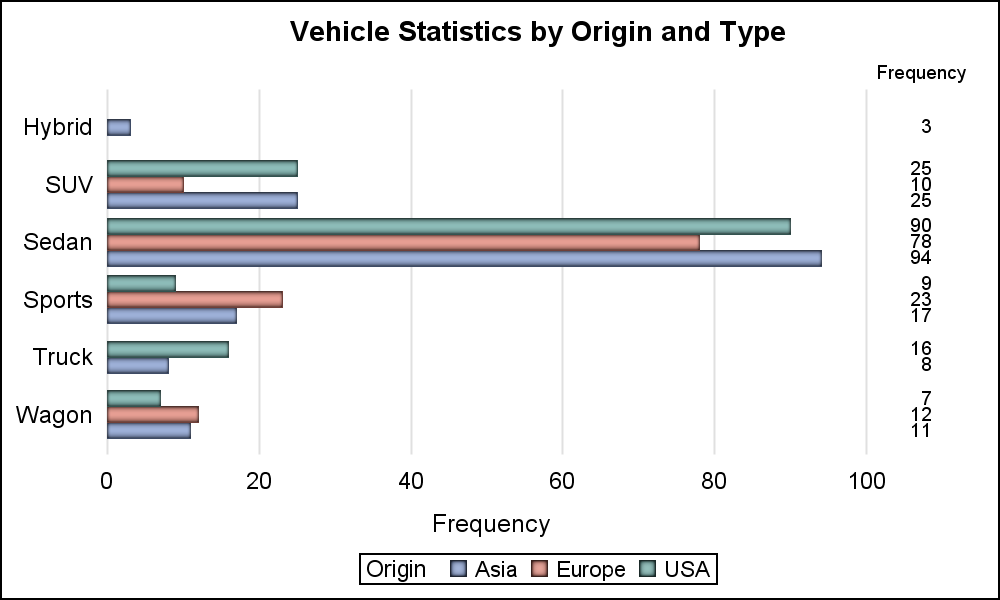 The simplest case is to display the frequency of each bar on the right hand side as shown in the graph on the right. Here we have used the SGPLOT HBAR statement with the DataLabel option with Position=right.
I have also used the NoWall, NoBorder options and suppressed axis lines and baseline to get this popular view. Note, the stat values are not colored by group. Click on the graph for a higher resolution image.
proc sgplot data=cars nowall noborder; hbar type / group=origin groupdisplay=cluster dataskin=pressed baselineattrs=(thickness=0) datalabel datalabelpos=right; yaxis display=(nolabel noline noticks); xaxis display=(noline noticks) grid; run; |
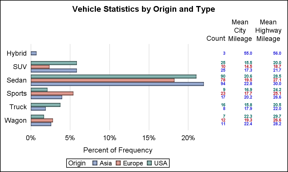 With SAS 9.4, you have the option to include any statistics with a HBAR plot using the YAxisTable statement. We can use this statement to display other statistics as shown on the right.
In this example, I have included the Mean City and Highway mileage along with the frequency counts. Note, the frequency count values are now color coded by group. All values are displayed right justified in the column by default.
proc sgplot data=cars nowall noborder; label mpg_city='Mean City Mileage' mpg_highway='Mean Highway Mileage' n='Count'; format mpg_city mpg_highway 4.1; hbar type / group=origin groupdisplay=cluster stat=pct dataskin=pressed baselineattrs=(thickness=0); yaxistable n / stat=sum classdisplay=cluster colorgroup=origin valueattrs=(size=6 weight=bold) nostatlabel; yaxistable mpg_city mpg_highway/ stat=mean classdisplay=cluster colorgroup=origin valueattrs=(size=6 weight=bold); yaxis display=(nolabel noline noticks); xaxis display=(noline noticks) grid; run; |
In the graph and code above, I have used one YAxisTable to display the frequency values by using an additional variable called "N" with Freq=Sum. This variable contains only "1" for each observation so we get the sum of the counts in this column. You can also use any other numeric variable with Stat=Freq, and set the variable label appropriately.
Using the YAxisTable instead of the DataLabel option as in the first graph allows us to color each observation by group. Then, I have used a second YAxisTable with mpg_city and mpg_highway as the variables with Stat=Mean to display the mean mileage values also colored by group.
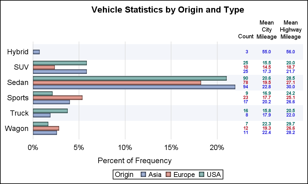 For the graph on the right, I have used ValueHAlign=center to display each value in the center of the column using a 4.1 format. I have set the labels for the variables to indicate the statistic used for each label. I have also used faint horizontal bands for each category to help the eye across the graph.
Statistics can be displayed "Inside" or "Outside" the graph area, which is more apparent if graph borders are used. Additional statistics can be displayed by adding more variables to the YAxisTable statement, or using another YAxisTable statement to display values on the left of the bars.
Full Program: BarStats_SG_94


8 Comments
Sanjay,
Is this dataset available? I'd like to replicate your code and make it work completely in my enviornment. This should NOT require a SAS/Graph license, right?
Thanks,
Wex
Please see the link at the bottom that shows the full code. It uses sashelp.cars data set, and only needs Base SAS. You can add as many columns of data as you want on the left or the right of the graph.
Sanjay,
Thanks for the quick response. Got the full code. Ran. Got this: yaxistable n / stat=sum classdisplay=cluster colorgroup=origin nostatlabel;
------------
1
ERROR: Variable CLUSTER not found.
"For the classdisplay option to have any effect, the CLASS= option must be specified" was shown in documentation. Which variable combination did you intend to specify in your original code. I guess a combination of origin and type. But I thought you may want to get your Web version fixed for other readers who do follow-up as well.
Thanks!
Wex
CLASSDISPLAY=STACK | CLUSTER
specifies how the class values are displayed.
STACK
displays the class values vertically at each midpoint value on the X axis or horizontally on the Y axis.
CLUSTER
displays the class values horizontally at each midpoint value on the X axis or vertically on the Y axis.
Default STACK
Interaction For this option to have any effect, the CLASS= option must be specified.
When we first introduced the X and Y AxisTable statements, we overlooked the need to display the class values side-by-side to match plots like bar chart that display groups side-by-side. The Axistable always displayed the class values as a stack, and that works fine too, except when you want to line up these class values with the cluster group values. So, in SAS 9.4M2, we introduced the new option ClassDisplay (similar in function to GroupDisplay). You can remove this option if you do not have SAS 9.4M2.
Another reason for using horizontal bars and horizontal charts generally is when the bar labels must be long, as is the case where I work. For that reason, it is very helpful if all charts can be displayed horizontally with an absolute minimum of recoding. Last time I looked, needle charts were vertical only. Fixed x and y keywords and such make transposition more difficult. How about a simple keyword to re-orient a chart: transpose=no or transpose=yes?
We have struggled a bit with the idea of using an ORIENT option in GTL to switch between vertical and horizontal orientation for some plots like bar chart, histograms and box plots. This is especially true as the axis options change from X to Y. We have found that it is generally easier to deal with explicit H and V prefixed to the statement, hence we use VBar and HBar. We have also changed the required option names from X= and Y= to Category= and Response= to make it easier to see how each variable is used.
But this gets harder with the axis options because GTL and SG axes have to accept values from multiple plots with different orientations. As long as the data type is compatible (character or numeric), it is allowed. Hence these continue to be called X and Y axes.
Is there a way we could determine and display the n, Min and Mix of a group using the yaxistable like Mean, Median.
Currently, the STAT option on the AXISTABLE does not support MIN or MAX (but, FREQ is supported). It is possible to compute these statistics externally (such as with PROC SUMMARY or PROC MEANS) and have them displayed using the AXISTABLE. In that case, you would use PROC SUMMARY or MEANS to compute all of your statistics, and use an HBARPARM to create the chart, along with a YAXISTABLE to display the computed stats.