Learn about the latest tips, tutorials, upcoming events and certifications
The location of ticks in statistical graphics

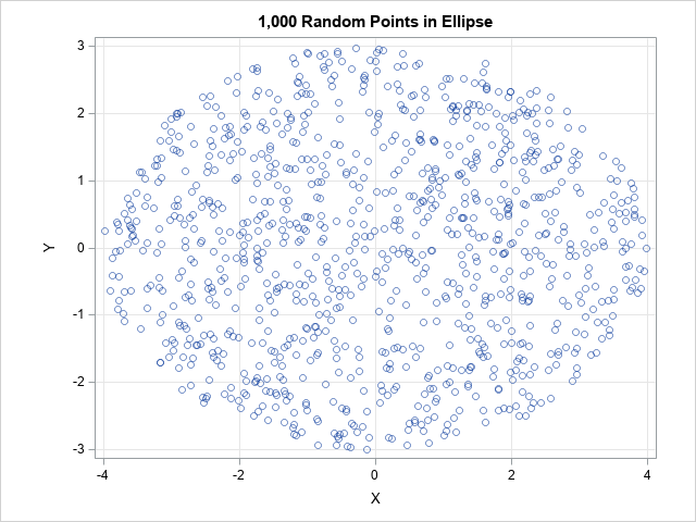
Modern software for statistical graphics automatically handles many details and graph defaults, such as the range of the axes and the placement of tick marks. In the days of yore, these details required tedious manual calculations. Think about what is required to place ticks on a scatter plot. On the