Move beyond spreadsheets to data mining, forecasting, optimization – and more
Lag selection in dynamic demand models using PROC TSSELECTLAG in SAS Viya

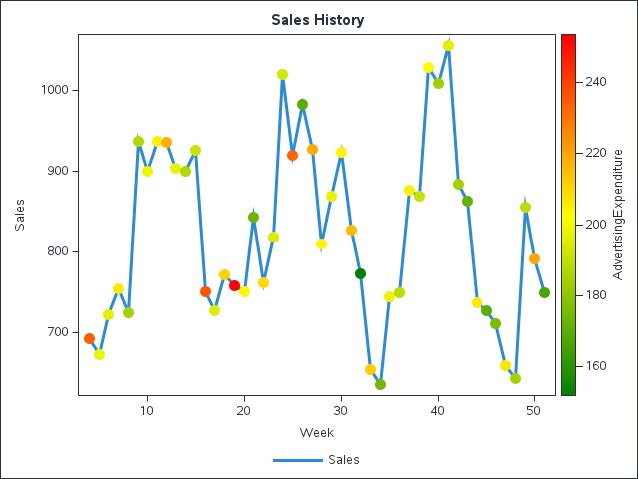
SAS's Kevin Scott explains how to set up and analyze a dataset for forecasting in SAS Viya with a particular emphasis on selecting lags for dynamic models