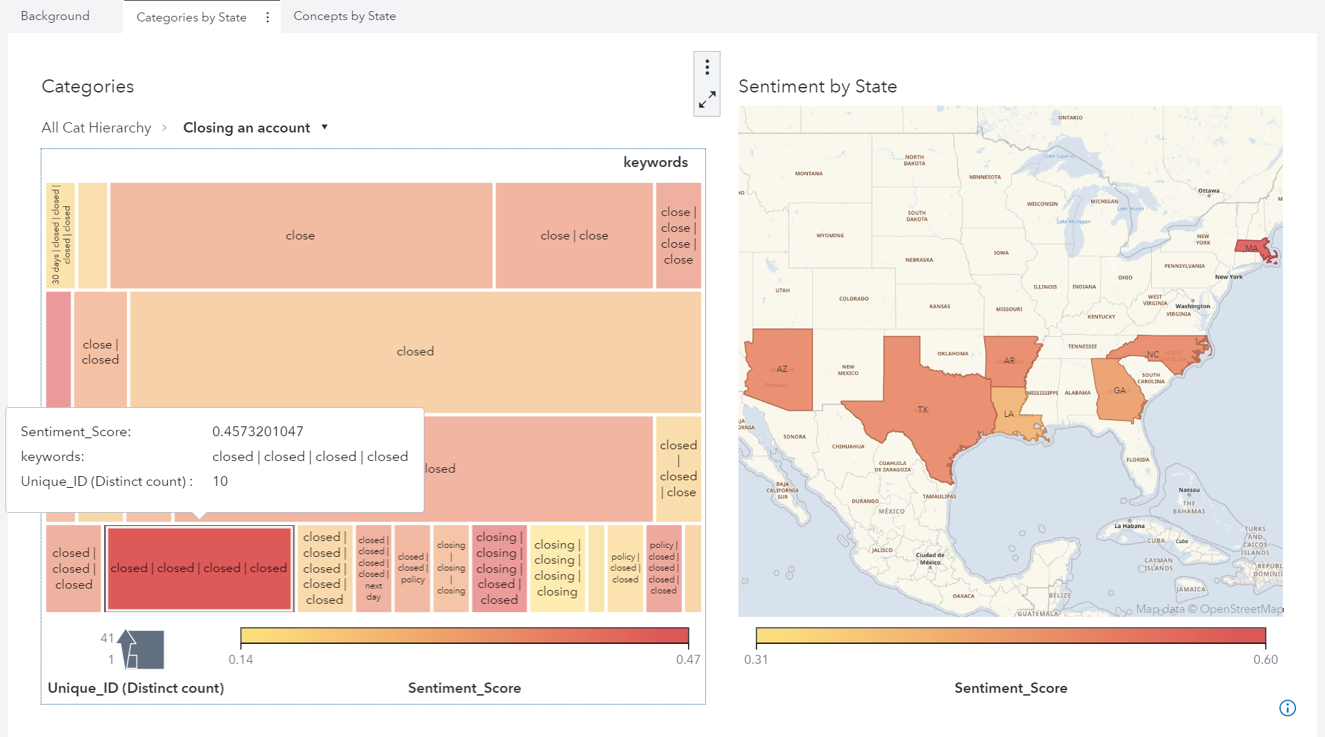
When a busy university analytics team is tasked with creating a new, interactive way to share data with dozens of different constituents, data visualization from SAS is the obvious answer. The University of Idaho’s office of Institutional Effectiveness and Accreditation is the source for comprehensive information, analyses and university statistics.
Tag: Visual Analytics
Styl prezentacji danych jest ważnym aspektem raportów. Użyta kolorystyka oraz metody wyróżniania mają znaczący wpływ na sposób odbioru, a także szybkość zrozumienia danych. Mają zwykle na celu zwrócenie uwagi na najważniejsze informacje, mogą wskazywać na pewne zależności lub wartości odstające, a nieodpowiednie ich użycie może prowadzić do nieporozumień czy nawet
Earth is an explosive world! Data from the Smithsonian Institution's Global Volcanism Program (GVP) documents Earth's volcanoes and their eruptive history over the past 10,000 years. The GVP database includes the names, locations, types, and features of more than 1,500 volcanoes. Let's look closer into volcanic eruptions across the globe
How many meteorites have hit the earth in the last 4,000 years? Where have they landed? And which ones were the biggest? Can we show all of this information - and more in an intuitive data visualization? It turns out NASA provides public data about recorded meteorite impacts on earth all the
Obecnie większość firm, operujących na danych, korzysta z mniej lub bardziej zaawansowanej analityki. Ten trend przestaje być przywilejem wielkich korporacji, a staje się standardem dla wszystkich, także małych i średnich firm. I tak jak potrzeba korzystania z analityki rozprzestrzenia się wśród firm, tak dzieje się to także wewnątrz organizacji, zwiększając
The NC Scholastic Chess Championship is coming up this weekend, and my buddy Michael Thomas asked if I might could create a few graphs to help analyze the event data. How could I pass up an opportunity like that?!?! Read along, and find out what graphs I created, and the
Some would say that it's impossible for blind users to see charts and graphs. Those same people might have once said it was impossible for the visually impaired to see the particles that comprise an atom, or galaxies that are billions of light years away. Innovation would prove them wrong
Self-Service Business Intelligence (BI) wartet mit einer ganzen Reihe von Vorteilen auf, einer der wichtigsten ist sicherlich Agilität. Doch gerade diese Agilität kommt manchmal der Governance eines Unternehmens in die Quere. Nicht selten passiert es, dass Anwender angesichts des blinkenden schönen Self-Service-Visualisierungstools die vereinbarten Regeln außer Acht lassen. Hier die
I’ve always loved watching crime series or films – from Homeland and True Detective to Sherlock Holmes. But after years of building software products and solutions designed to help security and law enforcement agencies solve crimes, I've noticed there are several clichés that need to be conquered by technology. No.
Are you struggling to hire talented data scientists to glean insights from your corporate data? There’s currently a lack of big data talent hampering corporate analytics and causing nightmares for CIO’s, but I have good news for you: You may already have all the data scientists you need! There are
You have all seen, or perhaps even created, some really bad graphics: Cluttered, confusing, too small, incomprehensible. Or worse, the author may have committed one of the three unforgivable sins of data visualization by deceptively distorting a map, truncating the axis so as to misrepresent the data, or used double
“Analytics” and “data scientist” aren’t new terms, but they are trending buzzwords. The popularity of these concepts has created a false impression: Analytics are mysterious abstractions that can only be decoded if you have a white lab coat and an advanced degree in computer science. The reality couldn’t be more different.
With educator preparation programs (EPPs) under fire, states must make difficult decisions on how to hold EPPs accountable, provide information for program improvement, and offer consumer information to the public on EPP efficacy. In conversations I’ve had with state leaders grappling with this issue, I have seen a debate arise
Being an industry disruptor is a lonely place to be – but if you’re successful, the rewards are well worth the initial risk. Betting big on your new way of doing things takes courage, and is only the first step in a risky process. Your next critical step is to
En todos lados se habla de lo mismo: transformación digital. Es generalizada la necesidad de hacer las cosas diferentes, ya sea por medio de una nueva apuesta o reinventando la forma en la que hoy se hacen las cosas. Tener acceso a soluciones en todas partes gracias a la Nube
No cabe duda de que la analítica ahora está en todas partes. Gracias a la Nube (cloud) se puede acceder a las soluciones desde cualquier lugar y aplicarla en todo lo que nos imaginemos. Incluso en una pista tan sofisticada y tecnológica como resulta ser la de la Fórmula 1,
Have you ever been involved in executing an exploratory analysis based on an integrated clinical trial database? If so, you've probably experienced firsthand how elaborate the initial phase of data access and data processing can be. Market analysts estimate the ratio for preparing the data, compared to actually analyzing the information,
Ist Ihnen das auch schon mal passiert? Sie radeln mit Ihrem Fahrrad zügig durch Gegend, und plötzlich werden Sie scheinbar mühelos von einem anderen Radfahrer überholt. Keuchend sehen Sie dem anderen hinterher und wundern sich über die unglaubliche Fitness des vermeintlich untrainierten oder älter aussehenden Rasers. Erst auf den zweiten
El papel del CEO en las grandes empresas ha venido transformándose a la velocidad con que la tecnología dispone para él la información crítica de su negocio. Y ahora que puede tenerla casi al instante, su protagonismo y responsabilidad son mayores. Para gerentes de vanguardia. >> Vea también: Analítica y
When your job involves making decisions that affect thousands of college students, making the right decisions can have a large impact on the future. Giving college administrators easy access to reliable analytics can help improve enrollment and graduation rates – and find answers to complex questions that cut across many
"Correlation does not imply causation.” Does that bring back memories from your college statistics class? If you cringe when you hear those words, don’t worry. This phrase is still relevant today, but is now more approachable and easier to understand. Here at SAS, we use SAS® Visual Analytics to make
W rozwoju narzędzi Business Intelligence oraz w sposobie ich wykorzystania w nowoczesnych organizacjach można wyróżnić 4 dominujące trendy. To właśnie one przełożą się na kierunki rozwoju tych narzędzi, zmienią ich rolę we wsparciu procesów decyzyjnych i budowania przewag konkurencyjnych. Trend 1: Modele samoobsługowe Popularyzacja wykorzystania narzędzi BI w przedsiębiorstwach do
En el mundo en el que vivimos, caracterizado en la rapidez de la información, nos hemos empezado a acostumbrar a términos como Big Data o el Internet de las Cosas. Lo primero nos hace pensar en muchas cifras y datos. Lo segundo, en la interconectividad de todo y los muchos datos que eso
No importa el tamaño de su organización, usted necesita una solución que le permita explorar todos los datos relevantes que se generan a diario de forma rápida y sencilla, descubriendo oportunidades ocultas e identificando relaciones clave. Todo con el objetivo de tomar las mejores decisiones de manera inmediata y precisa.
In diesem Gastbeitrag von Kybeidos geht es darum, wie der Feinstaubbelastung in Städten mit Big Data Analytics begegnet werden kann. Kybeidos präsentiert sich auf dem SAS Forum in Bonn am 28. April mit einem eigenen Stand. Lassen wir ab jetzt Kybeidos sprechen: Stellen Sie sich vor, Sensoren im Straßenbelag beurteilen die
Sind Sie ein Geodät ? Tragen Sie Ihr Smartphone in den Wald? Wenn, dann wohl eher unbewusst und ohne einen expliziten Standpunkt zu suchen... Ihr Smartphone hat einen – und zwar so plus/minus fünf Meter genau. Und das ist gleichzeitig der Ausgangspunkt für eine visuelle Verbesserung der Welt – einfach so beim
Im zweiten Teil meiner Evolutionstheorie beschäftigen wir uns zunächst mit Diagrammen. Stufe 3 – (Balken)Diagramme Im Vergleich zu Kreuztabellen gelingt es Diagrammen zumeist, Information über allgemeine Trends und Verteilungen schneller zu transportieren, allerdings auf Kosten der Detailinformation.
I recently read the book "Die Zahl die aus der Kälte kam" (which would be The Number That Came in from the Cold in English) written by the Austrian mathematician Rudolf Taschner. He is ingenious at presenting complex mathematical relationships to a broader audience. One of his examples deals with
Si entre las preguntas que se plantea en su gestión están ¿cómo mejorar la presentación de mis reportes?, ¿cómo puedo comunicar a la organización información clave de una forma clara, sencilla y oportuna? Entonces le interesará saber cómo la Visualización Analítica ayuda a las organizaciones en el mejor entendimiento y
How many of us have used the phrases… It’s a piece of cake Anyone can do it It’s as easy as ABC I could do it with my eyes shut When it comes to business intelligence it should be “easy peasy” but for many organization it can still be a