 You have all seen, or perhaps even created, some really bad graphics: Cluttered, confusing, too small, incomprehensible. Or worse, the author may have committed one of the three unforgivable sins of data visualization by deceptively distorting a map, truncating the axis so as to misrepresent the data, or used double axes that imply relationships where none exist. You’ve waded through line charts with 24 elements in the legend composed of six colors, four line styles and another eight symbols gratuitously thrown in as if they might help.
In a world driven by data, in knowledge economies where ideas are currency, visualization has emerged as a shared language. Charts, graphs, maps, diagrams – all transcend text, spoken languages and culture to help people understand one another and connect. Visual analytics is becoming the default approach to exploring, understanding, and explaining our data.
Speaking this new language requires us to adopt a new way of thinking – visual thinking. Making good charts isn’t a special or nice-to-have skill anymore. Data visualization is a discipline. And there’s more to it than just clicking on a chart type and dragging some data into the workspace.
There's a science to how we perceive and understand visual imagery. Having a data visualization expert on staff to advise not just the marketing department, but everyone in your organization who creates and presents visualizations is likely a good investment considering what’s at stake.
By now most of us know the basics of building a good chart: Keep it simple, keep it honest, make the important stuff salient and maximize your data-to-ink ratio. Additionally, those with some communication savvy know not to start with the data, but with your audience and the message you want to convey, the outcome you intend, or the decision that needs to be made. It’s about context: What am I trying to say, and to whom?
For those ready to take their visualizations to the next level, here are a few insights from the pros in the field. Obvious once you think about them, but not so obvious that we regularly use them in our visual presentations.
Quantitative versus qualitative
You have a dozen attributes to consider when creating a graph, from color to length to size to position. But when it comes to applying them to quantitative versus qualitative data, not all attributes are created equal. You can’t use color hue (i.e. blue versus green) or shape for quantitative data, whereas length and size, which display quantitative differences quite well, are awful choices for categorical / qualitative information.
There's a hierarchy to the attributes
And it differs between quantitative and categorical data. 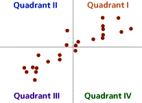 In the quantitative realm, 2D position (on a map or grid) outranks everything else in terms of perception accuracy. Length comes in a close second, whereas area (i.e. size) is further down the list, with volume performing even worse, and color saturation (dark to light) barely passable. So unless you need to convey more than two quantitative relationships simultaneously, skip the circle sizes and cube volumes and just stick with 2D position and length for much improved audience understanding.
2D position is also the best attribute to convey qualitative/categorical information, but here, color moves way up the scale, along with texture and a couple more we’ll discuss next – connection and enclosure.
Below is the ranking, in order with the most effective on top, of the best attributes to use for quantitative and qualitative data:

Categorical data can make great use of connection and enclosure
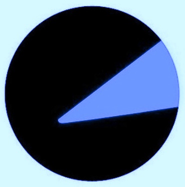
If you want to show a 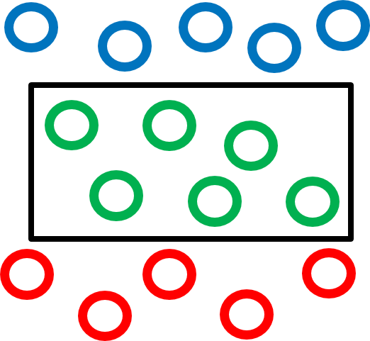 relationship between elements on the chart, color is the tried-and-true go-to for most of us: make all the X’s blue and all the Y’s green and all the Z’s red. Or color the important category cherry red to make it stand out from a gray sea of “others”. Often overlooked, however, are the attributes of connection and enclosure. Simply connect related items with lines or arrows, or draw a dark circle around a set of elements you want to group together, and watch your readers’ comprehension soar.
Bad, bad pie chart
Now that you have this additional visual vocabulary under your belt, it’s time to apply these skills to that really bad pie chart in your slide deck, and as promised, make it even worse.
- If you only have four or five slices, there’s a chance your audience might accidentally extract something of value from it. Instead, aim for 12-15 slices with hard-to-read labels placed far from the corresponding slice connected by little lines that clutter the legend.
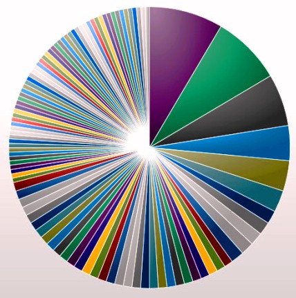 If your data will support it, you can incorporate both several really small slices plus one large “Other” category that includes 20-25% of the total data. Trying to imagine the possibly hundreds of minor categories that must make up ‘Other’ will distract your audience enough so that they never get close to discerning the main message.
- Lastly, if you really want to go all out, make it a 3D pie chart, where the tilt completely distorts the visual relationship between the areas/angles and the actual magnitude of the underlying data. Such a presentation should, however, come with a warning similar to that on side-view mirrors: Slices in the background may be larger than they appear.
(Bonus points if you can combine all three)
Remember - charts and data are just middlemen between phenomena and your ideas about them. Visualization is merely a technique, a way of using that middleman to communicate ideas that convey much more than just pictures of statistics.
When we create strong visualizations, we uncover some truth and help people understand that truth – to see what couldn’t be seen before. We do it to change minds. To cause action. It’s not data visualization; it's visual rhetoric – the art of graphical discourse.
For more information on how to implement these and other related approaches in SAS Visual Analytics, I recommend this white paper: Data Visualization Techniques - From Basics to Big Data With SAS Visual Analytics, which even includes more advice on pie charts and other visualizations.

1 Comment
Great blog Leo. I'm a big fan of the importance of information design in data visualisation. I'd highly recommend Cleveland 1984 as a great reference document from one of the early pioneers.