There has been a spate of recent high-profile airline crashes (Malaysia Airlines, TransAsia Airways, Germanwings,...) so I was surprised when I saw a time series plot of the number of airline crashes by year, which indicates that the annual number of airline crashes has been decreasing since 1993. The data
Tag: Statistical Graphics
I recently wrote about how to overlay multiple curves on a single graph by reshaping wide data (with many variables) into long data (with a grouping variable). The implementation used PROC TRANSPOSE, which is a procedure in Base SAS. When you program in the SAS/IML language, you might encounter data
Data. To a statistician, data are the observed values. To a SAS programmer, analyzing data requires knowledge of the values and how the data are arranged in a data set. Sometimes the data are in a "wide form" in which there are many variables. However, to perform a certain analysis
The xkcd comic often makes me think and laugh. The comic features physics, math, and statistics among its topics. Many years ago, the comic showed a "binary heart": a grid of binary (0/1) numbers with the certain numbers colored red so that they formed a heart. Some years later, I
I began 2015 by compiling a list of popular articles from my blog in 2014. Although this "People's Choice" list contains many interesting articles, some of my favorites did not make the list. Today I present the "Editor's Choice" list of articles that deserve a second look. I've highlighted one
My colleague Robert Allison has a knack for finding fascinating data. Last week he did it again by locating data about how blood types and Rh factors vary among countries. He produced a series of eight world maps, each showing the prevalence of a blood type (A+, A-, B+, B-,
One of my presentations at SAS Global Forum 2014 was about the new heat map functions in SAS/IML 13.1. Over the summer I created a short video of my presentation, which gives an overview of visualizing matrices with heat maps, and describes how to choose colors for heat maps: If
Have you ever looked as a statistical graph that uses bright garish colors and thought, "Why in the world did that guy choose those awful colors?" Don't be "that guy"! Your choice of colors for a graph can make a huge difference in how well your visualization is perceived by
In a previous article I introduced the HEATMAPCONT subroutine in SAS/IML 13.1, which makes it easy to visualize matrices by using heat maps with continuous color ramps. This article introduces a companion subroutine. The HEATMAPDISC subroutine, which also requires SAS/IML 13.1, is designed to visualize matrices that have a small
While at JSM 2014 in Boston, a statistician asked me whether it was possible to create a "customized bin plot" in SAS. When I asked for more information, she told me that she has a large data set. She wants to visualize the data, but a scatter plot is not
In a previous blog post I showed how to order a set of variables by a statistic. After reshaping data, you can create a graph that contains box plots for many variables. Ordering the variables by some statistic (mean, median, variance,...) helps to differentiate and distinguish the variables. You can
When I create a graph of data that contains a categorical variable, I rarely want to display the categories in alphabetical order. For example, the box plot to the left is a plot of 10 standardized variables where the variables are ordered by their median value. The ordering makes it
While I was working on my recent blog post about two-dimensional binning, a colleague asked whether I would be discussing "the new hexagonal binning method that was added to the SURVEYREG procedure in SAS/STAT 13.2." I was intrigued: I was not aware that hexagonal binning had been added to a
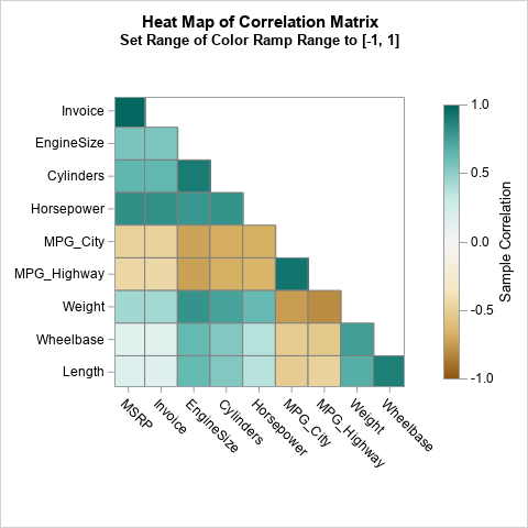
In a previous blog post, I showed how to use the graph template language (GTL) in SAS to create heat maps with a continuous color ramp. SAS/IML 13.1 includes the HEATMAPCONT subroutine, which makes it easy to create heat maps with continuous color ramps from SAS/IML matrices. Typical usage includes
Heat maps have many uses. In a previous article, I showed how to use heat maps with a discrete color ramp to visualize matrices that have a small number of unique values, such as certain covariance matrices and sparse matrices. You can also use heat maps with a continuous color
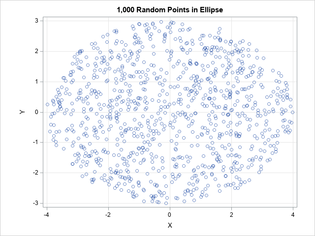
In a previous blog post, I showed how to overlay a prediction ellipse on a scatter plot in SAS by using the ELLIPSE statement in PROC SGPLOT. The ELLIPSE statement draws the ellipse by using a standard technique that assumes the sample is bivariate normal. Today's article describes the technique
It is common in statistical graphics to overlay a prediction ellipse on a scatter plot. This article describes two easy ways to overlay prediction ellipses on a scatter plot by using SAS software. It also describes how to overlay multiple prediction ellipses for subpopulations. What is a prediction ellipse? A
In my previous blog post, I showed how to use log axes on a scatter plot in SAS to better visualize data that range over several orders of magnitude. Because the data contained counts (some of which were zero), I used a custom transformation x → log10(x+1) to visualize the
If you are trying to visualize numerical data that range over several magnitudes, conventional wisdom says that a log transformation of the data can often result in a better visualization. This article shows several ways to create a scatter plot with logarithmic axes in SAS and discusses some of the
Last week I showed how to use the SUBMIT and ENDSUBMIT statements in the SAS/IML language to call the SGPLOT procedure to create ODS graphs of data that are in SAS/IML vectors and matrices. I also showed how to create a SAS/IML module that hides the details and enables you
As you develop a program in the SAS/IML language, it is often useful to create graphs to visualize intermediate results. The language supports basic statistical graphics such as bar charts, histograms, scatter plots, and so on. However, you can create more advanced graphics without leaving PROC IML by using the
I enjoy reading the Graphically Speaking blog because it teaches me a lot about ODS statistical graphics, especially features of the SGPLOT procedure and the Graph Template Language (GTL). Yesterday Sanjay blogged about how to construct a stacked bar chart of percentages so that each bar represents 100%. His chart
When I visualize three-dimensional data, I prefer to use interactive graphics. For example, I often use the rotating plot in SAS/IML Studio (shown at the left) to create a three-dimensional scatter plot. The interactive plot enables me to rotate the cloud of points and to use a pointer to select
SAS/IML 13.1 shipped a few months ago. I was asked to produce a video that highlights some of the new features in SAS/IML 13.1. In this video I describe several changes to the language before introducing the new built-in subroutines that create ODS statistical graphs. If your browser does not
My last blog post described three ways to add a smoothing spline to a scatter plot in SAS. I ended the post with a cautionary note: From a statistical point of view, the smoothing spline is less than ideal because the smoothing parameter must be chosen manually by the user.
Like many SAS programmers, I use the Statistical Graphics (SG) procedures to graph my data in SAS. To me, the SGPLOT and SGRENDER procedures are powerful, easy to use, and produce fabulous ODS graphics. I was therefore surprised when a SAS customer told me that he continues to use the
O Christmas tree, O Christmas tree, Last year a fractal made thee! O Christmas tree, O Christmas tree, A heat map can display thee! O tree of green, adorned with lights! A trunk of brown, the rest is white. O Christmas tree, O Christmas tree, A heat map can display
A heat map is a graphical representation of a matrix that uses colors to represent values in the matrix cells. Heat maps often reveal the structure of a matrix. There are three common applications of visualizing matrices with heat maps: Visualizing a correlation or covariance matrix reveals relationships between variables.
The mosaic plot is a graphical visualization of a frequency table. In a previous post, I showed how to use the FREQ procedure to create a mosaic plot. This article shows how to create a mosaic plot by using the MOSAICPARM statement in the graph template language (GTL). (The MOSAICPARM
Mosaic plots (Hartigan and Kleiner, 1981; Friendly, 1994, JASA) are used for exploratory data analysis of categorical data. Mosaic plots have been available for decades in SAS products such as JMP, SAS/INSIGHT, and SAS/IML Studio. However, not all SAS customers have access to these specialized products, so I am pleased