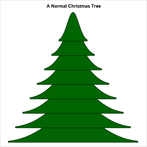
Tag: Statistical Graphics

Rick Wicklin 0
How to plot a discontinuous function

It is easy to use the SGPLOT procedure in SAS to plot the graph of a well-behaved continuous function: just create a data set of the (x,y) values on some domain and use the SERIES statement to connect the points. However, to plot the graph of a discontinuous function correctly

Rick Wicklin 0
Visualizing US commute times and congestion

Robert Allison posted a map that shows the average commute times for major US cities, along with the proportion of the commute that is attributed to traffic jams and other congestion. The data are from a CEOs for Cities report (Driven Apart, 2010, p. 45). Robert use SAS/GRAPH software to

Rick Wicklin 0
How to get data values out of ODS graphics

Many SAS procedures can produce ODS statistical graphics as naturally as they produce tables. Did you know that it is possible to obtain the numbers underlying an ODS statistical graph? This post shows how. Suppose that a SAS procedure creates a graph that displays a curve and that you want

Rick Wicklin 0
Create a contour plot in SAS

When I need to graph a function of two variables, I often choose to use a contour plot. A surface plot is probably easier for many people to understand, but it has several disadvantages when compared to a contour plot. For example, the following statements in SAS/IML Studio displays a

Rick Wicklin 0
The Poissonness plot: A goodness-of-fit diagnostic

Last week I discussed how to fit a Poisson distribution to data. The technique, which involves using the GENMOD procedure, produces a table of some goodness-of-fit statistics, but I find it useful to also produce a graph that indicates the goodness of fit. For continuous distributions, the quantile-quantile (Q-Q) plot

Rick Wicklin 0
Smoothers for periodic data

Over at the SAS and R blog, Ken Kleinman discussed using polar coordinates to plot time series data for multiple years. The time series plot was reproduced in SAS by my colleague Robert Allison. The idea of plotting periodic data on a circle is not new. In fact it goes

Rick Wicklin 0
Funnel plots for proportions

I have previously written about how to create funnel plots in SAS software. A funnel plot is a way to compare the aggregated performance of many groups without ranking them. The groups can be states, counties, schools, hospitals, doctors, airlines, and so forth. A funnel plot graphs a performance metric

Rick Wicklin 0
The most likely birthday in the US

Do you know someone who has a birthday in mid-September? Odds are that you do: the middle of September is when most US babies are born, according to data obtained from the National Center for Health Statistics (NCHS) Web site (see Table 1-16). There's an easy way to remember this

Rick Wicklin 0
Visualizing Scrabble games

My elderly mother enjoys playing Scrabble®. The only problem is that my father and most of my siblings won't play with her because she beats them all the time! Consequently, my mother is always excited when I visit because I'll play a few Scrabble games with her. During a recent

Rick Wicklin 0
Visualizing correlations between variables in SAS

Exploring correlation between variables is an important part of exploratory data analysis. Before you start to model data, it is a good idea to visualize how variables related to one another. Zach Mayer, on his Modern Toolmaking blog, posted code that shows how to display and visualize correlations in R.

Rick Wicklin 0
Side-by-side bar plots in SAS 9.3

When I was at the Joint Statistical Meetings (JSM) last week, a SAS customer asked me whether it was possible to use the SGPLOT procedure to produce side-by-side bar charts. The answer is "yes" in SAS 9.3, thanks to the new GROUPDISPLAY= option on the VBAR and HBAR statements. For

1 7 8 9 10