My colleague Robert Allison has a knack for finding fascinating data. Last week he did it again by locating data about how blood types and Rh factors vary among countries.
He produced a series of eight world maps, each showing the prevalence of a blood type (A+, A-, B+, B-, AB+, AB-, O+, and O-) in various countries around the world. As I studied his maps, I noticed that the distribution of blood types in certain ethnic groups (Chinese, Japanese, Indians,...) was different than the distribution in Western Europe and former European colonies.
When dealing with multivariate data, a single visualization is rarely sufficient to answer all the questions that you can ask. Robert's maps answer the question, "What is the spatial distribution of each blood type?" I was curious about a different question: "Within each country, what is the distribution of blood types?" To answer my question, I needed a different visualization of the same multivariate data.
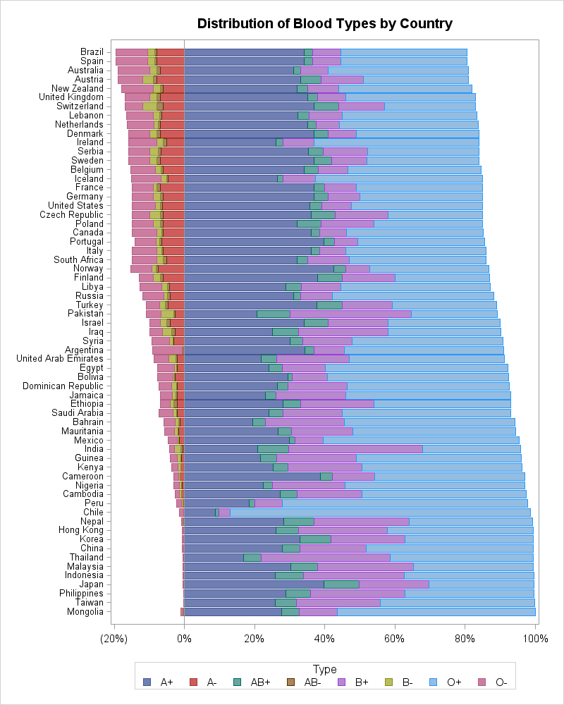
My attempt is shown to the left. (Click to enlarge.) The graph is a stacked bar chart of the percentage of blood type for 63 countries, sorted by the percentage of types that have positive Rh factors. Blood types with positive Rh factors are plotted on the right; negative Rh factors are plotted on the left. The A+ and A- types are plotted closest to the 0% reference line. The next types are AB, B, and O, in increasing distances from the 0% reference line.
A few ethnic differences are apparent. At the top of the chart are Western European countries and former European colonies such as Brazil, Australia, and New Zealand. A little lower on the list are countries in Eastern Europe and Scandinavia.
After that, the list starts to get geographically jumbled. The United States, Canada, and South Africa were all settled by people of multiple ethnicities. The middle of the list is dominated by countries from the Middle East, Northern Africa, and the Near East.
The next set of countries includes South American countries such as Argentina and Bolivia, Caribbean countries, India, and African countries.
Finally, the bottom of the list features Asian populations such as China, Japan, Mongolia, and the Philippines. These populations have almost no negative Rh factors in their blood. The distribution of blood types in those countries are similar to each other, although regional differences appear, such as the relatively small number of A+ blood in Thailand.
This one dimensional ranking of countries by blood types reflects historical connections between peoples as a result of conquest, trade, and colonization.
A few countries seem "out of place" in their list order. Lebanon, Ireland and Iceland, and Peru and Chile, are some of the countries whose distribution of blood types differ from those adjacent to them in the list.
The distribution of blood types by country. #Statistics Share on XRelationships between countries
Some of the "out of place" countries are probably a result of the fact that it is hard to linearly order the countries when there are eight variables to consider. Principal component analysis (PCA) is a statistical technique that can group observations according to similar characteristics. In SAS software, you can use the PRINCOMP procedure to conduct a principal component analysis.
The analysis reveals that 81% of the variation in the data can be explained by the first two principal components. About 92% can be explained by using three principal components, which means that the eight variables (percentages of each blood type) fit well into these lower-dimensional linear subspaces.
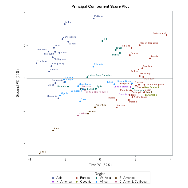
The score plot from a two-dimensional PCA analysis is shown to the left. (Click to enlarge.) I added colors to the data to indicate a geographical region for the countries; the regions came from the United Nations list of countries and geographic regions. This plot shows the relationships between countries based on similarities in the distribution of blood types.
The middle of the plot contains African and West Asian nations. (West Asia is the UN name for the region that many people call the Middle East.) The right side of the plot is dominated by European countries and their former colonies. The upper left quadrant contains the Asian countries. The lower left quadrant includes the Caribbean, Central American, and South American countries. This presentation once again shows that the distribution of blood types in Peru and Chile is different from other countries, but are similar to each other.
You can download the data and the SAS program that analyzes it and do additional analyses.
What interesting features can you find in these data? Are there other ways to view these data? Leave a comment.

46 Comments
interesting to look at, but from what year are the blod type data taken?
As Europe today have a very mixed population immigrating from 1990 and increasing since.
It would be interesting with a timeseries plot of changes over time.
The source of the data compiles statistics from many different sources and years.
Gee Rick did you forget the 40 percent A+ Blood type in Japan? Gee if that is not an anomaly I don't know what is!
I find the PCA score plot provides some interesting information. Upper left quadrant is quite homogeneous, with almost all Asian countries. Lower right is most diverse. Switzerland and Chile are the most distant. I wonder what makes Chile and Peru so unique and different from the others?
Switzerland, Chile, and Peru are all mountainous -- genetic isolation?
It's an awesome article but guys it shows 8 types of blood type groups that is in India too same then how can it shows that different types of blood group in different countries
CAN ANYONE ANSWER OR SAY ME PLEASE KINDLY.. THANK YOU.. IN ADVANCE FOR ANSWERING...
For each country, the graph shows the proportion of the population that has each of the 8 different blood types.
I've read different blood types fight disease in different ways, and wonder if this could explain differences in the severity and morbidity of Covid 19?
What I am wondering as well. So many variables. Could less susceptible blood types increase transmission to more susceptible blood types? Is there a country that would be an ideal type to examine? Maybe somewhere in South America? Seems too simple, and peer reviews aren’t in, but curious nonetheless.
Hello from 2020.
Has anyone found any more insights or studied this correlation?
I’ve been wondering the same, because it does show a proportionate amount of people affected by the Covid19 are of the positive blood type!
I’ve noticed a correlation between Covid19 and positive blood types also!
Three different studies seem to bear this out, though no one seems to know why. One study was in China, one from Europe, and one from U.S. (info. here from 23 and me) - not peer reviewed.
immigrants.
the blood group B+ is to be believed developed in Himalayan continents, A+ and others to be outside.
that's the reason many ppl in India are having B+.
You say "A few countries seem 'out of place' in their list order. Lebanon, Ireland and Iceland, and Peru and Chile, are some of the countries whose distribution of blood types differ from those adjacent to them in the list."
Can you please define why they are out of place, those I am descendant of come from most of those places. What is it that makes them different? a specific blood type? Interested to know.
They are only "out of place" in the sense that the geographic location of the country differs from the geographic location of adjacent countries. The most likely explanation is the mixing of blood types through immigration. For example, in the 1990s there was a mass immigration to Ireland of people from Eastern Europe and Asia. This immigration altered the blood types in Ireland. Thus Ireland appearing next to Serbia on the list can be explained through immigration. I'm not a historian, but there are probably similar historical facts that explain other relationships.
Can you please confirm, is AB - mainly found in Peru Bolivia, the brown. My mother carried that. Those places consul in my DNA markings.?
Many thanks
AB- is most prevalent in Switzerland (2%). The following countried have AB- factors in about 1% of the population:
Australia, Austria, New Zealand, United Kingdom, Denmark, Ireland, Sweden, France, Germany, Czech Republic, Poland, South Africa, Finland, Israel, and Ethiopia.
The percentage in Peru is 0.1%. In Peru it is a tiny 0.02%.
what is the most common blood group in Cape verde and Afghanistan??
The data does not provide that information. You might assume that the proportions in be Afghanistan will be similar to its neighbor Pakistan. Cape Verde was settled by many groups, so you need actual data.
Pingback: Ahh, that's smooth! Anti-aliasing in SAS statistical graphics - The DO Loop
I'm interested in AB+ I read in another source that this blood type is a more recent development. That is, is seems to have developed after 900 AD. Do your findings support this too? I'm researching a project, and cannot find much information on when these more recent blood types first appeared in populations.
Thank you, in advance, for you time and help.
Sorry, but I do not know.
I am new at this I have A+blood so we're would my anstery be.
You need to run a genetic profile to obtain ancestry information. The data show that certain countries and regions tend to have a certain proportion of blood types, but you can't infer a person's ancestry from their blood type.
It would be interesting to see blood type distribution based in age ranges by country. Younger groups will represent the effects of very recent immigration while older groups will represent the population as it has been for since the last immigration wave in each country.
Only about 15% of the population of the African Continent in included in this graph. African has 1.2B, but only about 0.2B are included. Why were they excluded? Lack of data? I was hoping to compare Congo, Mongolia, Nepal, Bolivia, and Poland.
Thanks for your comment. This visualization is based on the data provided at
http://www.rhesusnegative.net/themission/bloodtypefrequencies/
in Nov 2014. You can investigate their site to see if they have any additional data.
What are your thoughts as to why Argentina and Chile, adjacent on the map, have such a difference in distribution in blood types? Visually they appeared more dissimilar, and was the first thing that jumped out at me from the chart. Chile with minimal O-, but an over abundance of O+ and Argentina with a significantly larger O- population.
Most likely differences in post-Colonial immigration. Although both were initially colonized by Spain, Argentina had a massive influx of European immigrants in 1880-1910. For example, 62% of Argentinians have Italian ancestry.
I believe that your research on blood types by countries implies that there are certain blood types associated with populations. I have been researching my ancestry using oral tradition, documentary evidence and physical evidence. My uncle took a DNA Ancestry Test which pretty much agreed with I found from the European side, however, the DNA Test did not identify his Cherokee ancestry and identified massive West Afrikan ancestry which I didn`t find in my research. I believe that blood type can give a clue of ones ancestry. For example I took a poll of my family for blood types and found that 91% are O Positive. Three of us are O Negative - I read that O Negative is associated with Scottish people and the Basque people of the Iberian Peninsula. I knew that my material grandmother was mixed Scottish-Irish and Indigenous but just recently I found out that my fraternal great grandmother was Scottish. Am I correct in attributing the O Negative ancestry to this Scottish great grandmother? One of my sister`s and one of my daughters are also O Negative.
I am not an expert on genealogy, so I suggest you post your question to a genealogy forum. Blood types are not strong indicators of ethnicity.. The inheritance of A/B/O alleles and Rh factors is covered in most biology classes. Since O and Rh- are both recessive alleles, the only conclusion I can make is that your direct ancestors are also O-. At some point, one or more people in your cousin's tree married an O+ person, and that led to the O+ cluster in your family.
Agreed but she is correct at least about the Basque people having the highest levels of RH- blood than any other group. A close second to the Basque would be the Amazaih people of Morocco.
Are these statistics published on or in any board approved sites or articles? I would like to cite your research and am needing approved published material. Is there another site where the most current stats relative to this data are available? Yours are the most detailed and seemly accurate I was able to locate. Thanks.
I didn't do any research. I merely produced a data visualization and did some basic data analysis of blood-type data from 2014. I do not know whether there are newer data or a "board-approved" site.
It looks like all your data came from an old version of the page "Blood_type_distribution_by_country" from wikipedia, verbatim.
I have come to wonder about the accuracy of that data, especially concerning China, which came from this website: http://bloodtypes.jigsy.com/East_Asia-bloodtypes
which only reference "Blood A research Institute in the Netherlands" and the year 1999, without further reference. The numbers given for China are quite different from other sources I found.
I am trying to challenge the Chinese paper that claims that blood type A is most susceptible to COVID-19. I believe their conclusion is inaccurate, probably because the control group might not be large enough, or not matching the ratio of age groups in the patient group. I currently have a hard time finding comprehensive and accurate data concerning ABO blood types in each Chinese province.
By the way did you notice that the numbers given for Mongolia sum up to 101% (which explains why it seems out of place in your chart), and that the numbers given for Norway sum up to 102%?
Hello Rick, I really enjoyed your analysis and used it as a jumping off point to look at Covid death rates by country based on a clinical study showing higher risk for A+ patients and lower risk for O patients. I did not find that, but I did find a correlation between lower Covid death rates and higher B+ percentages (primarily Asia). My write up (with links to data and code and a reference to your work) is at https://rpubs.com/whelanh/CovidBloodType
Good data collections. I still think possible that A+ is related to higher Covid morbidity when it reaches severe cases. New Zealand was lucky to have taken strong measures at the onset while Brazil exponential death was caused by its arrogant President just like what Trump did to the Americans Japan has a high type A population may also have higher morbidity in severe cases but have not manifested thus far. Hope they are safe and taken strong measures.
I have been contacted several times by people who are trying to relate the proportion of blood types in a country to rates of COVID-19 infections or mortality within that country. In my opinion, these data are not very useful for investigating those questions. National and local public health policies, socioeconomic factors, public compliance, and access to health care will have a much larger effect than blood type. If blood type had a strong measurable effect on morbidity or mortality, you would use the blood type of the COVID PATIENTS (not the population) to establish such a link.
40% isn't too far from the normal A+ distribution. Coupled with the lower incidence of negative blood types in that area, it's easy to predict that the A+ distribution would be around 15 - 25% higher than because there are very, very few negatives to dilute the A population. Plus, Norway looks to have more anyway. Japan's A+ at 40%... that's not what an anomaly is; your last 5 words are likely correct.
I stand on what I said: Japan has a higher concentration of type A blood than any Asian country it also has a population of around 105 to 110 million people where as the UK which does not include the Republic of Ireland only Northern Ireland has about 69 million people with 44 % type O blood and 42 % type A blood 10 % type B blood and 4% type AB a hybrid of types A and B. So if we were to add the folks in the UK that are type AB with type A then you actually get 46 % of the UK population that as type A blood in their veins and they out number type O by 2% and you can do this because all you need is one allele of type A to be A blood type if the other allele is O so another words an AB blooded person has one A gene and i have one A gene because my mother is o+ and over half of all A or B type blooded people carry type o recessively so if I can call myself type A blood than my father can call himself half type A blood and half type B blood see. So 40% of the Japanese people are type A blood but ten percent of the Japanese are type AB blood so let's add them both together and see what we get? 50% of Japan an ASIAN COUNTRY that has a higher type A blood population than even the UK has. That is an ANOMALY for an Asian country!
I just saw this info. being posted on another forum -
Scientists Discover Why Blood Type May Matter for COVID Infection (March 3, 2021)
https://www.usnews.com/news/health-news/articles/2021-03-03/scientists-discover-why-blood-type-may-matter-for-covid-infection
I saw a map version of this or similar data showing overall distribution of Rhesus Negative blood. It seems to have disappeared. Do you have a map representation of this data or could you do one?
Sorry, I do not have the map you are looking for.
Do you have statistics on African and non-African countries? I see Libya, Egypt and South Africa. There may be a few others. But, why is this the case?
When this article was written in 2014, those were the data that were available. It looks like the web site https://www.rhesusnegative.net/themission/bloodtypefrequencies/ now contains data for additional countries, including more African nations.