Heat maps have many uses. In a previous article, I showed how to use heat maps with a discrete color ramp to visualize matrices that have a small number of unique values, such as certain covariance matrices and sparse matrices. You can also use heat maps with a continuous color ramp to visualize correlation matrices or data matrices.
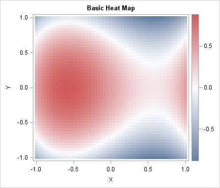
This article shows how to use a heat map with a continuous color ramp to visualize a function of two variables. A heat map of a simple cubic function is shown to the left. In statistical applications the function is often a quantity—such as the mean or variance—that varies as a function of two parameters. Heat maps are like contour plots without the contours; you can use a heat map to display smooth or nonsmooth quantities.
You can create a heat map by using the HEATMAPPARM statement in the graph template language (GTL). The following template defines a simple heat map:
proc template; /* basic heat map with continuous color ramp */ define statgraph heatmap; dynamic _X _Y _Z _T; /* dynamic variables */ begingraph; entrytitle _T; /* specify title at run time (optional) */ layout overlay; heatmapparm x=_X y=_Y colorresponse=_Z / /* specify variables at run time */ name="heatmap" primary=true xbinaxis=false ybinaxis=false; /* tick marks based on range of X and Y */ continuouslegend "heatmap"; endlayout; endgraph; end; run; |
The template is rendered into a graphic when you call the SGRENDER procedure and provide a source of values (the data). The data should contain three variables: two coordinate variables that define a two-dimensional grid and one response variable that provides a value at each grid point. I have used dynamic variables in the template to specify the names of variables and the title of the graph. Dynamic variables are specified at run time by using PROC SGRENDER. If you use dynamic variables, you can use the template on many data sets.
The following DATA step creates X and Y variables on a uniform two-dimensional grid. The value of the cubic function at each grid point is stored in the Z variable. These data are visualized by calling the SGRENDER procedure and specifying the variable names by using the DYNAMIC statement. The image is shown at the top of this article.
/* sample data: a cubic function of two variables */ %let Step = 0.04; data A; do x = -1 to 1 by &Step; do y = -1 to 1 by &Step; z = x**3 - y**2 - x + 0.5; output; end; end; run; proc sgrender data=A template=Heatmap; dynamic _X='X' _Y='Y' _Z='Z' _T="Basic Heat Map"; run; |
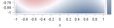
The GTL template uses default values for most options. The default color ramp is a continuous three-color ramp. For the ODS style I am using, the default ramp uses blue to display low values, white to display middle values, and red to display high values. The XBINAXIS=false and YBINAXIS=false options override the default placement of tick marks on the axes. By default, the tick marks are be placed at data values of the X and Y variable, which are multiple of 0.04 for this data. The following image shows part of the heat map that results if I omit the XBINAXIS= and YBINAXIS= options. I prefer my tick labels to depend on the data range, rather than the particular value of &Step that I used to generate the data.
The HEATMAPPARM statement has many options that you can use to control features of the heat map. Because the heat map is an important tool in visualizing matrices, SAS/IML 13.1 supports functions for creating heat maps directly from matrices. I will discuss one of these functions in my next blog post.

8 Comments
Pingback: Creating heat maps in SAS/IML - The DO Loop
Hi Rick,
I have a question concerning heatmaps and the heatmapparm statement. I want to do a heatmap, the Y-axis is made of ten stock exchanges, the X-axis is made of daily dates, and the colorresponse is an indicator ranging from 0 to 1. Using daily data, I have missing dates, for instance during week ends. For this dates, SAS draws vertical white line. How to deal with unregular spaced data, or how asking SAS not considering these missing data. I have tried the INCLUDEMISSINGCOLOR. Not sure what it does, but that does not work. Any help welcome.
Best
Philippe
You can ask questions like this at the SAS Support Communities. Try the Graphics communitity, unless you are using SAS/IML, in which case use the SAS/IML Community. My advice is to put the 10 exchanges on X and to put the dates on Y. Delete the weekend dates.
Pingback: Mathematical art: Weaving matrices - The DO Loop
Pingback: Create a surface plot in SAS - The DO Loop
Hi Rick,
It is very helpful. But, may I ask for more guidance on the heatmap? Is it possible to create a heatmap panel? It means several heatmaps displayed side by side, like proc sgpanel does. I did not google any code. If possible, would you please give some code example
Use the LAYOUT LATTICE statement. There are many example on Sanjay's blog.
Pingback: Create heat maps with PROC SGPLOT - The DO Loop