When SAS 9.4m3 was released last month (including SAS/STAT and SAS/IML 14.1), I was happy to see that a HEATMAP statement had been added to the SGPLOT procedure. Although heat maps in the SAS/IML language have been available for several releases, you previously had to use the Graph Template Language (GTL) to create a customized heat map in Base SAS.
Create heat maps in SAS with PROC SGPLOT #DataViz Share on XTo illustrate using the HEATMAP statement, consider the following counts for patients in a medical study, classified by ordinal variables that represent the patients' weight and smoking status. The data and the techniques used to create the table are discussed in the article "How to order categories in a two-way table with PROC FREQ." You can download the complete SAS program that is used to create the table and graphs in this analysis.
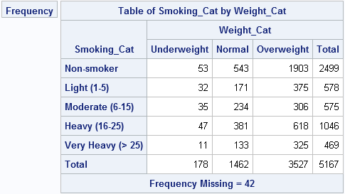
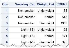
The categories and counts are contained in a data set called FreqOut, which was created by the FREQ procedure. The data set is arranged in "list form" (or "long form") as follows:
A basic heat map of a frequency table
The following statements create a basic heat map of the frequencies for the 15 cells of the table:
proc sgplot data=FreqOut; heatmap x=Weight_Cat y=Smoking_Cat / freq=Count discretex discretey colormodel=TwoColorRamp outline; run; |
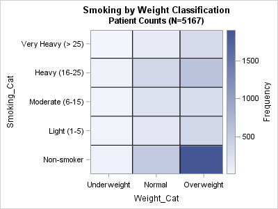
On the HEATMAP statement, the DISCRETEX and DISCRETEY options are used because the underlying variables are numeric; a user-defined format is used to render the numbers as "Underweight," "Normal," "Overweight," and so forth. A two-color gradient ramp is good for showing counts. The default color ramp has three colors (blue, white, and red), which is good for visualizing deviations from a reference value.
The heat map makes it visually clear that most patients in the study are overweight non-smokers. Other categories with many patients include the overweight heavy-smokers, the normal-weight non-smokers, and the normal-weight heavy-smokers. Underweight patients (regardless of smoking status) are relatively rare.
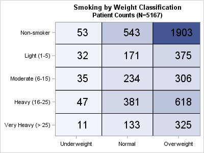
Overlaying text on a heat map
Although this same heat map can be created in SAS/IML by using the HEATMAPCONT subroutine, using PROC SGPLOT makes it easy to overlay other plot types and change properties of the graph. For example, you might want to overlay the counts of each cell to create a color-coded table. You can easily add the TEXT statement to the previous SGPLOT statements. If you add the counts, you don't need to include the gradient color ramp. Furthermore, to make the heat map look more like the table, you can add the REVERSE option to the YAXIS statement. Lastly, the category labels make it clear that the variables are related to smoking and weight, so you can suppress the variable names. The following statements implement these revisions and create a new heat map:
proc sgplot data=FreqOut noautolegend; heatmap x=Weight_Cat y=Smoking_Cat / freq=Count discretex discretey colormodel=TwoColorRamp outline; text x=Weight_Cat y=Smoking_Cat text=Count / textattrs=(size=16pt); yaxis display=(nolabel) reverse; xaxis display=(nolabel); run; |
I'm excited by the HEATMAP statement in PROC SGPLOT. I think it is a great addition to one of my favorite SAS procedures.

12 Comments
Great enhancements to SAS' data visualization portfolio! I really like the text overlay providing the figures to the visual color "heat" without having to hover over for tool tips to compare.
Thanks for sharing Rick.
Hi,
I was wondering if you can offer some insight. I tried to generate a heatmap with the code presented below
proc sgplot data=work.nwn2
heatmap x=trt y= response / freq=count
discretex discretey
colormodel=TwoColorRamp outline;
run;
I got the error presented below
heatmap x=trt y= response / freq=count
_______
22
76
ERROR 22-322: Syntax error, expecting one of the following: ;, (, ASPECT, CYCLEATTRS, DATA, DATTRMAP, DESCRIPTION, NOAUTOLEGEND,
NOBORDER, NOCYCLEATTRS, NOOPAQUE, NOSUBPIXEL, NOWALL, OPAQUE, PAD, PCTLEVEL, PCTNDEC, RATTRMAP, SGANNO, SUBPIXEL,
TMPLOUT, UNIFORM.
regards,
Sen
You can ask questions like this at the SAS Support Community for Graphics. Someone there will quickly respond that you forgot a semicolon at the end of the PROC SGPLOT statement.
Please delete my last comment. I have figured it out
Pingback: Twelve posts from 2015 that deserve a second look - The DO Loop
This is very cool Rick!
Thank you for sharing this new data visualization technique!
Is it possible to overlay text of the significance such as "n.s." for non-significance and "*" or "**" for level of significance instead of overlaying data numbers?
Yes. You can create a character variable that contains the information and then specify it on the TEXT= option. You can also use the cell color to depict significance.
i have a question that every number in the cell of table how to set in?
thank you.
I see that you posted your question to the SAS Support Communities. I'm sure someone there will be able to help.
Is it possible to define the range of the scale using proc sgplot?
Thanks!
Yes,. Look at the documentation for the XAXIS and YAXIS statements. Look at the MIN= and MAX= options.