The Graph Template Language (GTL) provides you the ability to create complex graphical layouts. We have seen how to create a regular grid of cells based on one or more classification variables using the SGPANEL procedure. Each cell contains the same type of plot. This topic was covered in Dan's article on Sorting Paneled Graphs. The SGPANEL procedure essentially uses the related GTL DATALATTICE layout behind the scene.
But what if you want to create a specific non-regular layout of different plots? This is where you need to use the GTL LATTICE layout. This layout provides you powerful and flexible ways of arranging your graphs with or without common axes or common regions. In this article we will go over some of the features of this layout.
Simple Lattice Layout:
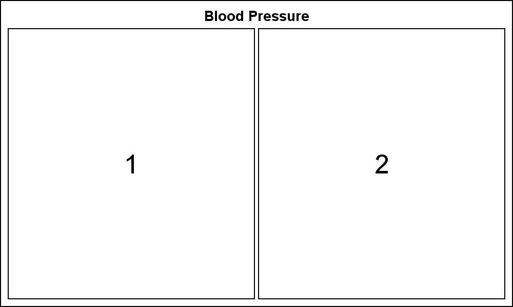
Here is an example of a simple 2-cell side by side layout. Each cell can be populated with its own plots, essentially any combinations of compatible plot types in a Layout Overlay. Here I have shown only the layout.
GTL Code for simple layout:
proc template; define statgraph Simple_Layout; begingraph; entrytitle 'Blood Pressure'; layout lattice / columns=2 columngutter=5; layout overlay / walldisplay=(outline) xaxisopts=(display=none) yaxisopts=(display=none); scatterplot x=weight y=systolic / markerattrs=(size=0); entry halign=center textattrs=(size=20) "1" / valign=center; endlayout; layout overlay / walldisplay=(outline) xaxisopts=(display=none) yaxisopts=(display=none); scatterplot x=weight y=diastolic / markerattrs=(size=0); entry halign=center textattrs=(size=20) "2" / valign=center; endlayout; endlayout; endgraph; end; run; proc sgrender data=sashelp.heart template=Simple_Layout; run; |
Here are the salient points of the code above:
- We have used one LAYOUT LATTICE with a TITLE.
- The layout has two columns, with a gutter between them.
- Each cell contains a SCATTERPLOT and an ENTRY.
- The scatter plot is required to make the layout code work, but since we want to see the empty space, we have set marker size to zero.
- The entry statement is used to display the cell numbers.
- The display of the axes have been suppressed.
- To create any output, we need to run the template with a real data set.
Simple Lattice Layout with Plots:
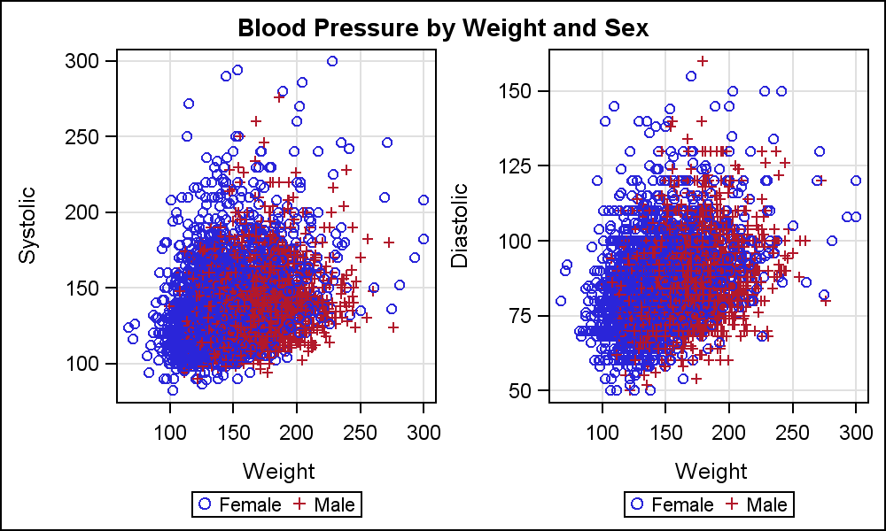
Here we have taken the next step of populating each cell with the plots. Here, the content of each cell is a single scatter plot and a legend, but any combination of compatible plots can be used within a Layout Overlay.
GTL Code for simple layout:
proc template; define statgraph Simple_Layout_Graphs; begingraph; entrytitle 'Blood Pressure by Weight'; layout lattice / columns=2 columngutter=5; layout overlay / xaxisopts=(griddisplay=on) yaxisopts=(griddisplay=on); scatterplot x=weight y=systolic / group=sex name='s'; discretelegend 's'; endlayout; layout overlay / xaxisopts=(griddisplay=on) yaxisopts=(griddisplay=on); scatterplot x=weight y=diastolic / group=sex name='d'; discretelegend 'd'; endlayout; endlayout; endgraph; end; run; proc sgrender data=sashelp.heart template=Simple_Layout_Graphs; run; |
Here are the salient points of the code above:
- Each cell is populated with a scatter plot of response by weight and sex.
- Each cell has a complete graph, with axes and legends.
- Note, the two Y axes are different and NOT uniform.
Lattice Plots with Common Axes and Legends:
Now, let us improve the graph by using a common Y axis, so we can see the relationship between the Systolic and Diastolic blood pressure. This also saves some space and reduces potential confusion.

GTL Code for layout with common axes and legends:
proc template; define statgraph Layout_CommonAxis_Sidebar; begingraph; entrytitle 'Blood Pressure by Weight and Sex'; layout lattice / columns=2 columngutter=5 rowdatarange=union; rowaxes; rowaxis / griddisplay=on label='Blood Pressure'; endrowaxes; column2headers; entry 'Systolic'; entry 'Diastolic'; endcolumn2headers; layout overlay / xaxisopts=(griddisplay=on); scatterplot x=weight y=systolic / group=sex name='s'; endlayout; |
layout overlay / xaxisopts=(griddisplay=on); scatterplot x=weight y=diastolic / group=sex name='d'; endlayout; |
        sidebar / spacefill=false;
	 discretelegend 'd';
endsidebar; |
      endlayout;
    endgraph;
  end;
run;

proc sgrender data=sashelp.heart template=Layout_CommonAxis_Sidebar;
run; |
Here are the salient points of the code above:
- The ROWDATARANGE is set to UNION.
- A ROWAXES block is defined to create a single external Y axis.
- The DISCRETELEGEND is placed in a SIDEBAR.
- COLUMN2HEADERS are used to display the response variable.
Nested Layouts:
Layouts can be nested inside other layouts to create a more complex arrangement. Here is an example of such a nexted layout. See attached full program to see the code for this arrangement.

The Subgrouped Forest Plot is an excellent example of the usage of the GTL LATTICE layout.
Full SAS Code: GTL_Layout_Lattice


4 Comments
This is interesting, but I must say that while I use SAS a lot - this chart would have been done in much less code using ggplot2 in R.
I love SAS, but easier code wins all the time
So happens I was at the Statistical Practice conference in New Orleans last week and took a course in R graphics. While we did not get to GGPLOT2, we did work some basic R graphics and Lattice package examples. I hope to have more related content.
Is that possible to rotate the label of Y-axis 90 degree. I used to hear that y-axis label in SGplots is always angled sideways. Is it same for SGPanel and all the other SG family?
Not with SAS 9.2 or SAS 9.3. Yes, with SAS 9.4, to be released soon.
With SAS 9.3, you could use annotate.