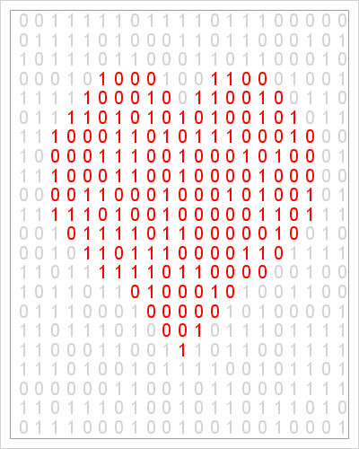
The xkcd comic often makes me think and laugh. The comic features physics, math, and statistics among its topics. Many years ago, the comic showed a "binary heart": a grid of binary (0/1) numbers with the certain numbers colored red so that they formed a heart.
Some years later, I used an equation in polar coordinates to draw a heart in SAS as a Valentine's Day gift to my wife. This year I thought it would be fun to combine these two ideas into a geeky Valentine's Day post.
The following SAS DATA step generates on a uniform grid of points near the origin. You can create an indicator variable that specifies which elements of the grid are inside the heart equation. By using the RAND function, you can generate a random 0 or 1 according to the Bernoulli distribution. You can then call the SGPLOT procedure to show the binary values, using red to display those that are inside the heart region and light gray to display the values outside the heart. The resulting image is shown at the top of this article.
/* generate random binary heart similar to xkcd comic: http://xkcd.com/99/ */ data BinaryHeart; drop Nx Ny t r; Nx = 21; Ny = 23; call streaminit(2142015); do x = -2.6 to 2.6 by 5.2/(Nx-1); do y = -4.4 to 1.5 by 6/(Ny-1); /* convert (x,y) to polar coordinates (r, t) */ r = sqrt( x**2 + y**2 ); t = atan2(y,x); /* eqn: blogs.sas.com/content/iml/2011/02/14/a-parametric-view-of-love/ */ Heart= (r < 2 - 2*sin(t) + sin(t)*sqrt(abs(cos(t))) / (sin(t)+1.4)) & (y > -3.5); B = rand("Bernoulli", 0.5); output; end; end; run; ods graphics / width=400px height=500px; title "Happy Valentine's Day"; proc sgplot data=BinaryHeart noautolegend; styleattrs datacontrastcolors=(lightgray red); scatter x=x y=y / group=Heart markerchar=B markercharattrs=(size=14); xaxis display=none offsetmin=0 offsetmax=0.06; yaxis display=none; run; |
The image is similar to the original hand-drawn xkcd comic, although the random binary values are different. I don't know what a "binary heart" means, but I find it interesting nonetheless.
Notice the use of the STYLEATTRS statement in PROC SGPLOT to set the colors of the marker characters. The STYLEATTRS statement was added in SAS 9.4. In SAS 9.3 you can use the DATTRMAP= option in the PROC SGPLOT statement to specify the colors of groups in SAS statistical graphics.

7 Comments
Be still my binary heart! Your use of SAS/IML for special occasions is brilliant and I know my valentine would appreciate this ;-)
Yes, I bet he would. Print it out and paste it on some cardstock for a homemade Valentine's Day card. Fill with geeky words of affection from my previous Valentine's Day article.
Great idea... and especially with the words "You are more beautiful than Euler's identity." It's funny that I'm writing this while having a cup of tea in my favourite mug - http://www.amazon.com/The-Unemployed-Philosophers-Guild-W64004M/dp/B001237296
Rick,
What a great, fun post. Shows that computer geeks can be romantics too.
----MMMMIIIIKKKKEEEE
(aka Michael A Raithel)
Such a fun post! You guys are so creative.. I love it!
One more way of sharing love around office. Thanks!
Hi Rick, I took you code and added some fun mouseover.