Sometimes a graph is more interpretable if you assign specific colors to categories. For example, if you are graphing the number of Olympic medals won by various countries at the 2012 London Olympics, you might want to assign the colors gold, silver, and bronze to represent first-, second-, and third-place medals. A good choice of colors can reduce the time that a reader spends studying the legend, and increase the time spent studying the data. In this example, I assign a "traffic light" scheme to visualize data about gains and losses: green means positive gains, gray indicates little or no change, and red indicates negative change.
The SGPLOT procedure in SAS makes it easy to display a different color for each level of a grouping variable. By default, when you specify the GROUP= option for a graph, colors are assigned to groups based on the current ODS style. But what can you do if you want to assign specific colors for group categories?
There are several ways to assign colors to categories, including using PROC TEMPLATE to write your own ODS style. However, in SAS 9.3, the easiest option is to use an "attribute map." An attribute map is a small data set that describes how each category level should be rendered. Dan Heath wrote a blog post about the attribute map. In this article I give a simple example of using an attribute map with the SGPLOT procedure, and I show that you can use a format to help you create an attribute map.
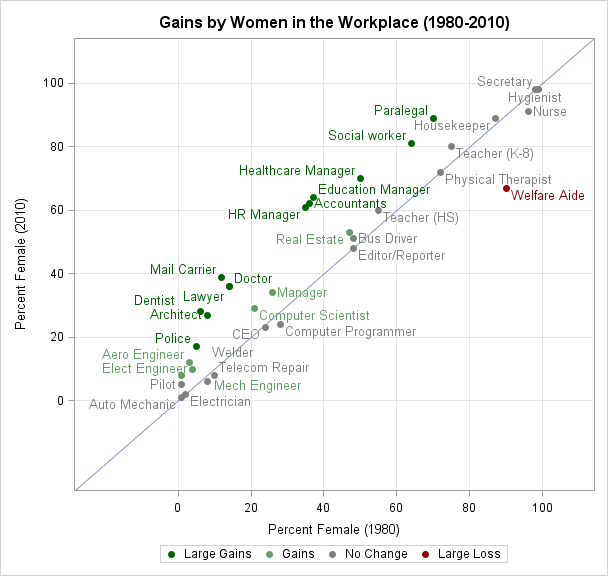
In my last article, I created a scatter plot that shows the gains made by women in the workplace. This graph is reproduced below, and you can download the SAS program that contains the data and that creates the plot. The colors make it clear that the proportion of women has increased in most job categories.
The program begins by using PROC format to define a mapping between a continuous variable (the difference between the proportion of women in 1980 and the proportion in 2010) and five discrete levels:
proc format; value Gain low-< -10 ="Large Loss" /* [low,-10) */ -10 -< -5 ="Loss" /* [-10, -5) */ -5 - 5 ="No Change" /* [ -5, 5] */ 5 - 10 ="Gains" /* ( 5, 10] */ 10 - high="Large Gains";/*( 10, high] */ run; |
Notice that because I use a format, there is not an explicit categorical variable in the data set. Instead, there is a continuous variable (the difference) and a format on that variable.
Nevertheless, you can assign a color to each category by creating an attribute map that assigns formatted values to colors. To do this, define two variables, one named Value and the other MarkerColor. The values of the Value variable define the categories; the corresponding values of the MarkerColor variable define the colors of markers in the scatter plot. (There are other columns that you could define, such as LineColor and MarkerSymbol.) You could hard-code the values "Large Loss," "Loss", and so forth, but why not use the fact that there is a format? That way, if the labels in the format change, the graph will pick up the new labels. The following DATA step uses the PUTN function to apply the user-defined format to values that are representative of each category:
data Attrs; length Value $20 MarkerColor $20; ID = "Jobs"; Value = putn(-15,"Gain."); MarkerColor = "DarkRed "; output; Value = putn( -8,"Gain."); MarkerColor = "DarkOrange "; output; Value = putn( 0,"Gain."); MarkerColor = "MediumGray "; output; Value = putn( 8,"Gain."); MarkerColor = "GrayishGreen"; output; Value = putn( 15,"Gain."); MarkerColor = "DarkGreen "; output; run; |
Notice also that the attribute map includes an ID variable that is used to identify the map, because you can define multiple attribute maps in a single data set.
Equivalently, you could use arrays to store the "cut points" for each category, and use a loop to iterate over all possible categories. This is more general, and I think that the cut points make the program easier to understand than the "strange" numbers (15 and 8) in the previous attribute map.
data Attrs2; length Value $20 MarkerColor $20; ID = "Jobs"; array cutpts{6} _temporary_(-100 -10 -5 5 10 100); array colors{5} $20 _temporary_ ("DarkRed" "DarkOrange" "MediumGray" "GrayishGreen" "DarkGreen"); drop i v; do i = 1 to dim(cutpts)-1; v = (cutpts[i+1] + cutpts[i]) / 2; /* midpoint of interval */ Value = putn(v,"Gain."); /* formatted value for this interval */ MarkerColor = colors[i]; /* color for this interval */ output; end; run; |
To use an attribute map, you have to specify two pieces of information: the data set (Attrs) and the ID variable (Jobs). You specify the data set by using the DATTRMAP= option on the PROC SGPLOT statement. You specify the map by using the ATTRID= option on the SCATTER statement, as follows:
proc sgplot data=Jobs DATTRMAP=Attrs; scatter x=PctFemale1980 y=PctFemale2010 / group=Diff ATTRID=Jobs; run; |
Attribute maps are a useful feature of the SG procedures in SAS 9.3. Most of the time, the default colors that are defined in ODS styles are sufficient for visualizing grouped data. However, you can use attribute maps when you need to assign specific colors to categories. As I've shown in this article, you can also assign a color to a category that is defined by a format. In either case, an attribute map can make it easier for your audience to understand the data.

7 Comments
Pingback: A fractal Christmas tree in SAS - The DO Loop
Hi,
Great post, thanks. But I was wondering is it anyhow possible to do such graphs that there is both stacked and clustered groups in one sgplot graph?
I mean that if I could plot review and reference period in cluster and the type of defect in stacked display (within the review and reference separately)?
It sounds like you want to use PROC SGPANEL with the PCTLEVEL= option. In each cell of the panel will display a VBAR with the GROUPDISPLAY=STACK option:
Pingback: Binary heart in SAS - The DO Loop
Pingback: Create a map with PROC SGPLOT - The DO Loop
Pingback: Automate the creation of a discrete attribute map - The DO Loop
Pingback: Using colors to visualize groups in a bar chart in SAS - The DO Loop