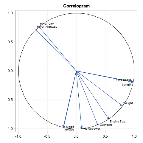
Tag: Data Analysis

Rick Wicklin 0
Error distributions and exponential regression models

Last week I discussed ordinary least squares (OLS) regression models and showed how to illustrate the assumptions about the conditional distribution of the response variable. For a single continuous explanatory variable, the illustration is a scatter plot with a regression line and several normal probability distributions along the line. The

Rick Wicklin 0
She wants to be an airborne ranger

I wanna be an airborne ranger, Live the life of guts and danger.* If you are an 80's movie buff, you might remember the scene in The Breakfast Club where Bender, the juvenile delinquent played by Judd Nelson, distracts the principal by running through the school singing this song. Recently,

Rick Wicklin 0
Correlations between groups of variables

Typically a correlation analysis reports the correlations between all pairs of variables, including the variables with themselves. The resulting correlation matrix is square, symmetric, and has 1s on the main diagonal. But suppose you are interested in only specific combinations of variables. Perhaps you want the pairwise correlations between one

Rick Wicklin 0
Regression coefficient plots in SAS

Last week's post about odds ratio plots in SAS made me think about a similar plot that visualizes the parameter estimates for a regression analysis. The so-called regression coefficient plot is a scatter plot of the estimates for each effect in the model, with lines that indicate the width of

Rick Wicklin 0
Wealth and winning in NC high school athletics

The Raleigh News & Observer published a front-page article about the effect of wealth and poverty on high school athletics in North Carolina. In particular, the article concluded that "high schools with a high percentage of poor students rarely win titles in the so-called country club sports—tennis, golf and swimming—and

Rick Wicklin 0
The relationship between toothlessness and income

My colleague Robert Allison finds the most interesting data sets to visualize! Yesterday he posted a visualization of toothless seniors in the US. More precisely, he created graphs that show the estimated prevalence of adults (65 years or older) who have had all their natural teeth extracted. The dental profession

Rick Wicklin 0
How to Winsorize data in SAS

Recently a SAS customer asked how to Winsorize data in SAS. Winsorization is best known as a way to construct robust univariate statistics. The Winsorized mean is a robust estimate of location. The Winsorized mean is similar to the trimmed mean, and both are described in the documentation for PROC

Rick Wicklin 0
The spiral of splatter

"Daddy, help! Help me! Come quick!" I heard my daughter's screams from the upstairs bathroom and bounded up the stairs two at a time. Was she hurt? Bleeding? Was the toilet overflowing? When I arrived in the doorway, she pointed at the wall and at the floor. The wall was

Rick Wicklin 0
Popular posts from The DO Loop in 2014

I published 118 blog posts in 2014. This article presents my most popular posts from 2014 and late 2013. 2014 will always be a special year for me because it was the year that the SAS University Edition was launched. The University Edition means that SAS/IML is available to all

Rick Wicklin 0
Resampling and permutation tests in SAS

My colleagues at the SAS & R blog recently posted an example of how to program a permutation test in SAS and R. Their SAS implementation used Base SAS and was "relatively cumbersome" (their words) when compared with the R code. In today's post I implement the permutation test in

Rick Wicklin 0
Does this kurtosis make my tail look fat?

What is kurtosis? What does negative or positive kurtosis mean, and why should you care? How do you compute kurtosis in SAS software? It is not clear from the definition of kurtosis what (if anything) kurtosis tells us about the shape of a distribution, or why kurtosis is relevant to

Rick Wicklin 0
Create discrete heat maps in SAS/IML

In a previous article I introduced the HEATMAPCONT subroutine in SAS/IML 13.1, which makes it easy to visualize matrices by using heat maps with continuous color ramps. This article introduces a companion subroutine. The HEATMAPDISC subroutine, which also requires SAS/IML 13.1, is designed to visualize matrices that have a small

Rick Wicklin 0
The frequency of bigrams in an English corpus

In last week's article about the distribution of letters in an English corpus, I presented research results by Peter Norvig who used Google's digitized library and tabulated the frequency of each letter. Norvig also tabulated the frequency of bigrams, which are pairs of letters that appear consecutively within a word.

Rick Wicklin 0
Designing a quantile bin plot

While at JSM 2014 in Boston, a statistician asked me whether it was possible to create a "customized bin plot" in SAS. When I asked for more information, she told me that she has a large data set. She wants to visualize the data, but a scatter plot is not

Rick Wicklin 0
Skew this

The skewness of a distribution indicates whether a distribution is symmetric or not. A distribution that is symmetric about its mean has zero skewness. In contrast, if the right tail of a unimodal distribution has more mass than the left tail, then the distribution is said to be "right skewed"