All Posts

Have you ever wanted to see examples of all of the output styles that SAS provides? You can run a program and look at the resulting file, styles.html. This post explains more about the styles that you will see including a discussion of attribute priority.


Get ready to have your mind blown. Whether or not you plan to attend Analytics Experience in San Diego on September 17, you'll be inspired by the speakers we have lined up to keynote the event. There's an inventor. A data scientist. A world class athlete. And a photographer. They've


Avoid frustrations by following these 5 tips from David Loshin to create a successful data management strategy for analytics.

Visualization of data density estimation, which is often used in statistical analysis and machine learning, will show the data’s characteristics like distribution, skewness and modality, etc. Commonly-used data density visualizations include boxplot, histogram, kernel density estimates, and some other plots. This blog post visualizes the kernel density estimates superimposing on histogram using SAS Visual Analytics.

When I'm at a social gathering, someone always asks what type of work I do. I like to keep my social life separate from my work, therefore I usually give a vague answer such as "software" (and quickly change the topic). How vague or specific is your response? How vague


Con los años, y debido a la amplia oferta de ciertos productos y servicios, el reto de llegar a nuevos clientes y fidelizar a los actuales ha crecido. Esto ha llevado a las empresas a buscar diferentes tecnologías que les permitan saber más de sus clientes. Dicha adopción, en la


Desde que me mudé a media cuadra de una estación de servicios, descubrí que una tienda 24hs de autoservicio se convirtió en mi kiosko, mi almacén, mi oficina, mi cafetería, mi restaurante, ¡y hasta mi farmacia a veces! Basta con pasar por la puerta, para que la cajera me salude


In SAS Viya 3.4, promotion support has been added for many additional SAS 9.4 resources, making it easier to make the leap to Viya. In this blog, SAS' Gerry Nelson reviews this new functionality.
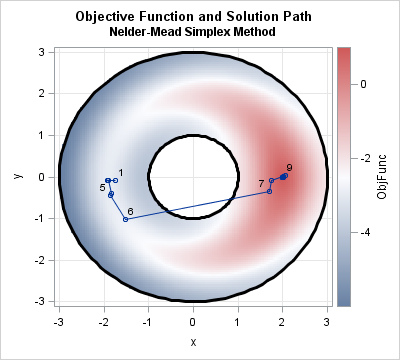

This article shows how to perform an optimization in SAS when the parameters are restricted by nonlinear constraints. In particular, it solves an optimization problem where the parameters are constrained to lie in the annular region between two circles. The end of the article shows the path of partial solutions


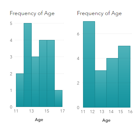
그래프를 만들 때 가장 어려운 작업은 무엇일까요? 바로 데이터를 준비하는 것인데요. 오늘은 엑셀 데이터를 SAS로 가져오고, 전치하고, 첫 열의 값을 데이터 값으로 사용하고, 플롯으로 요약하는 방법을 차례대로 소개해드리고자 합니다. 오늘 예시에서는 학생 대출 채무에 관한 데이터가 사용되는데요. 몇 년 전, 학생 대출 채무가 급증하면서 큰 이슈가 됐었고, 아래는 관련 기사에서 쓰인


Como es conocido, la analítica le suma valor a las estrategias de un negocio, pues se convierte en una solución fundamental para, entre muchas cosas, predecir situaciones y crear modelos que contribuyan a establecer acciones no solo para mantener la rentabilidad. Esta visualización de datos es una sabia inversión para


Even though I’ve worked at SAS for nearly 30 years, I still get excited when great things come together for our customers! This year we are hosting the very first hackathon at our Analytics Experience conference in San Diego - the AnalyticsX Hackathon. Analytics Experience is in its third year


I bet you were not expecting a photo of 22 youngsters in swimsuits in a math blog, were you? The first time I heard about this reality TV show called "Are You The One?", my nerdiness and love for OR yelled at me: "There is so much math in this


Data in the cloud makes it easily accessible, and can help businesses run more smoothly. SAS Viya runs its calculations on Cloud Analytics Service (CAS). David Shannon of Amadeus Software spoke at SAS Global Forum 2018 on his paper, Come On, Baby, Light my SAS Viya: Programming for CAS.


In the oil industry you can make or lose money based on how good your forecasts are, so I’ve pulled together six papers that discuss different ways in which you can leverage analytics to optimize your output and more accurately predict your production performance. Written by employees at oil and