All Posts


In this blog and in the book Statistical Programming with SAS/IML Software, I present tips and techniques for writing efficient SAS/IML programs for data analysis, simulation, matrix computations, and other topics of interest to statistical programmers. When I was writing my book, one of the reviewers commented that he wasn’t
How can you change a programming trick into a programming treat? Try this algorithm: If you develop a clever snippet of code, squirrel it away. This snippet is a "trick." If you use the trick a second time, copy and modify the code. The trick has become a "treat." If


Are you up to date on your hotfixes for SAS Enterprise Guide 4.1? If you're not certain of the answer, you'll find out next week when you might see this message appear: This version of SAS Enterprise Guide will expire on December 1st, 2010. If you've applied any SAS Enterprise
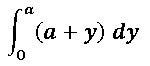
The SAS/IML language provides the QUAD function for evaluating one-dimensional integrals. You can also use the QUAD function to compute a double integral as an iterated integral. A One-Dimensional Integration Suppose you want to evaluate the following integral: To evaluate this integral in the SAS/IML language: Define a function module


One of the primary goals of this blog is to establish our contributors and by extension, SAS, as thought leaders in a variety of state & local government areas. It’s also a goal of the upcoming SAS Government Insights publication, which includes a thoughtful opinion piece about what it means
We've just pushed out the localized versions of the Getting Started with SAS Enterprise Guide 4.3 tutorial. This is the tutorial that you'll see when you select Help->Getting Started Tutorial from within SAS Enterprise Guide. Here is a list of the supported languages, and links to the tutorial content: English
I was recently asked how to create a tridiagonal matrix in SAS/IML software. For example, how can you easily specify the following symmetric tridiagonal matrix without typing all of the zeros? proc iml; m = {1 6 0 0 0, 6 2 7 0 0, 0 7 3 8 0,

The question came up on the SAS Enterprise Guide discussion forum: which do you prefer, List Report Wizard (PROC REPORT) or Summary Tables (PROC TABULATE)? And as with most SAS-related questions, the proper response is: "it depends." If you put these two PROCs in the ring with a Google Fight,
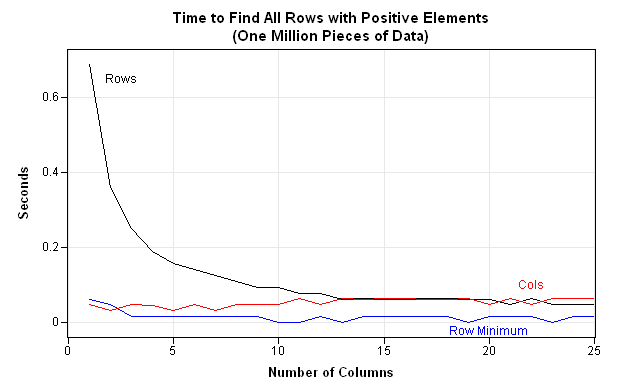
In a previous post, I discussed how to use the LOC function to eliminate loops over observations. Dale McLerran chimed in to remind me that another way to improve efficiency is to use subscript reduction operators. I ended my previous post by issuing a challenge: can you write an efficient
Today is World Statistics Day, an event set up to "highlight the role of official statistics and the many achievements of the national statistical system." I want to commemorate World Statistics Day by celebrating the role of the US government in data collection and dissemination. Data analysis begins with data.

Today SAS joins thousands of others across the globe to celebrate the first World Statistics Day, proclaimed by the United Nations as a way to “help strengthen the awareness and trust of the public in official statistics.” More than 85 government agencies in nearly 70 different countries around the world
The IMLPlus language has been available to SAS customers since 2002, but there are still many people who have never heard of it. What is IMLPlus? The documentation SAS/IML Studio for SAS/STAT Users says this about IMLPlus: The programming language in SAS/IML Studio, which is called IMLPlus, is an enhanced

Have you ever been stuck while trying to solve a scrambled-word puzzle? You stare and stare at the letters, but no word reveals itself? You are stumped. Stymied. I hope you didn't get stumped on the word puzzle I posted as an anniversary present for my wife. She breezed through

A few people asked me to explain the significance of the cartoon in the scrambled-word puzzle that I posted as an anniversary present for my wife. The cartoon refers to a famous experiment devised by Sir Ronald A. Fisher.
In a previous post, I discussed how to generate random permutations of N elements. But what if you want to systematically iterate through a list of ALL permutations of N elements? In the SAS DATA step you can use the ALLPERM subroutine in the SAS DATA step. For example, the