Back in SAS 9.3M2 (SAS/STAT 12.1), PROC FREQ introduced mosaic plots to visualize the joint frequencies in a contingency table. By default, the cells in a mosaic plot are colored according to levels of one of the categorical variables in the analysis. However, in 2013 I showed how you can use the output from PROC FREQ and the MOSAICPARM statement in the Graph Template Language (GTL) to color the cells by a statistic such as the standardized residuals in the chi-square model for independence.
I only recently learned that PROC FREQ in SAS/STAT 13.1 introduced built-in support for coloring cells in a mosaic plot. In other words, you can now automatically generate the graph that once required using GTL. For example, in my previous article, I wrote a program that orders the levels of the blood pressure and weight categories in the Sashelp.Heart data set. The following call to PROC FREQ creates a mosaic plot of the data in that program and specifies the COLORSTAT=STDRES suboption. Whereas the cell sizes are proportional to the frequency of the joint levels, the colors indicate the magnitude of the standardized residuals in a model that assumes independence between the two variables:
proc freq data=heart; tables BP_Cat*Weight_Cat / norow cellchi2 expected stdres crosslist missing plots=MosaicPlot(colorstat=StdRes); run; |
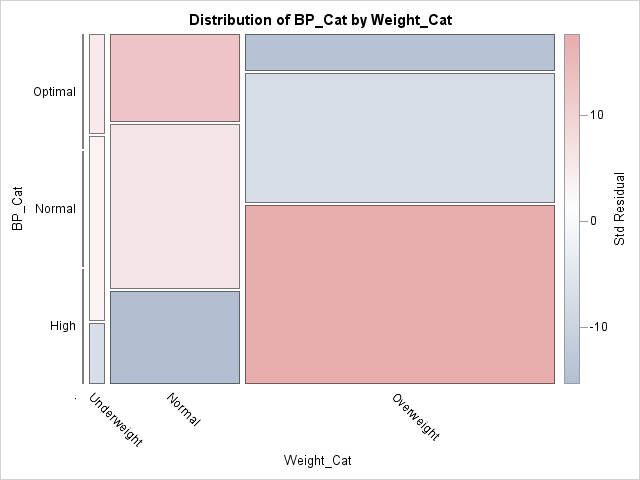
The mosaic plot visualizes the patterns of association between the weights of patients (categorized into underweight, normal, and overweight) and their blood pressure (categorized into optimal, normal, and high ranges). The size of the cells indicates that most patients in the study are overweight and about 35% are both overweight and have high blood pressure. The red colors indicate pairs of characteristics that occur more often in the data than would be expected if these measurements were independent. The blue colors indicate conditions that appear less often than would be expected. In particular:
- There are more overweight people with high blood pressure than would be expected under independence.
- There are fewer overweight people with optimal blood pressure than would be expected.
- There are more normal-weight patients with optimal blood pressure than would be expected.
- There are fewer normal-weight patients with high blood pressure than would be expected.
The mosaic plot indicates why the chi-square test for independence rejects the null hypothesis of independence and shows which categories of weight and blood pressure are strongly associated with each other. When you use the PLOTS=MOSAICPLOT(COLORSTAT=STDRES) option on the TABLES statement, PROC FREQ creates a mosaic plot that visualizes a chi-square test for independence.
