One of the most popular graph amongst clinical and pharmaceutical users is the Survival Plot as created from the LIFETEST Procedure. This is one graph that users most often want to customize. See Creating and Customizing the Kaplan-Meier Survival Plot in PROC LIFETEST - Warren F. Kuhfeld and Ying So, SAS Institute
Search Results: sgplot (969)
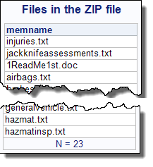
Need to read or update a ZIP file within your SAS program? In SAS 9.4, you can use the FILENAME ZIP access method to do the job. Explanation and examples here!
Users have often expressed the need for more marker symbols. ODS Graphics supports over 30 scalable marker symbols, both filled and empty. As mentioned in an earlier article, with SAS 9.4, filled markers can now have outlines and fills, and can also have special effects. Also with SAS 9.4, now you
A large variety of graphs fall in the category of what I call a "Single-Cell" graph. This type of graph consists of a single data region along with titles, footnotes, legends and other ancillary objects. Legends and text entries can be included in the data area. The data itself is displayed

In 2013 I published 110 blog posts. Some of these articles were more popular than others, often because they were linked to from a SAS newsletter such as the SAS Statistics and Operations Research News. In no particular order, here are some of my most popular posts from 2013, organized
Recently a user new to GTL and SG procedures asked how to create a Bland-Altman graph on the SAS Communities site. He included an image of the resulting graph to indicate what he wanted, I described to him how that graph can be created, but since he is new to the art
The SAS 9.4 Maintenance 1 release is now shipping to users. This is great news for GTL and SG procedures users as this release includes some useful new features. Some of these are in direct response to your requests, and others are enhancements that we think you will come to like.
Often we have situations where the category values on the graph have long character strings. This is often the case when graphing survey responses to questions. The questions may be sentences, sometimes moderately long. With SAS 9.4, GTL and SG now support the ability to display tick values split over
Creating a Bar Chart with a table of statistical data aligned with the bars is a popular topic. With SAS 9.4, creating such graphs gets easier with the new AXISTABLE statement in GTL and SG procedures. But some use cases can flummox the latest gizmos. Such is the case I ran into recently. Here
Last week I covered some of the interesting graph-related papers presented at WUSS. There were quite a few, so I broke up the report into two parts. Here is the second installment. In the paper Creating Graphical Patient Profiles using SAS by William Garner of Gilead Sciences, the author describes how to create
It is always a pleasure to attend SAS user conferences, regional conferences and in-house events. In addition to presenting papers, seminars and super demos to the attendees myself, my favorite activity is to attend presentations by users that include graphical data visualization. These include using SG procedures, GTL, Designer or SAS/GRAPH. This year
In recent conversations with many SAS users at NESUG, SESUG and WUSS, a pattern emerges on the question of creating graphs with SAS or R. Many SAS users are aware of the new graph features in SAS that create high quality graphs with minimum fuss. But, many have not actually used
In reference to a previous article on Violin Plots, a reader asked about creating comparative mirrored histograms to compare propensity scores. While I had my own understanding of "Mirrored Histograms", I also looked this up on the web. Google showed many cases of two histograms back to back, either horizontally or vertically.
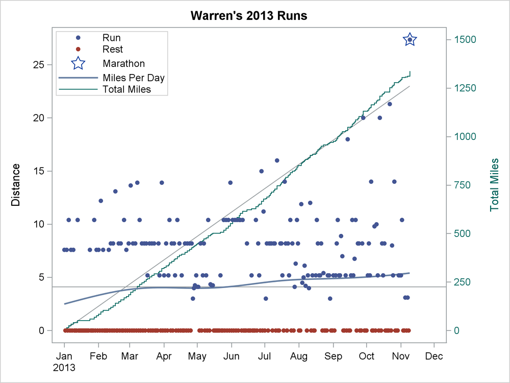
I decided this year to get serious about my running. I started recording my distance for every run. I made a SAS data set and generated simple reports. After a few weeks, I set a goal of averaging one marathon a week (3.8 miles per day, 26.2 miles per week,
Working at SAS, I consider myself fortunate to have the best employee benefits in the industry. That is one of the factors placing SAS as one of the best companies to work for worldwide, and often THE best company to work for in USA. Given that, I was curious to know the kind
A couple of weeks back I described q way to create a Schedule Chart using the SGPLOT procedure. In that case, I used the HIGHLOW plot to draw bar segments, both for a single and grouped case. A natural extension is to create one with links between each segment. So,
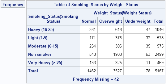
If you've ever tried to use PROC FREQ to create a frequency table of two character variables, you know that by default the categories for each variable are displayed in alphabetical order. A different order is sometimes more useful. For example, consider the following two-way table for the smoking status
Last week Bruno asked about creating a Schedule Chart using SG Procedures. To me, such projects are very interesting and challenging...How much mileage can we get out of the current set of SGPLOT procedure features to create a visual that was not part of the original requirements? The clear choice for
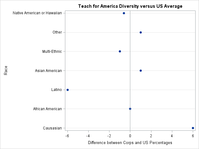
On Kaiser Fung's Junk Charts blog, he showed a bar chart that was "published by Teach for America, touting its diversity." Kaiser objected to the chart because the bar lengths did not accurately depict the proportions of the Teach for America corps members. The chart bothers me for another reason:
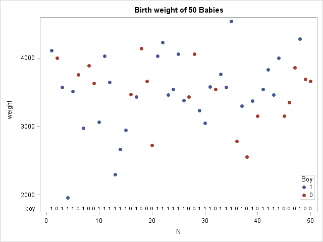
In my last blog post I described how to implement a "runs test" in the SAS/IML language. The runs test determines whether a sequence of two values (for example, heads and tails) is likely to have been generated by random chance. This article describes two applications of the runs test.

This is the last post in my recent series of articles on computing contours in SAS. Last month a SAS customer asked how to compute the contours of the bivariate normal cumulative distribution function (CDF). Answering that question in a single blog post would have resulted in a long article,
A couple of weeks back we had a question on how to make a bar chart with stacked and clustered groups. User also wanted to display the value for each stacked segment below the bars. The article Bar Charts with Stacked and Cluster Groups shows how to create such a
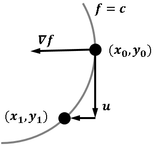
Like many other computer packages, SAS can produce a contour plot that shows the level sets of a function of two variables. For example, I've previously written blogs that use contour plots to visualize the bivariate normal density function and to visualize the cumulative normal distribution function. However, sometimes you
Recently, SAS released SAS Solutions OnDemand for academics. An academic user who is signed up for this can use the SAS Web Editor application to do all their data analysis over the web using a hosted server at SAS. This frees up the user from having to install the software on their own computers,
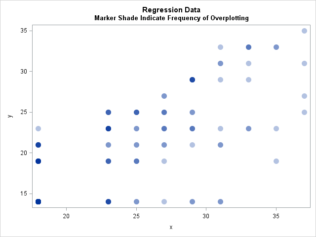
This week I read an interesting blog post that led to a discussion about specifying the frequencies of observations in a regression model. In SAS software, many of the analysis procedures contain a FREQ statement for specifying frequencies and a WEIGHT statement for specifying weights in a weighted regression. Theis
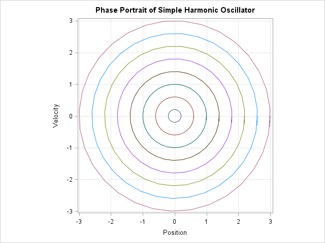
In a previous post, I showed how to solve differential equations in SAS by using the ODE subroutine in the SAS/IML language, which solves initial value problems. This article describes how to draw phase portraits for two classic differential equations: the equations of motion for the simple harmonic oscillator and
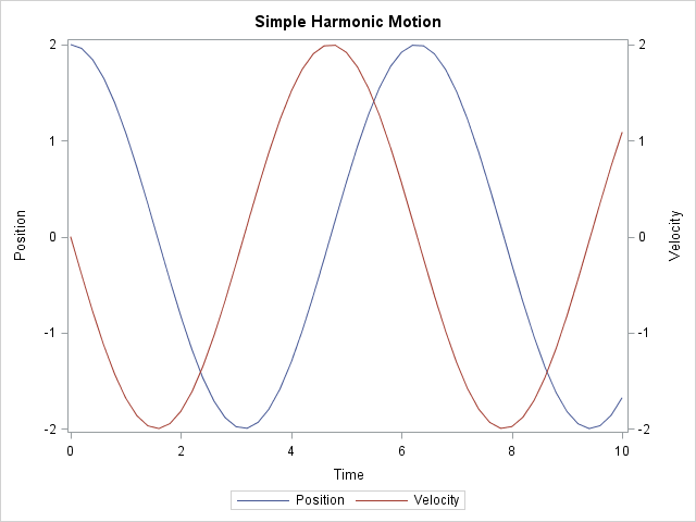
Differential equations arise in the modeling of many physical processes, including mechanical and chemical systems. You can solve systems of first-order ordinary differential equations (ODEs) by using the ODE subroutine in the SAS/IML language, which solves initial value problems. This article uses the equations of motion for the classic simple
Creating bar charts with group classification is very easy using the SG procedures. When using a group variable, the group values for each category are stacked by default. Using the sashelp.prdsale data set and default STAT of SUM, here is the graph and the code. SGPLOT code: proc sgplot data=sashelp.prdsale;
Recently my boss came across a graph where a time series plot was modified to include a "thickness" response. We wondered if this would be a good addition to the GTL / SG Series plot statement. What would the result look like, and what are the pros and cons? So, I took up
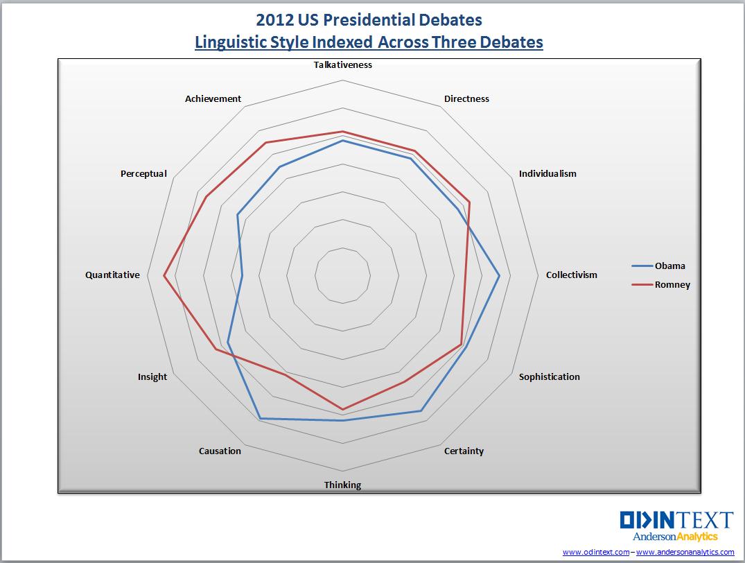
A common visualization is to compare characteristics of two groups. This article emphasizes two tips that will help make the comparison clear. First, consider graphing the differences between the groups. Second, in any plot that has a categorical axis, sort the categories by a meaningful quantity. This article is motivated


