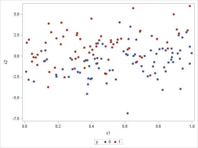
This post could be titled something like "Everything you wanted to know about Group Order in GTL - and more." The group ordering shows up in three different ways in your graph. Assignment of attributes (color, marker symbol) to group values. Position of group values in the graph. Display of the group
Search Results: sgplot (969)
![](https://blogs.sas.com/content/iml/files/2014/07/predellipse1.png)
It is common in statistical graphics to overlay a prediction ellipse on a scatter plot. This article describes two easy ways to overlay prediction ellipses on a scatter plot by using SAS software. It also describes how to overlay multiple prediction ellipses for subpopulations. What is a prediction ellipse? A
![](https://blogs.sas.com/content/iml/files/2014/07/logmodulus1.png)
In my four years of blogging, the post that has generated the most comments is "How to handle negative values in log transformations." Many people have written to describe data that contain negative values and to ask for advice about how to log-transform the data. Today I describe a transformation
![](https://blogs.sas.com/content/iml/files/2014/07/t_LogTransform-140x150.png)
In my previous blog post, I showed how to use log axes on a scatter plot in SAS to better visualize data that range over several orders of magnitude. Because the data contained counts (some of which were zero), I used a custom transformation x → log10(x+1) to visualize the
![](https://blogs.sas.com/content/iml/files/2014/07/LogAxis1.png)
If you are trying to visualize numerical data that range over several magnitudes, conventional wisdom says that a log transformation of the data can often result in a better visualization. This article shows several ways to create a scatter plot with logarithmic axes in SAS and discusses some of the
Spirals are cool. And useful. We use them every day without thinking about it. Every time the road turns from a straight line to a curve, we go through a transition spiral. Spirals allow us to change curvature in a steady increasing or decreasing fashion. Without a spiral, this
![](https://blogs.sas.com/content/iml/files/2014/06/ODSGraph1.png)
Last week I showed how to use the SUBMIT and ENDSUBMIT statements in the SAS/IML language to call the SGPLOT procedure to create ODS graphs of data that are in SAS/IML vectors and matrices. I also showed how to create a SAS/IML module that hides the details and enables you
The topic of VENN diagrams had come up a while ago. At that time, I thought it may be interesting to build a proportional VENN diagram. But, reading up on VENN Diagrams, I learned that VENN diagrams represent all intersections of N sets, regardless of whether there are actually any observations in one
By now you have heard all about the SAS(R) STUDIO software that provides access to the power of SAS analytics in a Web browser. The SAS(R) University Edition is also available free for higher education teaching, learning and research. This software includes ODS Graphics software for creating graphs. You can
![](https://blogs.sas.com/content/iml/files/2014/06/LogisticSim1.png)
In my book Simulating Data with SAS, I show how to use the SAS DATA step to simulate data from a logistic regression model. Recently there have been discussions on the SAS/IML Support Community about simulating logistic data by using the SAS/IML language. This article describes how to efficiently simulate
![](https://blogs.sas.com/content/iml/files/2014/06/makehistogram1.png)
As you develop a program in the SAS/IML language, it is often useful to create graphs to visualize intermediate results. The language supports basic statistical graphics such as bar charts, histograms, scatter plots, and so on. However, you can create more advanced graphics without leaving PROC IML by using the
At PharmaSUG 2014 in San Diego, I had the pleasure of attending "Swimmer Plot: Tell a Graphical Story of Your Time to Response Data Using PROC SGPLOT", by Stacey Phillips. In this paper, Stacey presented an interesting graph showing the effects of a study drug on patients' tumor size. Stacey
Recently, a user posed a question on how to plot stacked frequencies on a time axis. The data included frequencies of different viruses by week. The data is modified to preserve confidentiality and is shown below. The user's first instinct was to use a bar chart with stacked groups. This works for automatically computing frequencies
When teaching statistics, it is often useful to produce a normal density plot with shading under the curve. For example, consider a one-sided hypothesis test. An alpha value of .05 would correspond to a Z-score cutoff of 1.645. This means that 95% of a standard normal curve falls below a
It was almost two weeks ago that I got started making a display for lab tests for a subject, based on a graph I saw on the web for an article on this blog. This graph is a part of a larger panel display of the lab values for a
Just getting back from PharmaSUG 2014 in San Diego. The conference was great, both inside and outside. The organizers ordered up some great weather for the Padres game and also for dinner on the flight deck of the Midway Carrier. Our focus here being on graphics, we were all extremely gratified by the presentations in
![](https://blogs.sas.com/content/sgf/files/2014/02/ProblemSolvers.jpg)
Frequently you may want to modify the default colors, line patterns and symbols that are displayed on the graphics output produced by the Statistical Graphics, or SG procedures, and the Graph Template Language, GTL. Enhancements in SAS 9.4 have made that task much easier! In the examples below, we will look
SG Procedures and GTL provide you with a large set of plot statements, such as BarChart, ScatterPlot, BoxPlot and more. You can use them for the intended purpose, and all is well and good. However, the real fun starts when you leverage a plot to do something that was not
![](https://blogs.sas.com/content/iml/files/2014/04/t_RAMGB.png)
Dear Rick, I am trying to create a numerical matrix with 100,000 rows and columns in PROC IML. I get the following error: (execution) Unable to allocate sufficient memory. Can IML allocate a matrix of this size? What is wrong? Several times a month I see a variation of this
Often, the topic of an article is motivated by a question from a user. A satisfactory resolution of the situation is usually a good indication of a topic that may be of interest to other users. On such question was posed to me by a user this weekend. He wanted to display fit
![](https://blogs.sas.com/content/sasdummy/files/2014/04/codebar-150x90.png)
When you run a program or task in SAS Enterprise Guide, the application wraps your job in an "ODS sandwich", the colloquial term we use for the ODS statements necessary to create output that can be viewed in your project. That's convenient for exploring and refining your program, but at
When you hear of a Scatter Plot or a Series Plot, you have a picture in your mind what we are talking about. But one of the plot statements available in GTL, and soon with SGPLOT, is the BLOCK plot. I am sure this leaves many users scratching their heads, wondering
![](https://blogs.sas.com/content/iml/files/2014/04/stackedbar100.png)
I enjoy reading the Graphically Speaking blog because it teaches me a lot about ODS statistical graphics, especially features of the SGPLOT procedure and the Graph Template Language (GTL). Yesterday Sanjay blogged about how to construct a stacked bar chart of percentages so that each bar represents 100%. His chart
![SAS Statistics by Example](https://blogs.sas.com/content/sastraining/files/2014/03/Cody_booksrocks.jpg)
This week's SAS tip is from superstar author Ron Cody and his very popular book SAS Statistics by Example. Ron has been using SAS (and writing about SAS) for a long time. And he communicates his vast expertise in a friendly, easy-to-understand manner. If you've used any of Ron's books, I'm sure you'll agree. The following
![](https://blogs.sas.com/content/iml/files/2014/03/color3d1.png)
When I visualize three-dimensional data, I prefer to use interactive graphics. For example, I often use the rotating plot in SAS/IML Studio (shown at the left) to create a three-dimensional scatter plot. The interactive plot enables me to rotate the cloud of points and to use a pointer to select
Often we need to plot multiple response variables on Y axes by a common variable on X axis. When the response variables are very different in magnitudes or format, we prefer to plot the variables on separate Y (Left) and Y2 (Right) axes. Here is some sample data with three response
![](https://blogs.sas.com/content/iml/files/2014/02/smoother1.png)
My last blog post described three ways to add a smoothing spline to a scatter plot in SAS. I ended the post with a cautionary note: From a statistical point of view, the smoothing spline is less than ideal because the smoothing parameter must be chosen manually by the user.
![](https://blogs.sas.com/content/iml/files/2014/02/splinesm1.png)
Like many SAS programmers, I use the Statistical Graphics (SG) procedures to graph my data in SAS. To me, the SGPLOT and SGRENDER procedures are powerful, easy to use, and produce fabulous ODS graphics. I was therefore surprised when a SAS customer told me that he continues to use the
Browsing graphs on the web, this graph caught my eye: The Arctic Sea Ice Volume Graph. My interest is not so much in the debate on Climate Change or Global Warming. To me, this graph has some interesting features that can help show the benefits of plot layering to