This post could be titled something like "Everything you wanted to know about Group Order in GTL - and more." The group ordering shows up in three different ways in your graph.
- Assignment of attributes (color, marker symbol) to group values.
- Position of group values in the graph.
- Display of the group values in the legend.
Unique group values are assigned their visual attributes (color, marker symbol) from the GraphData1 - GraphDataN elements defined in the active style. Most SAS shipped styles like LISTING or HTMLBLUE have 12 group elements.
Starting with SAS 9.3M1, assignment of attributes to group values is based only on the order in which these group values are present in the data So, if the group value "B" is encountered first in the data, it gets the attributes from GraphData1 style element, and so on. This happens even if an observation cannot actually be drawn in the graph due to other other reasons. Also, missing group values get the "GraphMissing" element, and do not impact assignment of the other non-missing values.
I have created all graphs for this article using the GTL code shown below to keep the discussion simple. The SGPLOT procedure uses the SAS summary object to compute some statistics under the covers. This can change the order of the data received by the graph renderer. Here is the GTL program.
proc template; define statgraph bar; dynamic _resp _footnote _order; begingraph; entrytitle 'Mileage by Origin and Type'; entryfootnote halign=left "Data Set = " _footnote; layout overlay / xaxisopts=(display=(tickvalues)); barchart category=Origin response=_resp / group=Type groupdisplay=cluster stat=mean outlineattrs=graphdatadefault name='a' ; discretelegend 'a' / sortorder=_order; endlayout; endgraph; end; run; |
Note, _resp, _footnote and _order are dynamics so we can use the same GTL template to produce all the graphs in this article. These dynamics are set in the SGRENDER procedure. If a dynamic value for an option is not set, that option is ignored.
The template itself uses the following:
- A BARCHART statement, with Category, Response and Group options, using cluster groups and stat=mean.
- A DiscreteLegend, with the sort option.
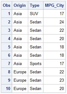 In the full data set (minus Hybrids), the first group value is SUV, but the first group value for the category Europe is Sedan. We use this data set to create the graph using the SGRENDER step shown below.
proc sgrender data=cars template=bar;
dynamic _resp="mpg_city"
_footnote="sashelp.cars";
run;
The graph is shown below. The group colors are assigned in the order the unique group values are encountered in the data. "SUV" is the first value for TYPE in the data set, and hence gets GraphData1 as the style element, with the blue fill color. "Sedan" is the second group value, so gets GraphData2, with the red fill color. All of the group colors are displayed in the legend in the order they are encountered in the data. Click on the graph for a higher resolution image.
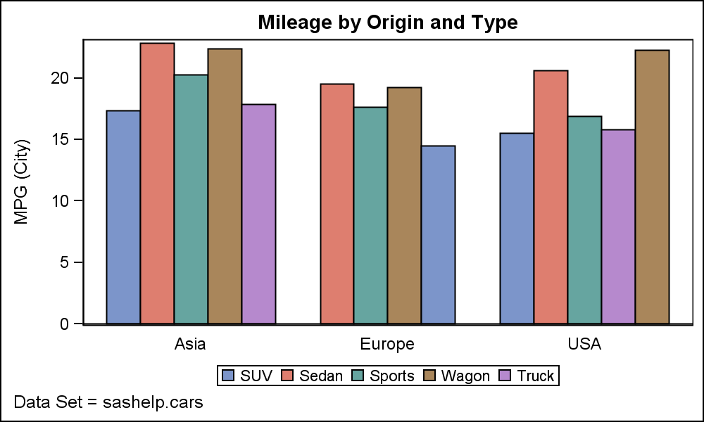 The order of displaying each group value within each category is unique to each category. So, for the category "Europe", Sedan is the first group value, and hence is displayed first. The color used for Sedan is consistent in the whole graph.
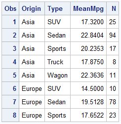
Now, instead of letting the GTL BarChart summarize the data, let us summarize the data ourselves. We will use the MEANS procedure to get the MeanMpg by Origin and Type as follows:
 proc means data=cars noprint;
class origin type;
var mpg_city;
output out=carmeans
mean=MeanMpg
n=N;
run;
Note, in the data shown above, the order of the type values has changed. Now the first type value for Europe is also SUV. This is different from the order of the original data.
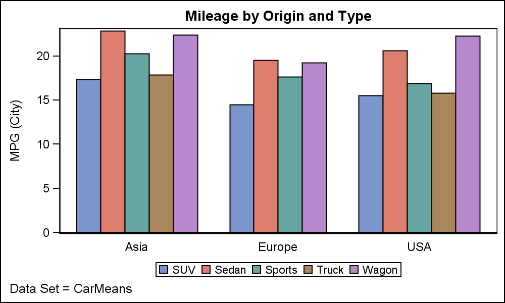
Now, we use this data to plot the MeanMpg by Origin and Type using the same template and the SGRENDER code below.
 proc sgrender data=carmeans template=bar;
dynamic _resp="meanMpg" _footnote="CarMeans";
run;
Note in the graph above, the order for assigning the group colors has now changed. Wagon and Truck have now swapped positions and colors. Also, the position of each type value within each category has changed. The colors are correct within the graph, but are no longer consistent with the first graph.
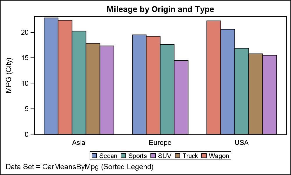 The purpose of this exercise was to order the group values within each category by descending value of the response. Since the order within each category is retained as was in the data, we can now sort the data however we want, and display the values in our custom order.
The graph above shows the car types by origin sorted by the mean mileage within each category. Now, since Sedan is first in the data, it gets the first color, and so on. But, every time you do this kind of a custom sort (say by car counts), the incoming data order changes, and so does the color assignment. How can we retain consistent group colors across all graphs?
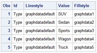 To ensure the colors are consistent we can use a Discrete Attr Map. Extract the original order of the group values using the MEANS procedure, and construct an attr map data set so that the colors are specified using the order. The attr map data set is shown on the right.
 The graph created using this attr map is shown on the right, with the legend entries sorted alphabetically. The colors of each type are exactly as the original graph, though the positions in the legend are now in alphabetical order.
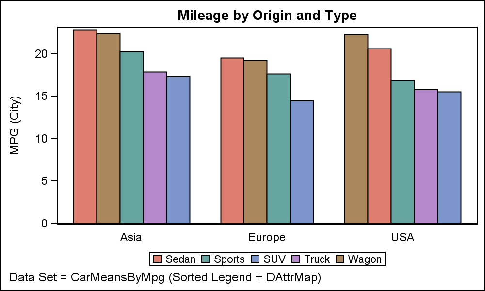
 If we are really picky, and want the colors assigned as per the original order AND get positions in the legend in the same data order, we have to play a little trick. Instead of building an attr map, we use the extracted the original order, and prepend those values into the sorted data, with missing values for the Origin column. See code in the attached program.
Remember, we said at the top of the article that colors are assigned based on the order of the group values, even if the observations cannot be drawn due to other reasons. So, prepending the unique group values in the order you want, with other missing values will do this trick. Now, the color values are assigned in the original data order (or, whatever order we want), and the observations are drawn in the order they are in rest of the data.
SAS 9.4 Code: Group_Order_94


2 Comments
Dear Sir, thanks a lot for sharing this codes, I am studying how to draw bar graph and your codes and explanations help me a lot. However, when I try to run your codes, the SAS log always says "WARNING: The barchart statement named 'a' will not be drawn because one or more of the required arguments were not supplied." and there is no bar chart output!! Could you help me point out the problem? Thank you very much!!
Yes, all the required variables should be in the data set else you will get that message.