Recently, a user posed a question on how to plot stacked frequencies on a time axis. The data included frequencies of different viruses by week. The data is modified to preserve confidentiality and is shown below.
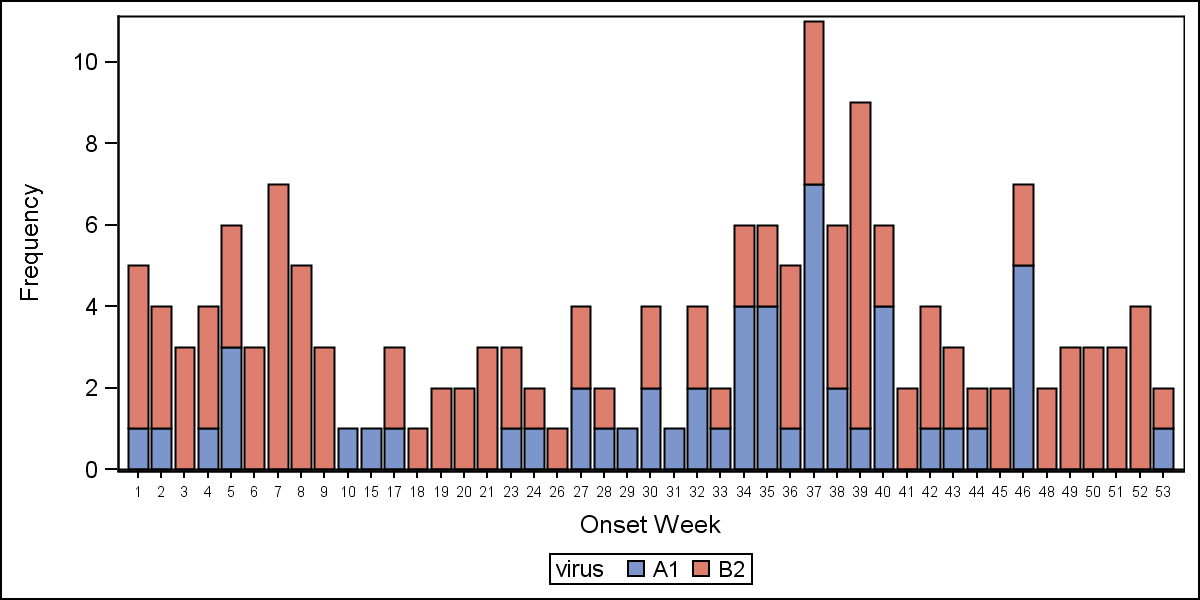
 The user's first instinct was to use a bar chart with stacked groups. This works for automatically computing frequencies by week and group and also stacked the group values. Except, the x axis is made discrete and the bars are only drawn where data exists. However, the user wants to see all weeks positioned correctly the x axis, with gaps where there is no data for some weeks. The data starts in April 2013 and goes to March 2014, so plotting by week displays the data out of order.
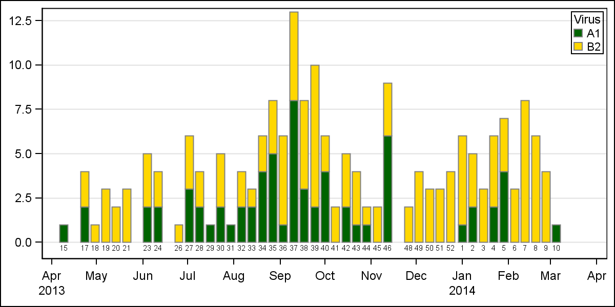
Here is the graph, created using the bar chart. The graph shows the frequencies for the two viruses by week, using stacked groups. The data for week numbers 1-14 are listed first even though these actually for 2014. The weeks are drawn as discrete values, and there are no gaps for weeks that are missing because the bar chart treats the Category axis as discrete. However, the VBAR statement makes it easy to see the stacked frequencies.
To get this kind of graph on a scaled time axis, one would need to use a Needle plot or a HighLow plot. However, neither of these will automatically compute the frequencies by date and group for a stacked display.
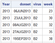
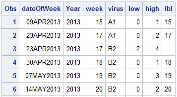 So, I used the MEANS procedure to compute the frequencies by week and virus. Then, I ran a data step by year and week to compute the low and high values for each virus in a given week. I also compute a "date" value for each week of the year. Here is the data set:
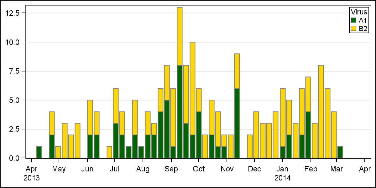
Now, I use the HighLow plot to draw the bar segments for each virus value by date. The low and high values for each group segment are already computed.
proc sgplot data=stacked dattrmap=attrmap; format week 2.; highlow x=dateOfWeek low=low high=high / group=virus name='a' type=bar lineattrs=graphdatadefault attrid=virus; yaxis display=(nolabel) offsetmin=0 grid; xaxis display=(nolabel); keylegend 'a' / title='Virus' location=inside position=topright across=1; run; |
As you can see, the SGPLOT code is very simple:
- We use a HighLow plot by dateOfWeek and GROUP=VIRUS.
- We used the previously defined discrete attributes map for each virus name.
- We set other details like legend and axis properties.
The user wanted to see the week values displayed, which can be easily done using the LOWLABEL option of the HighLow plot.
The full SAS code is snown below, however, I cannot share the data as it is confidential. You can see the structure of the data above and if you simulate similar data, you can run the code.
Full SAS 9.3 program (not including data): HighLow_Timeline


3 Comments
I have also run into this problem of time-series data with some missing periods. Like you, I had to run a data step to fill in the gaps with zeroes. We can't be the only ones: this must be a common requirement.
Could the next version default to filling the gaps for data formatted as date, time or datetime? What we probably want is not to "fill the gaps" but to use the axis as an interval scale rather than ordered categories.
Actually, I did not fill the gaps with zero. I ran proc MEANS and computed the frequencies by year, week and virus. Then, I plotted the data on an interval time axis using the HighLow plot, just like you have suggested. The x axis of the graph is a normal time axis.
Pingback: Epidemic Curve Graph - Graphically Speaking