This blog is a continuation of a previous blog that discussed creating simulated data sets. If you have not seen it, you might want to review it, especially if you are not familiar with the RAND function. The program that I'm going to show you simulates a drug study with
English
See how analytics fights back against ever-changing fraud trends.
Given a cloud of points in the plane, it can be useful to identify the convex hull of the points. The convex hull is the smallest convex set that contains the observations. For a finite set of points, it is a convex polygon that has some of the points as
I watched my husband practice or "play" tai chi for several years before I was willing to give it a go. "That's too slow for me," I thought. "I won't be able to do it". Tai chi, originally a martial art, provides me with joy and I'm so glad I
Canada is a geographically large country, but I've heard that much of the population lives in the small southernmost sections (near the US border). I decided to use my mapping skills, and put that to the test. Follow along, and we'll see what that looks like on a map ...
The Amazon rainforest is the largest rainforest on our planet. Nowhere else in the world can we find more animal and plant species. Unfortunately, we lose on average 800 square kilometres of forest every day to deforestation for logging, agriculture or road construction. But there is still hope for our
SAS' Cindy Wang uses SAS Visual Analytics to explore how people around the world spend their days.
Do you have a love/hate relationship with cruciferous vegetables? You love eating them, but your gut hates digesting them? Or you can’t stand the bitter flavor, but you would love to get the health benefits from eating them? Whether it’s your taste buds or your belly that has a crucifer
I was recently asked how to create a frequency polygon in SAS. A frequency polygon is an alternative to a histogram that shows similar information about the distribution of univariate data. It is the piecewise linear curve formed by connecting the midpoints of the tops of the bins. The graph
If you are thinking that nobody in their right mind would implement a Calculator API Service with a machine learning model, then yes, you’re probably right. But considering curiosity is in my DNA, it sometimes works this way and machine learning is fun. I have challenged myself to do it,
Analytics offers huge potential to transform raw data into operational intelligence. It provides new insights into old or new problems. This is crucial in business – but it is even more important for tackling big societal issues, such as domestic violence or human trafficking. I recently had the opportunity to
Multiple burglaries were reported over a three-week span in a specific area of Delaware. Delaware State Police used their institutional knowledge augmented by analytics and were able to bust the burglary ring after matching surveillance footage and public records to an address and photo description. In the past, the only option
The process changes that are taking place in the insurance world are massive. More and more insurance companies allow for remote sales of life products and entire sales processes have been simplified for the benefit of the customer. However, opportunities for abuse arose with them as well. A simpler process
[Editor's note: this post was co-authored by Marinela Profi and Wilbram Hazejager] Data science teams are multidisciplinary, each with different skills and technologies of choice. Some of them use SAS, others may have analytical assets already built in Python or R. Let's just say each team is unique. As part
"According to Gartner, “over 50% of senior marketing leaders are unimpressed with the results they receive from marketing analytics investments” – yet most companies expect to increase these investments over the next few years. How can we avoid throwing good money after bad?" By Oliver Sheerin, Senior Customer Intelligence Advisor, SAS. When
Recall that the binomial distribution is the distribution of the number of successes in a set of independent Bernoulli trials, each having the same probability of success. Most introductory statistics textbooks discuss the approximation of the binomial distribution by the normal distribution. The graph to the right shows that the
At SAS, we have a multidimensional culture that blends our different backgrounds, experiences, and perspectives from employees in nearly 60 countries around the world. Our mission is to infuse diversity, equity, and inclusion into everything we do. At SAS, we are focused on increasing the diversity of our own workforce at all
In my previous article, “The Vital Ingredients of Responsible AI,” I described the principles that underpin the need to develop AI systems that factor in the human factor, not only contribute to business outcomes but also protect individuals, society and the environment. While it’s difficult to argue with those principles,
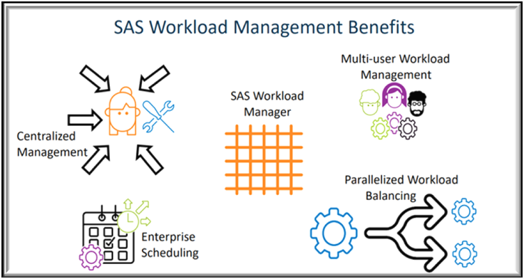
Think about what a modern implementation of SAS looks like for a customer. Programmers rely on robust environments to run the models and programs that answer business questions. These environments can be different for platforms like SAS® 9 and SAS® Viya®. They can be deployed across distributed servers, either on
A SAS programmer asked whether it is possible to add reference lines to the categorical axis of a bar chart. The answer is yes. You can use the VBAR statement, but I prefer to use the VBARBASIC (or VBARPARM) statement, which enables you to overlay a wide variety of graphs
In my previous article, “The Business Imperative for Responsible AI," I covered the main business drivers for responsible AI. Beyond the greater good and social responsibility, responsible AI is emerging as a key factor for successful AI adoption. In this article, I will describe the main ingredients of responsible AI:
“What’s our plan if we get hit by a big flood?” While this question may be plenty familiar to emergency management professionals, city administrators, legislators, and other leaders in coastal regions that are known for their exposure to potentially disastrous weather events, these days it’s being asked in some unexpected
Industries including sports and entertainment, travel, manufacturing, education and government benefit from analytical insights In the United States and other parts of the world, there are signs. Record automobile traffic. Surging demand for workers. And a continued push to vaccinate. The pandemic and its effects are still very much with
There are times when it is useful to simulate data. One of the reasons I use simulated data sets is to demonstrate statistical techniques such as multiple or logistic regression. By using SAS random functions and some DATA step logic, you can create variables that follow certain distributions or are
Some businesses overlook alternative data. That's probably a mistake.
In her book, Love More, Fight Less: A relationship workbook for couples, Certified relationship coach and author, Dr. Gina Senarighi recommends couples institute a weekly meeting: "Couples meet once a week to discuss schedules, finances, and shared resources as well as responsibilities and tasks. …Having regular check-ins helps keep any
A previous article discusses how to use SAS regression procedures to fit a two-parameter Weibull distribution in SAS. The article shows how to convert the regression output into the more familiar scale and shape parameters for the Weibull probability distribution, which are fit by using PROC UNIVARIATE. Although PROC UNIVARIATE
SAS Analytics Pro consists of three core elements of the SAS system: Base SAS®, SAS/GRAPH® and SAS/STAT®. The containerized deployment option adds the full selection of SAS/ACCESS engines making it even easier to work with data from virtually any source.
It has been my great pleasure writing this blog for the past 12 years, with over 370 posts. In doing so, I have enjoyed the support of my exceptional SAS managers over this time: From Anne Milley and Renee Nocker way back when it started, to Susan Kahler and David
With the 2020 Census numbers starting to come out, it's interesting to look at what states are gaining (or losing) people. In this example, I create a custom map similar to the ones the US Census Bureau likes to use, and plot the 10-year change in population. But before we