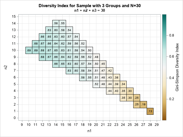
The modulo operation for large integers in SAS

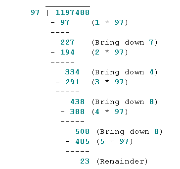
On social media, a SAS user reported that SAS could not compute the modulo of an extremely large integer. In SAS, the modulo operation is usually performed by using the MOD function, which computes the remainder of dividing an integer, N, by another integer, d. (In symbols, the remainder is