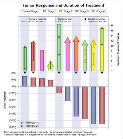
Tips and Tricks

Tips and Tricks

Data Visualization
Sanjay Matange 0
Overlay Bar Charts

A couple of days back, Rick Wicklin forwarded me a link to an article on the BadHessian Blog on creating a Bar Chart using six different freeware packages in R, Python and Julia.   The target bar chart was one produced by the Jetpack stat module with WordPress.  The graph is shown below. The unique feature of

Data Visualization
Sanjay Matange 0
Group order in GTL

This post could be titled something like "Everything you wanted to know about Group Order in GTL - and more."   The group ordering shows up in three different ways in your graph. Assignment of attributes (color, marker symbol) to group values. Position of group values in the graph. Display of the group

Data Visualization
Sanjay Matange 0
Spirals

Spirals are cool.  And useful.  We use them every day without thinking about it.  Every time the road turns from a straight line to a curve, we go through a transition spiral.  Spirals allow us to change curvature in a steady increasing or decreasing fashion.   Without a spiral, this

Data Visualization
Sanjay Matange 0
Proportional Euler Diagram

The topic of VENN diagrams had come up a while ago.  At that time, I thought it may be interesting to build a proportional VENN diagram.  But, reading up on VENN Diagrams, I learned that VENN diagrams represent all intersections of N sets, regardless of whether there are actually any observations in one

Data Visualization
Sanjay Matange 0
Swimmer plot

At PharmaSUG 2014 in San Diego, I had the pleasure of attending "Swimmer Plot: Tell a Graphical Story of Your Time to Response Data Using PROC SGPLOT", by Stacey Phillips.  In this paper, Stacey presented an interesting graph showing the effects of a study drug on patients' tumor size. Stacey

Data Visualization
Sanjay Matange 0
Grouped Timeline

Recently, a user posed a question on how to plot stacked frequencies on a time axis.  The data included frequencies of different viruses by week.  The data is modified to preserve confidentiality and is shown below. The user's first instinct was to use a bar chart with stacked groups.  This works for automatically computing frequencies

Data Visualization
Sanjay Matange 0
Report from PharmaSUG 2014

Just getting back from PharmaSUG 2014 in San Diego.  The conference was great, both inside and outside.  The organizers ordered up some great weather for the Padres game and also for dinner on the flight deck of the Midway Carrier. Our focus here being on graphics, we were all extremely gratified by the presentations in

Data Visualization
Sanjay Matange 0
The HIGHLOW Plot

SG Procedures and GTL provide you with a large set of plot statements, such as BarChart, ScatterPlot, BoxPlot and more.  You can use them for the intended purpose, and all is well and good.  However, the real fun starts when you leverage a plot to do something that was not

Data Visualization
Sanjay Matange 0
Multi-Group Series Plots

The series plot is a popular way to visualize response data over a continuous axis like date with a group variable like treatment.   Here is some data I made up of a response value by date, treatment, classification and company that makes the drug.  The data is simulated as shown in the attached program

Data Visualization
Sanjay Matange 0
Labeled curves

Often, the topic of an article is motivated by a question from a user.  A satisfactory resolution of the situation is usually a good indication of a topic that may be of interest to other users.  On such question was posed to me by a user this weekend.  He wanted to display fit

Data Visualization
Sanjay Matange 0
G100 with SGPLOT

The GCHART procedure has a popular option called G100 to display all the subgroups in % format such that all the subgroup values add up to 100% for each group.   Each subgroup is labeled with its own % values. SGPLOT procedure does not such an option, but with a little bit of

Data Visualization
Sanjay Matange 0
Axes Synchronization

Often we need to plot multiple response variables on Y axes by a common variable on X axis.  When the response variables are very different in magnitudes or format, we prefer to plot the variables on separate Y (Left) and Y2 (Right) axes. Here is some sample data with three response

Data Visualization
Sanjay Matange 0
Layered graphs

Browsing graphs on the web, this graph caught my eye:  The Arctic Sea Ice Volume Graph.   My interest is not so much in the debate on Climate Change or Global Warming.  To me, this graph has some interesting features that can help show the benefits of plot layering to

Data Visualization
Sanjay Matange 0
Sochi Medal Graphs

The attention of the world is now on Sochi and the Winter Games.  Gold, Silver and Bronze medals are being earned by these amazing athletes, and everyone has an eye on the tally.  Andre sent me a link to TRinker's R Blog, showing a graph of the current tally.  Andre

Data Visualization
Sanjay Matange 0
Survival Plot

One of the most popular graph amongst clinical and pharmaceutical users is the Survival Plot as created from the LIFETEST Procedure.  This is one graph that users most often want to customize.  See Creating and Customizing the Kaplan-Meier Survival Plot in PROC LIFETEST - Warren F. Kuhfeld and Ying So, SAS Institute

Data Visualization
Sanjay Matange 0
More symbols, you say?

Users have often expressed the need for more marker symbols.  ODS Graphics supports over  30 scalable marker symbols, both filled and empty.  As mentioned in an earlier article, with SAS 9.4, filled markers can now have outlines and fills, and can also have special effects. Also with SAS 9.4, now you

Data Visualization
Sanjay Matange 0
Two-in-one Graphs

A large variety of graphs fall in the category of what I call a "Single-Cell" graph.  This type of graph consists of a single data region along with titles, footnotes, legends and other ancillary objects.  Legends and text entries can be included in the data area.   The data itself is displayed

Data Visualization
Sanjay Matange 0
Broken Axis

In my previous post I described the new Polygon plot statement that is included with the SAS 9.4M1 release.   So, a valid question is - what is my motivation for discussing the new features in SAS 9.4M1 when most users are at SAS 9.3 or SAS 9.2 versions?  Here are a

Data Visualization
Sanjay Matange 0
New Polygon Plot

The SAS 9.4 Maintenance 1 release is now shipping to users. This is great news for GTL and SG procedures users as this release includes some useful new features. Some of these are in direct response to your requests, and others are enhancements that we think you will come to like.

Data Visualization
Sanjay Matange 0
Survey Charts

Often we have situations where the category values on the graph have long character strings.  This is often the case when graphing survey responses to questions.  The questions may be sentences, sometimes moderately long. With SAS 9.4, GTL and SG now support the ability to display tick values split over

Data Visualization
Sanjay Matange 0
Graphs at WUSS - Part 1

It is always a pleasure to attend SAS user conferences, regional conferences and in-house events.  In addition to presenting papers, seminars and super demos to the attendees myself, my favorite activity is to attend presentations by users that include graphical data visualization.  These include using SG procedures, GTL, Designer or SAS/GRAPH.  This year

Data Visualization
Sanjay Matange 0
R U Graphing with SAS?

In recent conversations with many SAS users at NESUG, SESUG and WUSS, a pattern emerges on the question of creating graphs with SAS or R.  Many SAS users are aware of the new graph features in SAS that create high quality graphs with minimum fuss.  But, many have not actually used

1 6 7 8 9 10 12

Back to Top