Following Sanjay's cue (see “R U Graphing with SAS”), I tried creating data driven multi-cell graphs using R. I played with the lattice and ggplot2 packages. I found ggplot2 simpler to understand and use than lattice, but there are probably some trades offs.
Data-driven layouts are referred to as 'faceting' in ggplot2. This package provides two faceting operators: facet_wrap and facet_grid, which roughly correspond to ODS Graphics' data panel and data lattice layouts, respectively.
Let us take the simple use-case of a graph with a categorical variable as the classifier. Here is a ggplot2 output of city MPG for SUVs classified by Origin using an sashelp.cars data set. (I imported the data in R from a CSV file exportedby SAS.)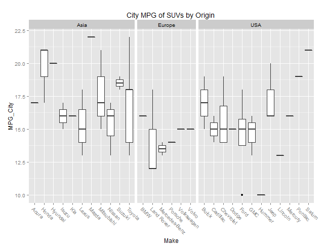
The code for the above graph, excluding the data import and subset , is shown below:
ggplot(data=sashelp.cars.suv) + geom_boxplot(aes(Make, MPG_City)) + facet_grid( ~ Origin, scales="free", space="free_x", shrink=T) + theme(axis.text.x=element_text(angle=-45, hjust=0)) + ggtitle("City MPG of SUVs by Origin ") |
For comparision, here is the output from the SGPANEL procedure:
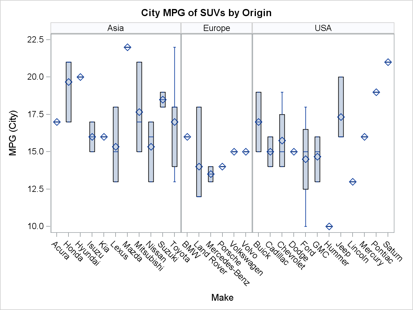
And here is the corresponding SAS 9.4 PROC SGPANEL code:
proc sgpanel data=sashelp.cars (where=(type='SUV')); title "City MPG of SUVs by Origin"; panelBy origin / rows=1 uniscale=row proportional; vbox mpg_city / category=make; run; |
As you can see there is a fair bit of correspondence between the two examples. ggplot2's space="free_x" gives you proportional width cells, just like SGPANEL panelBy's proportional option. SGPANEL manages tick value collisions with its tick value fit policies, whereas in ggplot2, I had to make some adjustments to the X axis tick values via the theme() to keep them legible.
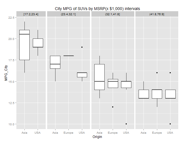
How about paneling by a numeric variable? ggpplot2 has two functions to ‘cut’ your numeric ranges into class values (or factors as they call them). cut_interval() categorizes a numeric variable into equal sized ranges, whereas cut_number() does it by equal observation counts.
Here is a ggplot2 facet_grid output after ‘cutting’ MSRP into four class values using cut_number():
The code snippet for this graph is as follows:
# Convert MSRP=$n,nnn to numeric MSRP2. sashelp.cars.suv$MSRP2 <- as.numeric(gsub('[\\$,]','', sashelp.cars.suv$MSRP)) # Scale MSRP2 by 1000 to keep the headers legible, sashelp.cars.suv$MSRP2 <- sashelp.cars.suv$MSRP2/1000; # Convert numeric MSRP2 to 4 class values. sashelp.cars.suv$cut <- cut_number(sashelp.cars.suv$MSRP2, n=4) # ggplot(data=sashelp.cars.suv) + geom_boxplot(aes(Origin, MPG_City)) + facet_grid( ~ cut, scales="free_x", space="free_x") + ggtitle("City MPG of SUVs by MSRP(x $1,000) intervals") |
In ODS Graphics, we do not have predefined ways to convert a numeric variable into a classifier. You need some data processing to get there. I used a quick and dirty version of equal count for illustrative purposes.
Here is an SGPANEL output using 4 classes of MSRP using equal observation counts:
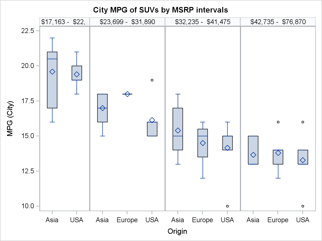
Here is the SAS 9.4 SGPANEL code snippet for the above output:
/* Data processing for equal count not shown */ proc sgpanel data=interval_bins; title "City MPG of SUVs by MSRP intervals"; panelBy binlabel / onePanel rows=1 uniscale=row noVarName proportional; vbox mpg_city / category=origin; run; |
For a better numeric variable ‘slicing’ treatment using SAS, please see Kincaid and Fuller’s SAS Global Forum 2012 paper “SG Techniques: Telling the Story Even Better!”.
In conclusion, the capabilities for data driven layouts from ggplot2 package are fairly well covered in ODS Graphics, although there are differences between the two systems.