All Posts


What if, 12 months ago, someone bet you that a technology was coming in the next year that would cause great excitement and great fear in all businesses, industries and geographies? Would you have taken that bet? Of course, now we know that the technology is generative AI. Popularized by


SAS is known for providing an excellent customer experience. To continue that trend, we are currently modernizing our customer portal. This new system is scheduled to be in place by the end of the third quarter. In this blog, we want to give you a brief overview of what to


SoDA를 이용해 쉽게 배우는 데이터 과학 #1 SoDA(SAS OnDemand for Academics)는 SAS가 무료로 제공하는 교육용 데이터 분석 소프트웨어 프로그램입니다. 앞으로 4회에 걸쳐 'SoDA 를 이용해 쉽게 배우는 데이터 과학'을 자세히 소개해 드리도록 하겠습니다. SoDA란? SoDA (SAS OnDemand for Academics; SoDA)는 데이터 과학을 처음 배우는 입문자들에게 SAS를 무료로 배울 수 있도록
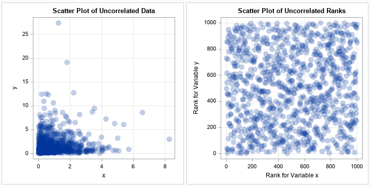

A previous article explains the Spearman rank correlation, which is a robust cousin to the more familiar Pearson correlation. I've also discussed why you might want to use rank correlation, and how to interpret the strength of a rank correlation. This article gives a short example that helps you to

Since the COVID-19 pandemic began, video presentations and webcasts have become a regular routine for many of us. On days that I will be using my webcam, I wear a solid-color shirt. If I don't plan to be on camera, I can wear a pinstripe Oxford shirt. Why the difference?

SAS, the world-renowned leader in analytics software and solutions, recently visited Tamkang University to share the groundbreaking applications of data science in finance and biomedical industries with the students. Consultant Shu-Wei shared his knowledge and experience in digital banking, Customer Relationship Management, and various SAS solutions for Anti-Money Laundering, Fraud


The analytics are mind boggling. But the story isn’t analytics. The designs will wow you. But the story isn’t design. The story, as it has been in each of the past 10 years, is that these amazing analytical designs sprang from the minds of students – North Carolina State University


As organizations embrace AI, they often handle large volumes of data that power AI systems. Handling data appropriately includes implementing adequate privacy policies and security measures to protect it. Doing so prevents accidental exposure and ensures ethical data use. AI technology often uses sensitive data for creating, training and utilizing models.


SAS expert Leonid Batkhan presents the %embed macro function as a way to embed both “foreign” and SAS native code from a file into a SAS program, preventing clutter in your code.


Did you know that over 300 people die daily from drug overdoses in the US? As a pharmacist, I have witnessed the harrowing effects of substance use disorder (SUD) and the resulting opioid crisis on individuals, families and communities. The complexity of addiction Who among us does not know someone


Welcome to the continuation of my series Getting Started with Python Integration to SAS Viya. In this post I'll discuss how to load multiple CSV files into memory as a single table using the loadTable action. Load and prepare data on the CAS server To start, we need to create multiple
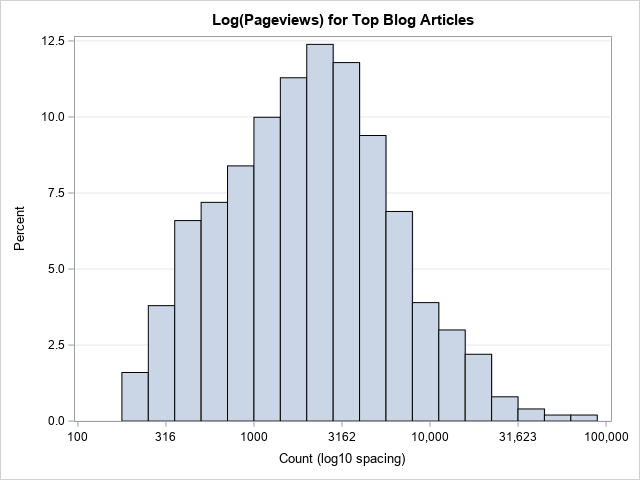
Real-world data often exhibits extreme skewness. It is not unusual to have data span many orders of magnitude. Classic examples are the distributions of incomes (impoverished and billionaires) and population sizes (small countries and populous nations). The readership of books and blog posts show a similar distribution, which is sometimes


La inteligencia artificial no es algo nuevo, ni siquiera reciente. Aunque sus orígenes se remontan al siglo XIX, el término "Inteligencia Artificial" se escuchó por primera vez en 1956 de boca de John McCarthy. Sin embargo, hasta ahora, y gracias a plataformas como ChatGPT, es que se escucha más. Con


A Fraude no setor bancário não é um tema recente, mas a pandemia e, mais tarde, a guerra tiveram impacto no setor, como aliás demonstra a quarta edição do relatório sobre a cibersegurança em Portugal do Centro Nacional de Cibersegurança (CNCS) "A mitigação progressiva da pandemia e o surgimento de uma


Vivimos en tiempos de un nuevo marketing. Ya no solo hay que vender productos y servicios, sino que hay que hacerlo de forma sostenible y responsable tanto con el entorno como con la empresa. Bajo esta orientación es que el marketing responsable e inteligente se ha convertido en una necesidad