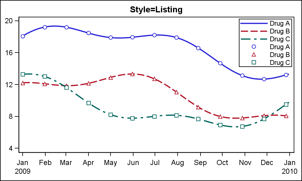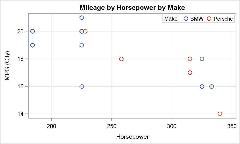
Fit Plot Customizations

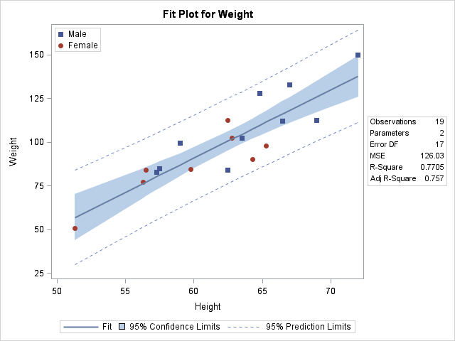
A customer wants to use PROC REG to fit a simple regression model but display in the fit plot markers that differentiate groups of individuals. Click on a graph to enlarge. Before we see how to do that, let's look at some simpler examples. The following step fits a linear