Back in late 2012 I discussed a technique for Conditional Highlighting, where additional attributes can be displayed in a graph.
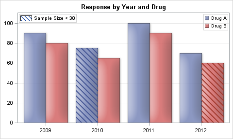 In the previous article the goal was to display a graph of Response by Year by Drug. We used a cluster grouped bar chart to create the bar chart. We also wanted to tag cases where the sample size was lower than a threshold, and we did that by adding a cross hatch pattern for such cases. Click on the graph for a higher resolution image.
So, the idea is that if the available features in a graph are already used up to show some data attributes, how can we add more features to the graph to display additional attributes. These attributes are added based on other conditions, and hence the term "Conditional Highlighting".
With SAS 9.4M1, additional features are supported in the SG Procedures to do more such things. Specifically, I am referring to the ability to create marker symbols from images and characters of a font. I discussed this in the article on Marker Symbols. Let us use this feature to add other attributes to a graph based on some conditions.
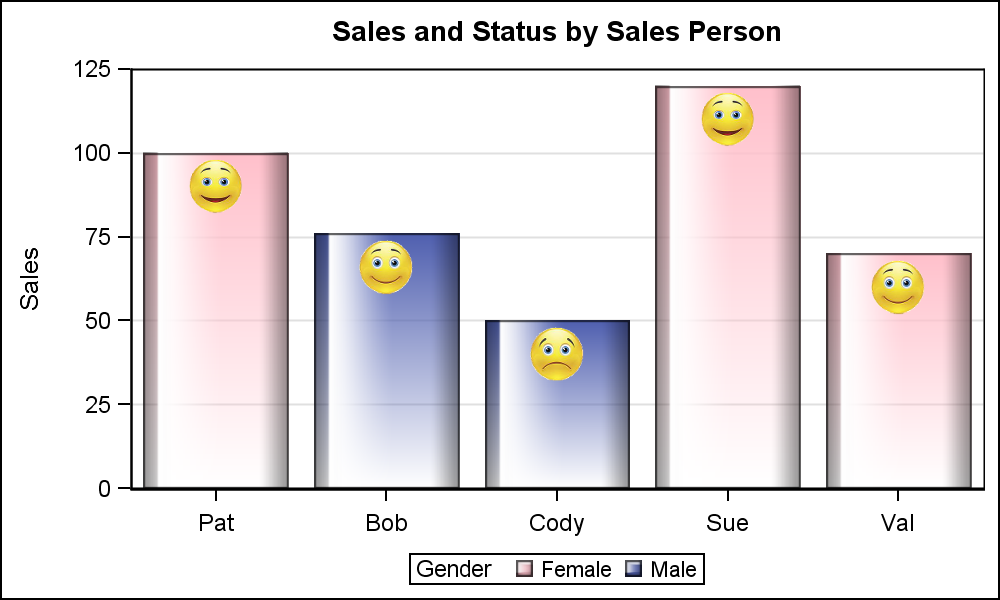 The graph on the right displays the Sales by Person, and also displays the gender of each sales person using a bar chart. We also want to display if the sales person is under, over or well over the projected performance. We have done that by adding an icon near the top of the bar. The icon has three versions, with sad or happy faces.
We have done this by layering a scatter plot on the bar chart. We used the VBarParm to display the bar chart as we have summarized data, and VBarParm allows layering with other basic plots. Here is the SAS9.4 code.
title 'Sales and Status by Sales Person'; proc sgplot data=sales; symbolimage name=bad image="C:\Work\Images\Conditional\Sad_Tran.png"; symbolimage name=good image="C:\Work\Images\Conditional\Happy_Tran.png"; symbolimage name=great image="C:\Work\Images\Conditional\VeryHappy_Tran.png"; styleattrs datasymbols=(great good bad) datacolors=(pink cx4f5faf); vbarparm category=name response=sales / group=gender dataskin=gloss filltype=gradient groupdisplay=cluster; scatter x=name y=ys / group=status markerattrs=(size=30); yaxis offsetmin=0 offsetmax=0 grid; xaxis display=(nolabel) offsetmin=0.1 offsetmax=0.1; run; |
To do this, we computed the "Status" based on the above condition. We defined three new symbols from the image files called "Sad_Tran.png", "Happy_Tran.png" and "VeryHappy_Tran.png" using the SymbolImage statement. These are transparent images. All image files are inherently rectangular in shape. However, the picture occupies only a part of the image, like the happy face. The pixels around that are black, or some other background color. We have used a image processing software to make these background pixels transparent, so when the image is drawn, these transparent pixels are not displayed.
We have used the StyleAttrs statement to define our list of group markers to include only these three new symbols only using the DataSymbols option.. We have also set the two colors we want for the "Male" and "Female" group value using the DataColors option. The StyleAttrs option allows you to define your own group attributes within the SG Procedure without having to define a new ODS Style.
We have also used the FillType=Gradient option to fill the bars with a gradient effect. I understand usage of such effects in the graph, often referred to as "Chart Junk" a term coined by Edward Tufte, is not preferred in many domains However, in some domains this can be useful.
 Now, let us take another step and add another conditional attribute to the graph as shown on the right to show you the possibilities of this approach. Here, we have added a "Blue Ribbon" for the salesperson with the highest sales. Note, the blue ribbon may be awarded based on other conditions.
I have done that by defining another symbol using the image "Blue_Ribbon_Tran.png". Note in this case, I have used Rotate=20 option to add some pizzazz to the visual. Actually, markers with a few different rotation angles can be used for classifier too.
Note, in this graph, the grid lines are not visible through the bottom part of the bars any more. FillType=Gradient uses a transparency gradient to fill the bars. This allows the grid lines to be visible through the bottom part of the bars, where the bars are more transparent. To prevent that, I have used another VBarParm with plain white color behind the one with gradient. This suppresses the bleeding of the grid lines. The full code is attached below.
Combining the ability to define your own symbols, along with the ability of layering plot statements together provides you with powerful ways to create all types of graphs. Conditional highlights can be many colored dot or swatches added to the the bars or any other element in the graph to convey more information to the reader.
Full SAS 9.4 Code: Conditional_Highlighting


1 Comment
Pingback: Category highlighting - Graphically Speaking