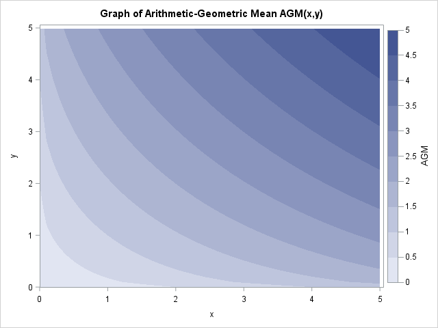
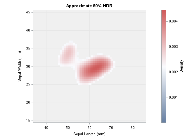
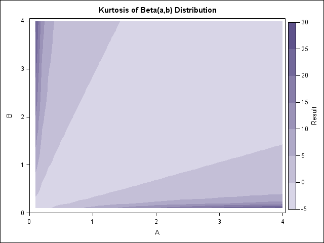
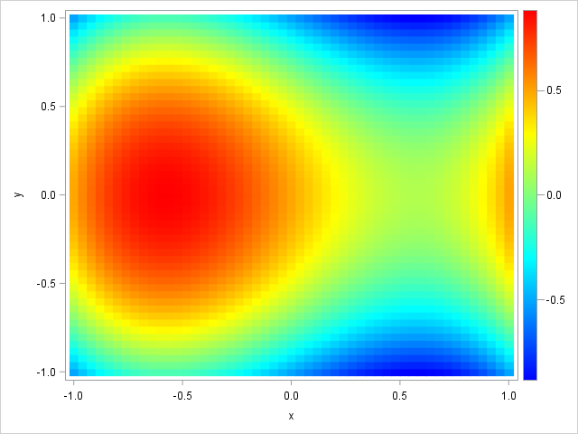
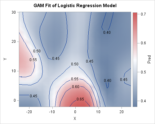
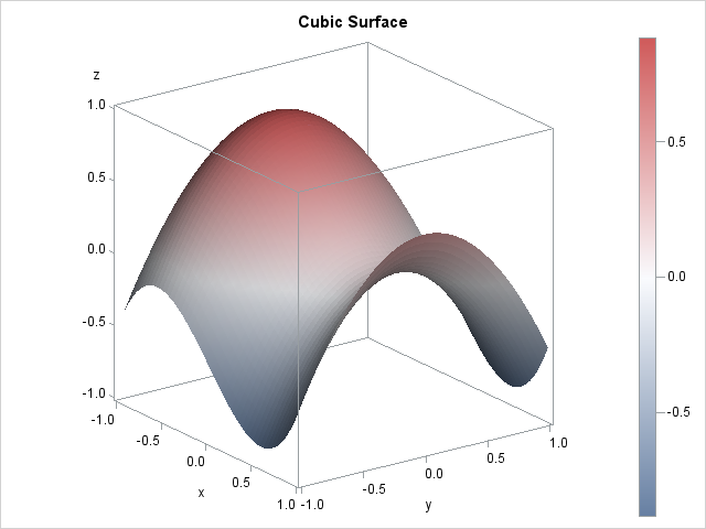
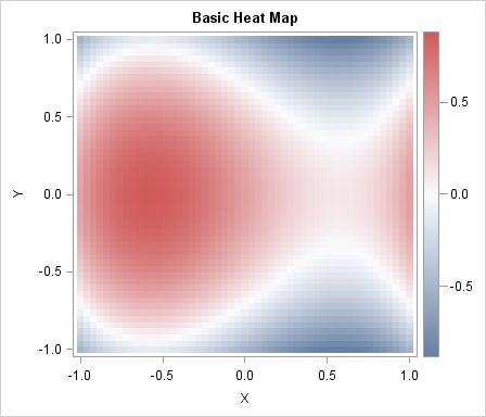
The SGPLOT procedure enables you to use the value of a response variable to color markers or areas in a graph. For example, you can use the COLORRESPONSE= option to define a variable whose values will be used to color markers in a scatter plot or cells in a heat
Search Results: contour (69)
Light lengthens the day and allows us more time to learn, socialize, contemplate and create. Exploring NASA nighttime satellite images shows how illumination patterns have changed over time. Increases and decreases in illumination show the effects of human civilization on earth. From population collapse and destruction in war zones to economic
이 기사는 SAS Korea가 번역 및 편집했으며 원래 Rick Wicklin이 썼습니다. 원문이 여기에 있습니다. 이번 블로그를 통해 ODS 템플릿을 효율적으로 수정할 수 있는 SAS 프로그래밍 기법, 일명 ‘커펠드 템플릿 수정 기법(Kuhfeld’s Template Modification Technique; TMT)’을 소개하고자 합니다. 다섯 단계만 거치면 20줄 미만의 SAS 코드만으로 이 기법을 구현할 수 있는데요. 방법은 간단하지만
This article demonstrates a SAS programming technique that I call Kuhfeld's template modification technique. The technique enables you to dynamically modify an ODS template and immediately call the modified template to produce a new graph or table. By following the five steps in this article, you can implement the technique
All statisticians are familiar with the classical arithmetic mean. Some statisticians are also familiar with the geometric mean. Whereas the arithmetic mean of n numbers is the sum divided by n, the geometric mean of n nonnegative numbers is the n_th root of the product of the numbers. The geometric
An important problem in machine learning is the "classification problem." In this supervised learning problem, you build a statistical model that predicts a set of categorical outcomes (responses) based on a set of input features (explanatory variables). You do this by training the model on data for which the outcomes
When building models, data scientists and statisticians often talk about penalty, regularization and shrinkage. What do these terms mean and why are they important? According to Wikipedia, regularization "refers to a process of introducing additional information in order to solve an ill-posed problem or to prevent overfitting. This information usually
Maximum likelihood estimation (MLE) is a powerful statistical technique that uses optimization techniques to fit parametric models. The technique finds the parameters that are "most likely" to have produced the observed data. SAS provides many tools for nonlinear optimization, so often the hardest part of maximum likelihood is writing down
How far away is the nearest hospital? How far is the nearest restaurant? The nearest gas station? These are commonly asked questions whose answers depend on the location of the person asking the question. Recently I showed an algorithm that enables you to find the distance between a set of
This past weekend, Hurricane Matthew came through the Carolinas. Some areas had record flooding, while other areas didn't. I was anxious to get back to work today, so I could use SAS software and create a custom map showing who got how much rain. But before we get to the official
It is easy to use PROC SGPLOT and BY-group processing to create an animated graph in SAS 9.4. Sanjay Matange previously discussed how to create an animated plot in SAS 9.4, but he used a macro loop to call PROC SGPLOT many times. It is often easier to use the
In a scatter plot, the regions where observations are packed tightly are areas of high density. A contour plot or heat map of a bivariate kernel density estimate (KDE) is one way to visualize regions of high density. A SAS customer asked whether it is possible to use SAS to
Were you the kid who sat there analyzing the amusement park map before entering the park, planning out how you could visit the most rides in the least amount of time? If so, then this blog's for you, my data analyst kindred spirit! And to get you in the mood,
With the Pokémon Go craze sweeping the world, techies and programmers are looking to apply their skills to gain an advantage over the average user. In this blog post, I show how to use some of SAS' geospatial analytics capabilities to capture a Pikachu. Let's say you know of a building that has
Graphs enable you to visualize how the predicted values for a regression model depend on the model effects. You can gain an intuitive understanding of a model by using the EFFECTPLOT statement in SAS to create graphs like the one shown at the top of this article. Many SAS regression
My previous blog post shows how to use PROC LOGISTIC and spline effects to predict the probability that an NBA player scores from various locations on a court. The LOGISTIC procedure fits parametric models, which means that the procedure estimates parameters for every explanatory effect in the model. Spline bases
There are several ways to simulate multinomial data in SAS. In the SAS/IML matrix language, you can use the RANDMULTINOMIAL function to generate samples from the multinomial distribution. If you don't have a SAS/IML license, I have previously written about how to use the SAS DATA step or PROC SURVEYSELECT
This article shows how to visualize a surface in SAS. You can use the SURFACEPLOTPARM statement in the Graph Template Language (GTL) to create a surface plot. But don't worry, you don't need to know anything about GTL: just copy the code in this article and replace the names of
This article show how to run a SAS program in batch mode and send parameters into the program by specifying the parameters when you run SAS from a command line interface. This technique has many uses, one of which is to split a long-running SAS computation into a series of
When the recent earthquake hit California, one of my friends commented that "California is so dry right now, I'm surprised it didn't just break off and fall into the ocean!" It got me wondering, just how bad and widespread is California's drought? I did a few Web searches and found lots
Heat maps have many uses. In a previous article, I showed how to use heat maps with a discrete color ramp to visualize matrices that have a small number of unique values, such as certain covariance matrices and sparse matrices. You can also use heat maps with a continuous color
In a previous blog post, I showed how to overlay a prediction ellipse on a scatter plot in SAS by using the ELLIPSE statement in PROC SGPLOT. The ELLIPSE statement draws the ellipse by using a standard technique that assumes the sample is bivariate normal. Today's article describes the technique
In light of the recent reports that glaciers in Antarctica are melting, what SAS graphs might be useful in analyzing the data?... When floating sea ice melts (such as at the North Pole), it doesn't raise the sea level - but when ice on land melts (such as glaciers at
SAS Global Forum 2014 was a great success, with the SAS Studio, a web based SAS interface garnering a lot of attention. SAS also announced the availability of SAS Analytics U, providing free web based access to SAS analytics for students, faculty and researchers. The conference had multiple paper and Super demos on data
SAS programmers use the SAS/IML language for many different tasks. One important task is computing an integral. Another is optimizing functions, such as maximizing a likelihood function to find parameters that best fit a set of data. Last week I saw an interesting problem that combines these two important tasks.
I began 2014 by compiling a list of 13 popular articles from my blog in 2013. Although this "People's Choice" list contains many articles that I am proud of, it did not include all of my favorites, so I decided to compile an "Editor's Choice" list. The blog posts on
This article describes how to generate random samples from the multinomial distribution in SAS. The content is taken from Chapter 8 of my book Simulating Data with SAS. The multinomial distribution is a discrete multivariate distribution. Suppose there are k different types of items in a box, such as a
The truncated normal distribution TN(μ, σ, a, b) is the distribution of a normal random variable with mean μ and standard deviation σ that is truncated on the interval [a, b]. I previously blogged about how to implement the truncated normal distribution in SAS. A friend wanted to simulate data
In the previous two articles we discussed Discrete Attribute Maps, and how these can be used to ensure that group attributes like color are consistently mapped to group values regardless of their position in the data. Now, let us take a look at the attributes map that allows you to
Did you know that your ODS style might result in changing the color ramp for contour plots and heat maps? For example, the default style in SAS 9.3 is HTMLBlue. Let's create a contour plot in the HTML destination by running an example adapted from the documentation for the RSREG