This past weekend, Hurricane Matthew came through the Carolinas. Some areas had record flooding, while other areas didn't. I was anxious to get back to work today, so I could use SAS software and create a custom map showing who got how much rain.
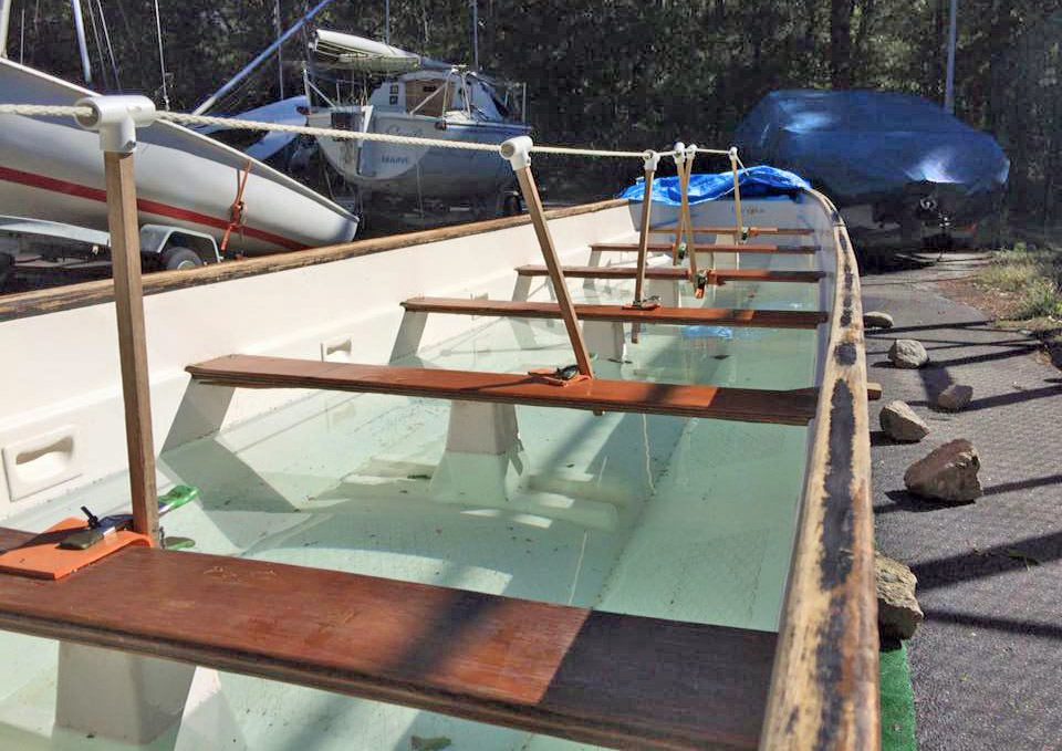
But before we get to the official rainfall data, let's have a bit of fun with some unofficial data... Below is a picture of my team's dragon boat after Hurricane Matthew. The cover blew off, and there was about a foot of water in it. Since it's about 40 feet long, and 3 feet wide, that's about 120 cubic feet of water -- which is about 898 gallons. At 8.3 pounds per gallon, that's (roughly) 7,500 pounds of water!
Now, on to the more serious analytics! ... I downloaded the rainfall data from the National Weather Service. It was in shapefile format, so I used Proc Mapimport to get it into a SAS dataset. I used a data step and a where clause to subset the data, and limit it to just the range of latitudes/longitudes I was interested in. I then used annotate to place a colored dot at each data point on the map. The dots are so close together that they blend together and resemble a contour map, which is the effect I was wanting. I think the resulting map looks pretty good! Click the image below to see the full-size map, with html hover-text showing county names.
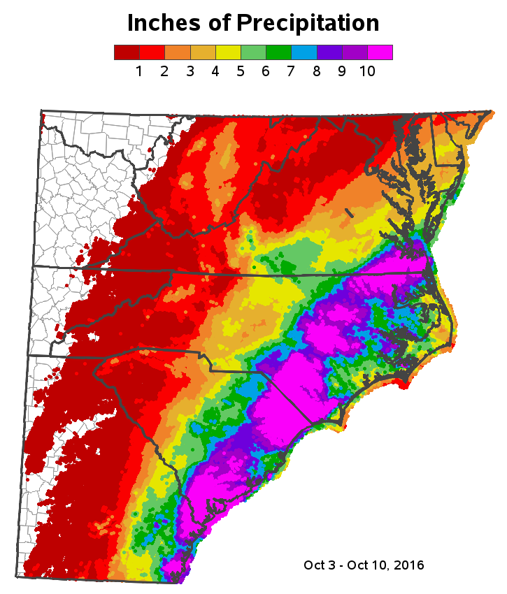
Notice that there is a definite band of the magenta color, showing the areas along the edge of the hurricane that got the most rain. It is interesting that some areas to the east (actually closer to the eye of the hurricane) got less precipitation. Was your area affected by this hurricane? If so, how did it compare to previous hurricanes?
Update: Some people have questioned how I picked the color scale. I'm not a weather expert, so I found a NOAA precipitation map, and used the same color scale they had used. If you'd like to re-use my example with different colors, they are easily changed via macro variables in the SAS code.


1 Comment
Pingback: The perfect storm for State Fair attendance! - SAS Learning Post