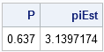
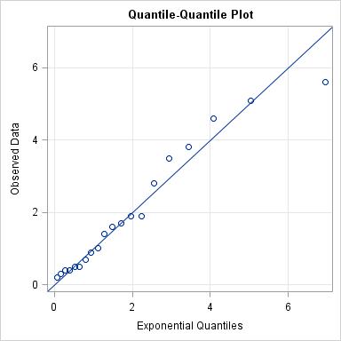
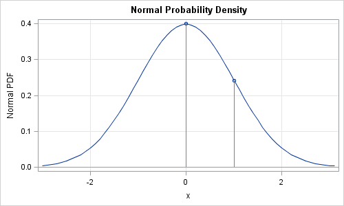
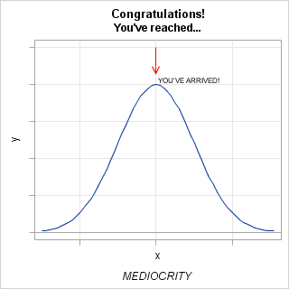
When I give presentations on using the SG procedures, I try to describe how you can take simple plots and layer them to create more complex graphs. I also emphasize how you must consider the output of each plot type so that, as you overlay them, you do not obscure
Search Results: sgplot (958)
In Simple maps can go a long way, we discussed some techniques to create simple outline maps from map datasets in the MAPS library using GTL. Now, let us take this a step further to do something more useful with this feature. For some graphs, the map information is an essential part of the
A new book from SAS Press, "Statistical Graphics Procedures by Example" co-authored by Dan Heath and I has now been published (phew!). For both Dan and I, this was our first foray into writing a book, so it was highly educational to say the least. The key idea behind the presentation
![](https://blogs.sas.com/content/iml/files/2011/12/Top2011.png)
Since this is a blog about statistical programming and analysis, I am always looking for data to analyze. As 2011 ends, I look back on the 165 blog entries that I published since 01JAN2011. This article presents the 10 most popular posts, as determined by the number of people who
Charlie Huang recently posted an article on a new way to draw maps using SGPlot procedure. The basic idea is simple, just use the SCATTER statement to plot the (x, y) points from the data sets in the MAPS library. The GROUP option can be used to color the markers for each
![](https://blogs.sas.com/content/iml/files/2011/12/sampletitles.png)
Recently the "SAS Sample of the Day" was a Knowledge Base article with an impressively long title: Sample 42165: Using a stored process to eliminate duplicate values caused by multiple group memberships when creating a group-based, identity-driven filter in SAS® Information Map Studio "Wow," I thought. "This is the longest
![](https://blogs.sas.com/content/iml/files/2011/11/funnelbinom.png)
I have previously written about how to create funnel plots in SAS software. A funnel plot is a way to compare the aggregated performance of many groups without ranking them. The groups can be states, counties, schools, hospitals, doctors, airlines, and so forth. A funnel plot graphs a performance metric
![](https://blogs.sas.com/content/sasdummy/files/2011/11/timeseries.png)
I've been working with date-time data on a recent project, and I've come across a few SAS programs that have "opportunity for improvement" when it comes time to create reports. (Or maybe I haven't, and I contrived this entire blog post so that I could reference one of my favorite
The Unicode character table contains a vast array of characters and symbols that can be quite useful for making your text more descriptive in your graph. These characters can be inserted into any viewable string that you can define in the GTL or SG procedure syntax. These strings include titles,
You can still get a paper proposal in for SAS Global Forum 2012. All you need is an idea. And probably some data. And also, some techniques for analyzing that data. Oh, and some conclusions would be helpful as well. I know: you are a busy person! You might not
Welcome to this new blog on data visualization at SAS. Our goal is to engage with you on a discussion about analytical and business graphics for reporting and interactive applications. Our primary focus will be on ODS Graphics and related topics, but we look forward to a lively discussion on all things
![](https://blogs.sas.com/content/iml/files/2011/11/long2wide-112x150.png)
Being able to reshape data is a useful skill in data analysis. Most of the time you can use the TRANSPOSE procedure or the SAS DATA step to reshape your data. But the SAS/IML language can be handy, too. I only use PROC TRANSPOSE a few times per year, so
![](https://blogs.sas.com/content/iml/files/2011/10/qqplot.png)
"I think that my data are exponentially distributed, but how can I check?" I get asked that question a lot. Well, not specifically that question. Sometimes the question is about the normal, lognormal, or gamma distribution. A related question is "Which distribution does my data have," which was recently discussed
![](https://blogs.sas.com/content/iml/files/2011/09/normalpdf.png)
Normal, Poisson, exponential—these and other "named" distributions are used daily by statisticians for modeling and analysis. There are four operations that are used often when you work with statistical distributions. In SAS software, the operations are available by using the following four functions, which are essential for every statistical programmer
![](https://blogs.sas.com/content/iml/files/2011/10/mlenormal.png)
A popular use of SAS/IML software is to optimize functions of several variables. One statistical application of optimization is estimating parameters that optimize the maximum likelihood function. This post gives a simple example for maximum likelihood estimation (MLE): fitting a parametric density estimate to data. Which density curve fits the
![](https://blogs.sas.com/content/iml/files/2011/10/barci.png)
I've noticed that a lot of people want to be able to draw bar charts with confidence intervals. This topic is a frequent posting on the SAS/GRAPH and ODS Graphics Discussion Forum and on the SAS-L mailing list. Consequently, this post describes how to add errors bars to a bar
![](https://blogs.sas.com/content/sasdummy/files/2011/10/nfminutesperday.png)
It turns out that I'm not receiving the maximum potential value from my Netflix streaming service. Perhaps it's because I place too much value on sleep. With my monthly subscription, I am permitted to view Netflix content 24 hours a day, 7 days a week. In my house I have
![](https://blogs.sas.com/content/iml/files/2011/09/t_fmmrick.png)
In my previous post, I blogged about how to sample from a finite mixture distribution. I showed how to simulate variables from populations that are composed of two or more subpopulations. Modeling a response variable as a mixture distribution is an active area of statistics, as judged by many talks
![](https://blogs.sas.com/content/sasdummy/files/2011/09/webquery.png)
Like millions of other Americans, I recently was asked to make a decision of tremendous importance to my household -- a decision that would affect the welfare of everyone in my family. That decision, of course, was whether to continue to receive Netflix movies by mail, or opt for the
![](https://blogs.sas.com/content/iml/files/2011/09/simts2002_box.png)
Last week I showed a graph of the number of US births for each day in 2002, which shows a strong day-of-the-week effect. The graph also shows that the number of births on a given day is affected by US holidays. This blog post looks closer at the holiday effect.
![](https://blogs.sas.com/content/sasdummy/files/2011/09/bdaysep.png)
Earlier today, Rick posted interesting information about which time of year the most babies are born, at least in the USA. I don't have data nearly as extensive as what's available at the NCHS, but I do have a sample of birthday records to compare against Rick's findings. My sample
![](https://blogs.sas.com/content/forecasting/files/2017/02/BFD.png)
In this guest blogger post, Udo Sglavo of the Advanced Analytics Division of SAS shows how to conduct time series cross-validation using SAS Forecast Server. Udo replicates the example from Rob J Hyndman's Research Tips blog. Replicating the Example In order to replicate the example in Hyndman's blog, the example
![](https://blogs.sas.com/content/iml/files/2011/08/scrabble.png)
My elderly mother enjoys playing Scrabble®. The only problem is that my father and most of my siblings won't play with her because she beats them all the time! Consequently, my mother is always excited when I visit because I'll play a few Scrabble games with her. During a recent
![](https://blogs.sas.com/content/iml/files/2011/08/solveperformance.png)
I've previously described ways to solve systems of linear equations, A*b = c. While discussing the relative merits of the solving a system for a particular right hand side versus solving for the inverse matrix, I made the assertion that it is faster to solve a particular system than it
![](https://blogs.sas.com/content/iml/files/2011/08/sidebysidebarchart.png)
When I was at the Joint Statistical Meetings (JSM) last week, a SAS customer asked me whether it was possible to use the SGPLOT procedure to produce side-by-side bar charts. The answer is "yes" in SAS 9.3, thanks to the new GROUPDISPLAY= option on the VBAR and HBAR statements. For
![](https://blogs.sas.com/content/iml/files/2011/08/t_polyroot.png)
At the SAS/IML Support Community, a SAS/IML programmer recently asked how to find "the root of a complicated equation." That's a huge question, and many papers and books have been written on the topic of root-finding, also known as finding the zeros of a function. Everyone has favorite techniques for
![Example of HTMLBlue style from PROC REG](https://blogs.sas.com/content/sasdummy/files/2011/08/htmlblueOutput.png)
One of the great innovations with SAS 9.3 is the focus on ODS statistical graphics. "Wait a minute," you're thinking, "weren't ODS graphics added in SAS 9.2?" Yes, that's true. But with SAS 9.3 there is even more capability: more analytical SAS procedures support the graphs, and there are more
![](https://blogs.sas.com/content/iml/files/2011/08/lineparm.png)
I've written about how to add a diagonal line to a scatter plot by using the SGPLOT procedure in SAS 9.2. The main idea (use the VECTOR statement) is easy enough, but writing a program that handles a line with any slope requires some additional effort. But now SAS 9.3
![](https://blogs.sas.com/content/iml/files/2011/08/ods93.png)
Here are a few new interface and graphics changes that every SAS programmer should know about SAS 9.3: HTML is now the default output destination when you run the SAS windowing environment. This means that tables and graphs appear in an HTML document instead of the classic LISTING destination. Of
![](https://blogs.sas.com/content/iml/files/2011/07/tabledist.png)
As I was reviewing notes for my course "Data Simulation for Evaluating Statistical Methods in SAS," I realized that I haven't blogged about simulating categorical data in SAS. This article corrects that oversight. An Easy Way and a Harder Way SAS software makes it easy to sample from discrete "named"