
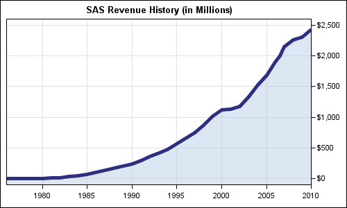
title "SAS Revenue History (in Millions)";
proc sgplot data=sas_revenue noautolegend;
  band x=year upper=revenue lower=&minval / transparency=0.5 y2axis;
  series x=year y=revenue / lineattrs=(thickness=5 color=cx2f2f7f) y2axis;
  xaxis grid offsetmin=0 offsetmax=0 display=(nolabel)
             valueshint values=(1980 to 2010 by 5);
  y2axis grid offsetmin=0 display=(nolabel);
  run;
- SGPLOT SERIES statement does not have a fill-under option. So, we used a BAND plot to do that.
- The response axis is set to Y2 (right hand side) to move it closer to the recent years.
- The x axis value requested are 1980 to 2010 by 5, with VALUESHINT. This option retains the actual extent of the data on the axis, while showing only the tick values we want.
- X and Y2 axis labels are suppressed to reduce unnecessary ink.
- We want to get some filled area under the whole curve, including the left end. So, we defined a macro variable MINVAL and used that for the lowermost value of the BAND plot.
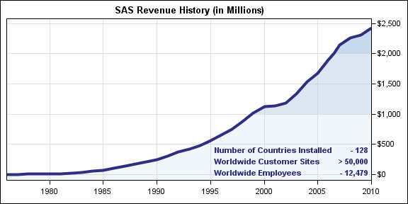
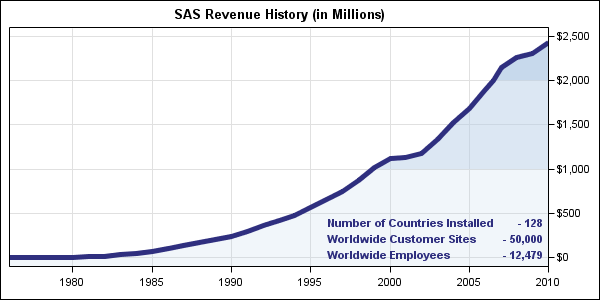
title "SAS Revenue History (in Millions)"; proc sgplot data=sas_revenue noautolegend; band x=year upper=revenue lower=r2 / transparency=0.2 y2axis; band x=year upper=r2 lower=r1 / transparency=0.5 y2axis; band x=year upper=r1 lower=&minval / transparency=0.8 y2axis; series x=year y=revenue / lineattrs=graphdata1(thickness=5 color=cx2f2f7f) y2axis; inset ("Number of Countries Installed" = "- 128" "Worldwide Customer Sites" = "> 50,000" "Worldwide Employees" = "- 12,479") / position=bottomright textattrs=(weight=bold color=cx2f2f7f); xaxis grid offsetmin=0 offsetmax=0 display=(nolabel) valueshint values=(1980 to 2010 by 5); y2axis grid offsetmin=0 display=(nolabel); run |
- We have used 3 bands to draw the filled areas with increasing intensity of color at $1 billion and $2 billion.
- We have add an inset table of some interesting information from the web page.
- The additional observation at 2006.5 was inserted to improve the rendering of the bands.
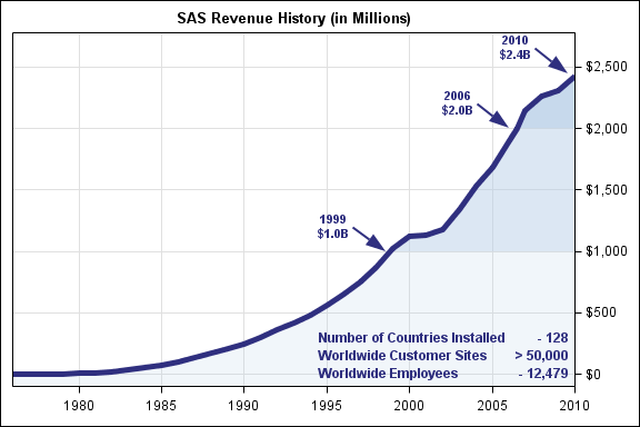
title "SAS Revenue History (in Millions)"; proc sgplot data=sas_revenue noautolegend sganno=sg_anno; band x=year upper=revenue lower=r2 / transparency=0.2 y2axis; band x=year upper=r2 lower=r1 / transparency=0.5 y2axis; band x=year upper=r1 lower=&minval / transparency=0.8 y2axis; series x=year y=revenue / lineattrs=graphdata1(thickness=5 color=cx2f2f7f) y2axis; inset ("Number of Countries Installed" = "- 128" "Worldwide Customer Sites" = "> 50,000" "Worldwide Employees" = "- 12,479") / position=bottomright textattrs=(weight=bold color=cx2f2f7f); xaxis grid offsetmin=0 offsetmax=0 display=(nolabel) valueshint values=(1980 to 2010 by 5); y2axis grid offsetmin=0 display=(nolabel) offsetmax=0.1; run; |
The key items to note in this program are:
- We have used the SGANNO= option on the proc statement. This causes the procedure to read the SG annotation data set and draw the annotations listed in it on the graph.
- We have set the OFFSETMAX on the Y2 axis to 0.1 (10%), to create some extra space for the last annotation.
The SG-Annotation data set is very similar to the SAS/GRAPH annotation data set in design. So, if you are familiar with the concept and the structure of the graph annotation data set, they you will find this very familiar. There are some significant differences which is why this optioin is intentionally named SGANNO, to avoid any compatibility implications.
In this case, we have used the ARROW and TEXT functions, with the related columns of data. The data set has many columns, but here are the important ones:
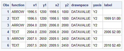
The Annotation feature is included in SAS 9.3 as pre production and released as production with SAS 9.3M1. The annotation data set is easy to create with use of RETAIN statements. Also, since the text is placed at the end of the arrow, the same X1 & Y1 coordinates computed for the arrow can be used for the text along with the ANCHOR="RIGHT". DATASPACE="DATAVALUE" allows specificatin of coordinates in data values, relative to the data space. WIDTH is provided so each label will wrap into 2 lines.
The program for creating this data set is included in the attached full program for this graph: Full SAS Code


