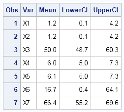
Recently a user posted a question on the SAS/GRAPH and ODS Graphics Forum about drawing a plot with custom confidence intervals . The user has a simple data set with category, response (mean) and custom lower and upper confidence intervals. The data looks like this:
Robert Allison provided the code (proc gplot + annotate) to draw a dot plot with the confidence intervals. This prompted follow up questions and discussion on whether such graphs (including Dot and BarCharts) can be created using SG procedures and GTL.
There are multiple ways to do this in SAS 9.2. A Dot plot with custom intervals can be created using the SGPLOT procedure and GTL, while a BarChart with custom intervals can be created in GTL in multiple different ways, the simplest way is by using the VBARPARM statement. Where a graph can be created using SGPLOT, I have not provided the GTL version, as using SGPLOT is easier.
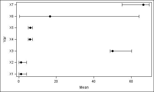
SAS 9.2: DOT plot with Custom Intervals using SGPLOT:

title 'Mean and Confidence Intervals'; proc sgplot data=confidence; scatter y=var x=mean / xerrorlower=lowerci xerrorupper=upperci markerattrs=(symbol=circlefilled size=9); run; |
SAS 9.2: HBAR with Custom Intervals using GTL:
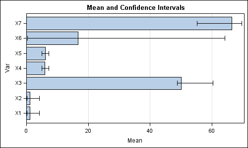
proc template; define statgraph confidence_H; begingraph; entrytitle 'Mean and Confidence Intervals'; layout overlay / xaxisopts=(offsetmin=0 griddisplay=on); barchartparm x=var y=mean / errorupper=upperci errorlower=lowerci orient=horizontal; endlayout; endgraph; end; run; proc sgrender data=confidence template=confidence_H; run; |
SAS 9.2: VBAR with Custom Intervals using GTL:
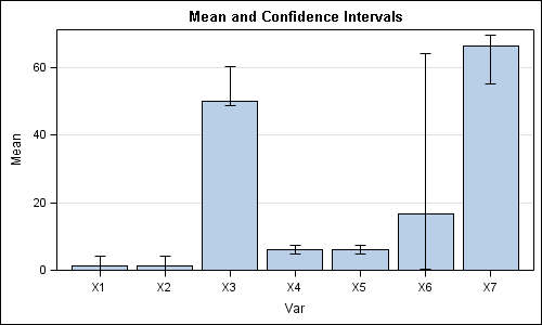
proc template; define statgraph confidence_V; begingraph; entrytitle 'Mean and Confidence Intervals'; layout overlay / yaxisopts=(offsetmin=0 griddisplay=on); barchartparm x=var y=mean / errorupper=upperci errorlower=lowerci; endlayout; endgraph; end; run; proc sgrender data=confidence template=confidence_V; run; |
The reason you cannot use the SAS 9.2 SGPLOT procedure to create the bar charts with the custom intervals is that the VBAR statement in proc SGPLOT computes its own intervals and does not allow overlay of other basic plot statements due to its special summarizing features.
SAS 9.2 example code: Full SAS 92 Code
With SAS 9.3, everything gets really easy with the addition of the new VBARPARM and HBARPARM statements to the SGPLOT procedure. These are designed explicitly to support the need to draw user computed confidence intervals on the bars. The VBARPARM statement also makes it very easy to display the statistics in the bar chart. These "parm" statements also allow layering of other basic statements, such as scatter, series, etc.
SAS 9.3: BarChart with Custom Intervals using VBARPARM statement in SGPLOT:
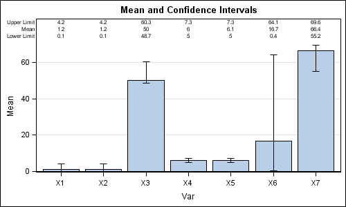
title 'Mean and Confidence Intervals'; proc sgplot data=confidence; vbarparm category=var response=mean / limitupper=upperci limitlower=lowerci datalabel datalabelpos=top; yaxis grid; run; |
Just a few lines of code does all the heavy lifting, including display of the statistics. Note the statistics at the top, which displayed at top or bottom of the bars. HBARPARM also does a similar plot, except it does not support display of statistics if error bars are included.
SAS 9.3 example code: Full SAS 93 Code
Update: The SAS 9.2 and SAS 9.3 sample code files were swapped by mistake. Now fixed. Also see article by Rick Wicklin on Creating bar charts with confidence intervals


4 Comments
See also "Creating bar charts with confidence intervals" for a discussion of which approach I prefer and why.
Is it possible to do the dot plot with the x-axis on the log scale? I often calculate odds ratios and confidence intervals separately and then plot on a log10 scale. Thanks for the SG lesson!
Yes, as long as the axis does not have a zero value, you can use an xaxis statement with type=log. See doc for all applicable options.
title 'Mean and Confidence Intervals';
proc sgplot data=confidence;
scatter y=var x=mean / xerrorlower=lowerci xerrorupper=upperci
markerattrs=(symbol=circlefilled size=9);
xaxis type=log;
run;
Is it possible to create Multipanel plot for VBAR with ci