I've noticed that a lot of people want to be able to draw bar charts with confidence intervals. This topic is a frequent posting on the SAS/GRAPH and ODS Graphics Discussion Forum and on the SAS-L mailing list. Consequently, this post describes how to add errors bars to a bar chart.
But frequencies don't have confidence intervals...
When I hear the words "confidence intervals on a bar chart," I experience momentary confusion. Usually, a bar chart is a graphical summary of frequencies (counts) for each of several categories. You use bar charts to plot observed counts, such as the numbers of males and females, or the percentages of people in various political parties. These counts or percentages do have an associate uncertainty (or "margin of error"), but it is unusual to display the uncertainty on the bar chart.
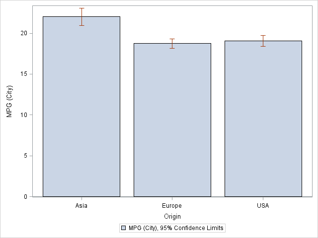
However, business analysts use bar charts to show the means of quantities, such as the following graph from the SGPLOT procedure, which shows the mean mileage for cars built in Asia, Europe, or the US:
The following statements create the graph from the SASHelp.Cars data, which is distributed with SAS:
proc sgplot data=sashelp.cars; vbar Origin / response=MPG_City stat=mean limitstat=clm; run; |
Notice that the VBAR statement creates a bar chart (with optional confidence limits) from raw (unsummarized) data. Creating the plot is as easy as 1-2-3:
- Use the VBAR statement to specify a categorical variable. (You can also use the HBAR statement to create a horizontal bar chart.) The levels of this variable form the categories for the bars. For example, the Origin variable has the values "Asia," "Europe," and "USA."
- Use the RESPONSE= and STAT=MEAN options to define Y variable. For example, RESPONSE=MPG_City specifies that the Y axis will contain the means of the MPG_City variable for each category.
- Use the LIMITSTAT= option to specify the "error bars" for the bar chart. For example, LIMITSTAT=CLM displays 95% confidence intervals for the mean values.
Bar charts for pre-summarized data
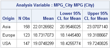
The bar chart is a graphical representation of a simple table that can be produced with PROC MEANS:
proc means data=sashelp.cars mean lclm uclm; class Origin; var MPG_City; output out=CarMPG mean=MeanVal lclm=LowerCLM uclm=UpperCLM; run; |
In some situations, you might not have the original data, but only the summarized data, such as are contained in the table. In this case, you can use the SAS 9.3 VBARPARM statement to create the same plot:
proc sgplot data=CarMPG; vbarparm category=Origin response=MeanVal / limitlower=LowerCLM limitupper=UpperCLM; run; |
The VBARPARM statement enables you to plot any quantities, not just means and confidence limits. For example, you can compute median values and confidence intervals for the medians, and the plot those quantities with the VBARPARM statement.
Should you even use a bar chart to display means and CIs?
I've shown how you can use the SGPLOT procedure to create bar charts that display the means and confidence intervals of categories. However, this is not necessarily the best way to display this information. In most cases, I prefer a scatter plot with error bars, (also called a dot plot) as shown below:
proc sgplot data=sashelp.cars; dot Origin / response=MPG_City stat=mean limitstat=clm; run; |
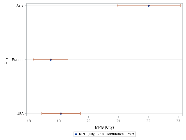
A bar chart always starts at zero, but if the mean values are in the hundreds (or millions!), you probably don't want to use a bar chart to display the means. You can create a dot plot by using the DOT statement, which has the same options as the VBAR statement. I have used the dot plot to display means and confidence intervals for airline delays.
If the data are summarized, you can use the SCATTER statement with the XERRORLOWER= and XERRORUPPER= options to create a similar plot. This is useful when there are many categories. If there are few categories, as in the present case, you can also place the categories on the horizontal axis:
proc sgplot data=CarMPG; scatter x=Origin y=MeanVal / yerrorlower=LowerCLM yerrorupper=UpperCLM; run; |

13 Comments
Bar charts with confidence intervals are also known as "dynamite plots" and for two reasons: 1) They look like the old dynamite things on cartoons and 2) They are dangerous. See
https://biostat.app.vumc.org/wiki/pub/Main/TatsukiRcode/Poster3.pdf
for a good explanation of why they are bad. That site suggests either strip plots (if N is not too big) or parallel box plots; I agree. These provide more information.
For a somewhat prettier SAS plot, you can also use proc gchart: http://sas-and-r.blogspot.com/2011/11/example-915-bar-chart-with-error-bars.html, where we also show a nice plot from an R package.
Pingback: Custom confidence intervals - Graphically Speaking
I was trying to do the interval plot and pairwise comparison plot in the book KNNL chap 17 and searching a really long time for SAS code to do this. And your blog really helps a lot!!!! Thank you!!!
Thanks Rick. Can I ask error bar chart with 95% confidenc interval for Relative risk or Odds Ratio is also frequently using in health research. Does the same codes be applied in this context. Fakhrul
Yes. You can use the ideas and code in the section for pre-summarized data. However, I recommend using the dot plot (shown at the end of the post) for displaying relative risk and odds ratios. I also recommend adding a reference line at RR=1 so that it is clear whether the RR confidence interval includes 1.
Thanks you so much Rick. Fakhrul
Do you know of a way to remove the little tick mark at the end of the error bar line? I think it looks much better without.
I'm also interested in adding data labels to the dot, if that can be done.
There are three approaches shown here. Check the doc for the VBAR, VBARPARM, and DOT statements. I think the DOT statement support the NOERRORCAPS option. Yes, you can add labels. Ask questions like this at the ODS Graphics Support Community.
I think, you are wrong. Of course frequencies do have confidence intervales. Frequencies are the estimate of the probability of the occurence of that class which number of occurencies in the sample has lead to the calculated frequency. The sample is random, and therfore the estimate from the sample is also random. The clopper-pearson-Interval is used to calculate the upper and lower bound of the confidence interval for the estimated probability.
If you have a dichotomous variable than a descriptive statistic of your concret sample is the frequency. However if you want to generalise your result to the whole population, than you take the frequence as an estimate for the probability. This value is random and as measure of the uncertainity a confidenc interval shoul be given, which is the clopper-pearson-interval.
If you have a metric variable than a descriptive statistic of your concret sample is the mean. However if you want to generalise your result to the whole population, than you take the mean as the estimate for the expected value. This value is random and as measure of the uncertainity a confidenc interval shoul be give. For normal distributet values with unknown variance these are calculated with the quantiles of the student distribution.
Frequencies and the lower and upper bound of the clopper pearson interval are always positive. Therfore it makes sense to use a bar-graph with added confidence interval.
Means and there lower and upper bound of the confidence intervale could be negative or positive or embracing the zero, there it might be better to use a dot-plot.
Thanks for writing. Yes, I understand what you are saying. Sorry if I was not clear. I think what I was trying to convey in the second paragraph is that most people use the bar chart to display empirical (observed) counts. As you correctly point out, the CIs are for an underlying population parameter, not for the sample. If your audience will understand the difference, you can use a bar chart to display expected counts (which are often not integers) and the CIs.
The main point of the article is that many people use the bar chart to display means and CIs. I suggest using a dot plot instead. In addition to the arguments I made, Peter Flom in the first comment links to a poster by Tatsuki Koyama that contains additional reasons to avoid a bar chart with error bars when your goal is to visualize the uncertainty in the estimate of a mean (or a proportion).
Pingback: 10 tips for creating effective statistical graphics - The DO Loop