Charlie Huang recently posted an article on a new way to draw maps using SGPlot procedure. The basic idea is simple, just use the SCATTER statement to plot the (x, y) points from the data sets in the MAPS library. The GROUP option can be used to color the markers for each state or "id". This can generally work well enough for some cases as shown in the examples included in Charlie's article.
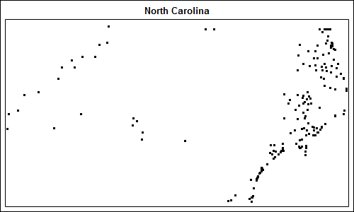
There are a couple of issues with this simple approach which can be addressed with a few changes. Let us take the map of North Carolina, for example, extracted from the MAPS.STATES data set where state=37 and density<3. Here is the code snippet using a scatter plot and the resulting graph
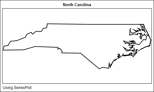
ods graphics / reset width=5in height=3in; title 'North Carolina'; proc sgplot data=nc; scatter x=x y=y / markerattrs=(size=3 symbol=circlefilled); xaxis display=none; yaxis display=none; run; |
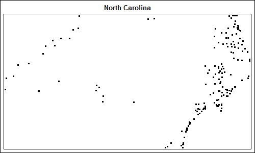
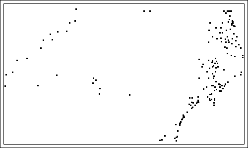
Problem # 1: Marker density. As we can see, the marker density is not enough for the scatter plot to create a nice graph. Straight line boundaries are lost, as is also evident in the map of North America shown in Charlie's post, where most of the border between USA and Canada is absent.
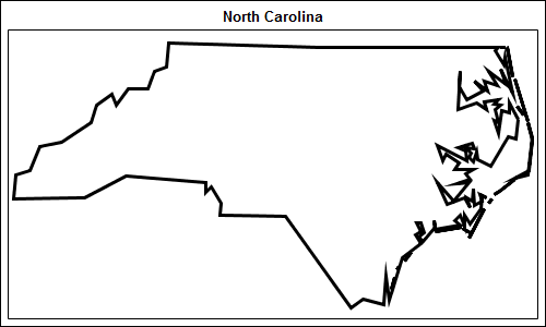
This can be addressed by using the SERIES statement instead of SCATTER. To ensure this works, we need to add a closing line segment by repeating the first vertex at the end of each segment of the state. A program snippet and graph is shown below. Full program can be seen here: Map_SGPlot
ods graphics / reset width=5in height=3in; title 'North Carolina'; proc sgplot data=nc tmplout='c:\mapGTL.sas'; series x=x y=y / group=segment lineattrs=graphdatadefault(thickness=2 pattern=solid); xaxis display=none; yaxis display=none; run; |
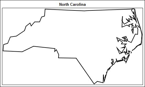
Problem # 2: Aspect ratio. As we can see from the map above, the map fills the entire graph region and does not retain the aspect ratio of the data. If a taller graph is requested, say be setting width=5in, height=4in, the map will get further distorted. Unfortunately, there is no fix in the SGPLOT procedure for this. You can use GTL to fix this and it is easier than expected.
Notice the option TMPLOUT='c:\mapGTL.sas' in the proc statement in the above example. This will cause the SGPLOT procedure to write out the internally generated GTL code to this file. You can open this file, and see the GTL code:
proc template; define statgraph sgplot; begingraph; EntryTitle "North Carolina" /; layout overlay / xaxisopts=( display=none type=linear ) yaxisopts=( display=none type=linear ); SeriesPlot X=X Y=Y / primary=true Group=SEGMENT Lineattrs=GRAPHDATADEFAULT( Pattern=1 Thickness=2); endlayout; endgraph; end; run; |
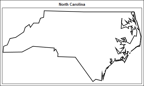
A few statements like Discrete offset, etc have been removed as they are not needed. Now, we will replace the LAYOUT OVERLAY statement with the LAYOUT OVERLAYEQUATED statement. This ensures the aspect ratio of the data is retained. We removed some unnecessary options and add the PROC SGRENDER proc statement to create the graph from the data and the template as shown below.
proc template; define statgraph MapSeries; begingraph; entrytitle 'North Carolina'; layout overlayequated / xaxisopts=(display=none) yaxisopts=(display=none); seriesplot x=x y=y / group=segment lineattrs=graphdatadefault(thickness=2); endlayout; endgraph; end; run; ods graphics / reset width=5in height=3in; proc sgrender data=nc template=MapSeries; run; |
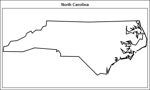
Now we have a map where all the boundries are clearly visible and is drawn to the correct aspect ratio of the data, regardless of the graph size. The full program is included here: Map_GTL
There are some limits to this approach, but also some benefits. The key limit is that we can only make simple outline maps. Choropleth maps cannot be created using this technique.
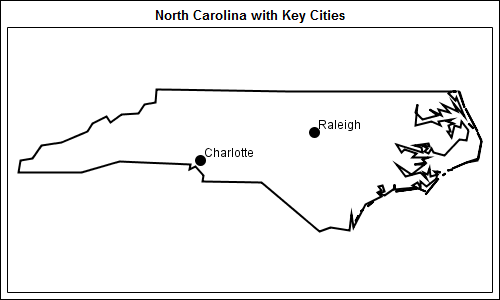
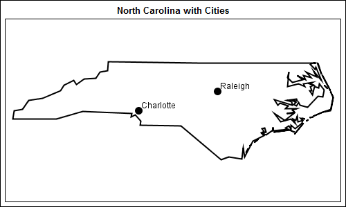
If a simple outline map would suffice, then there are some benefits. Using GTL, you can easily layer other data on the map, such as the map below:
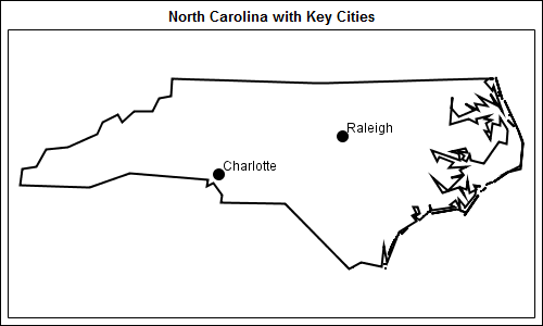
Here we have added markers with labels for the two big cities in North Carolina, USA. I will describe this process and other potential applications in a follow up post on Map Overlays.


3 Comments
Hope in the future GTL or those SG procedures will have MAPDRAW statement^-^
For another technique that uses the TMPLOUT= options to generate GTL from PROC SGPLOT,
see Creating tooltips for scatter plots with PROC SGPLOT.
Pingback: Map overlays - Graphically Speaking