In Simple maps can go a long way, we discussed some techniques to create simple outline maps from map datasets in the MAPS library using GTL. Now, let us take this a step further to do something more useful with this feature.
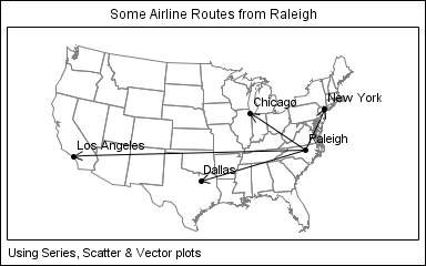
For some graphs, the map information is an essential part of the graph, like the airline route map shown below.
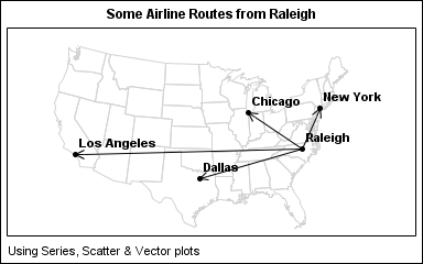
The GTL template code for this is shown below. The map itself is drawn using the SeriesPlot statement. The city markers and names are drawn using a ScatterPlot and the arrows by using a VectorPlot.
proc template; define statgraph AirlineRouteMap; begingraph; entrytitle 'Some Airline Routes from Raleigh'; entryfootnote halign=left 'Using Series, Scatter & Vector plots'; layout overlayequated / xaxisopts=(offsetmax=0.05 display=none) yaxisopts=(display=none); seriesplot x=x y=y / group=pid lineattrs=graphdatadefault(color=lightgray); vectorplot x=xc y=yc xorigin=xo yorigin=yo; scatterplot x=xc y=yc / group=city datalabel=city datalabelattrs=(size=10) markerattrs=graphdatadefault(symbol=circlefilled); endlayout; endgraph; end; run; |
The key to this graph is the creation of a merged data set that includes the map data, and the location data for the overlaid features. As you can see in the full code for the graph (AirlineRouteMap), we used the following steps:
- Start from the maps.states data set, keeping only the 48 contiguous states.
- Close each polygon segment.
- Add the X, Y data computed from the Lat / Long values as radians for the cities we want to overlay.
- Provide unique State and Segment ids for the city observations.
- Project the combined data.
- Partition the data for the overlay features into separate columns.
- Plot the map part using the SeriesPlot statement.
- Plot the overlaid features using the appropriate plot statement, here the VectorPlot.
A different category of graphs is where the map is not essential, but provides a geographical context to the understanding of the data. To view the population of the four largest cities in the USA, we could use a simple bar chart as showm below:
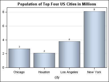
title 'Population of Top Four US Cities in Millions'; proc sgplot data=usa3; vbar city / response=pop dataskin=pressed datalabel; yaxis grid display=(nolabel); run; |
Alternately, we could use a graph like the one shown below to display the relative populations, while also providing some geographical context to the data:
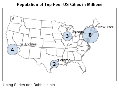
proc template; define statgraph PopulationMap; begingraph; entrytitle 'Population of Top Four US Cities in Millions'; entryfootnote halign=left 'Using Series and Bubble plots'; layout overlayequated / xaxisopts=(offsetmin=0 offsetmax=0.1 display=none) yaxisopts=(offsetmin=0 offsetmax=0 display=none); seriesplot x=x y=y / group=pid lineattrs=graphdatadefault(color=gray); bubbleplot x=xc y=yc size=pop / datatransparency=0.3 datalabel=city bubbleradiusmin=15 bubbleradiusmax=30 datalabelattrs=(size=9); scatterplot x=xc y=yc / markercharacter=pop markercharacterattrs=(size=14 weight=bold) ; endlayout; endgraph; end; run; |
This program uses a BubblePlot - a SAS 9.3 feature. The full program is included here: PopulationMap
Other interesting use cases for maps include insets and small multiples. We will dig into these use cases in a follow-up article.


4 Comments
Pingback: Simple maps can go a long way - Graphically Speaking
It should be noted that combining your polygon and point data is no longer required as of 9.3. You can do it like this:
proc gproject data=polygons out=polygons parmout;
id id;
run;
proc gproject data=points out=points parmentry=polygons;
id;
run;
The PARMOUT option saves your projection information to a default location on the first GPROJECT statement. The second GPROJECT statement then can use those saved settings by telling it you want to use the options saved for the POLYGONS dataset. You also do not need to specify an ID (or create dummy ones on the POINT data set), but you do still need an empty ID statement.
How can we add a logo ( png file or jpg file ) on the bottom of such map ?
With SAS 9.3 GTL you can use a DRAWIMAGE statement to insert an image. If you create such a graph using SAS 9.3 SGPLOT, then you can use the new SGANNO annotation feature to insert an image.