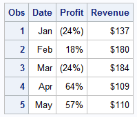
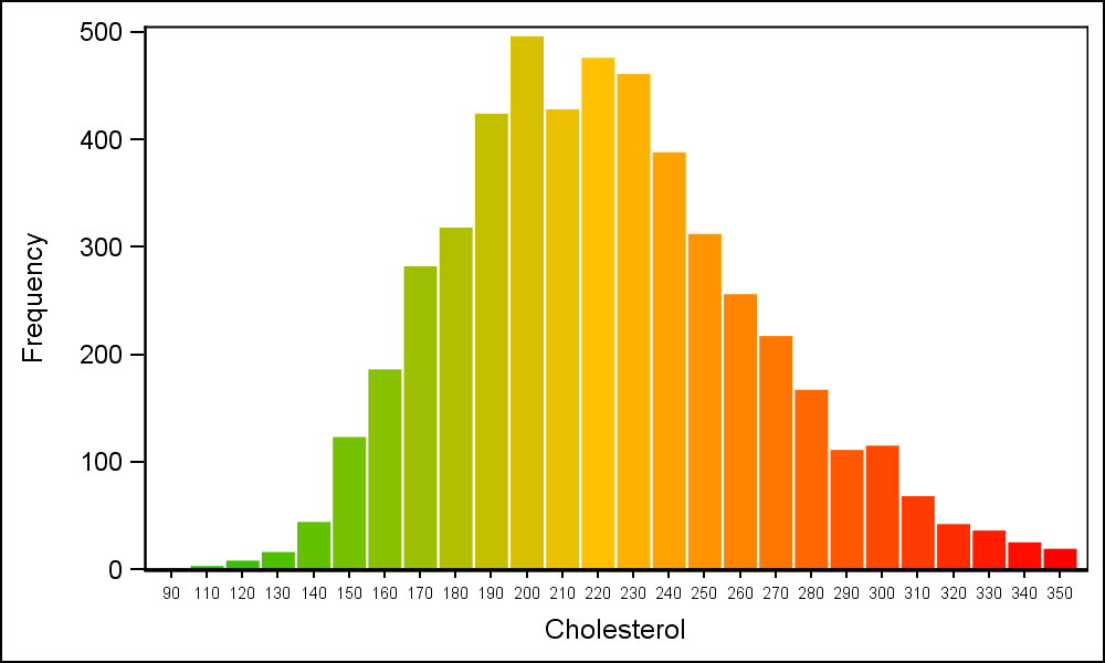
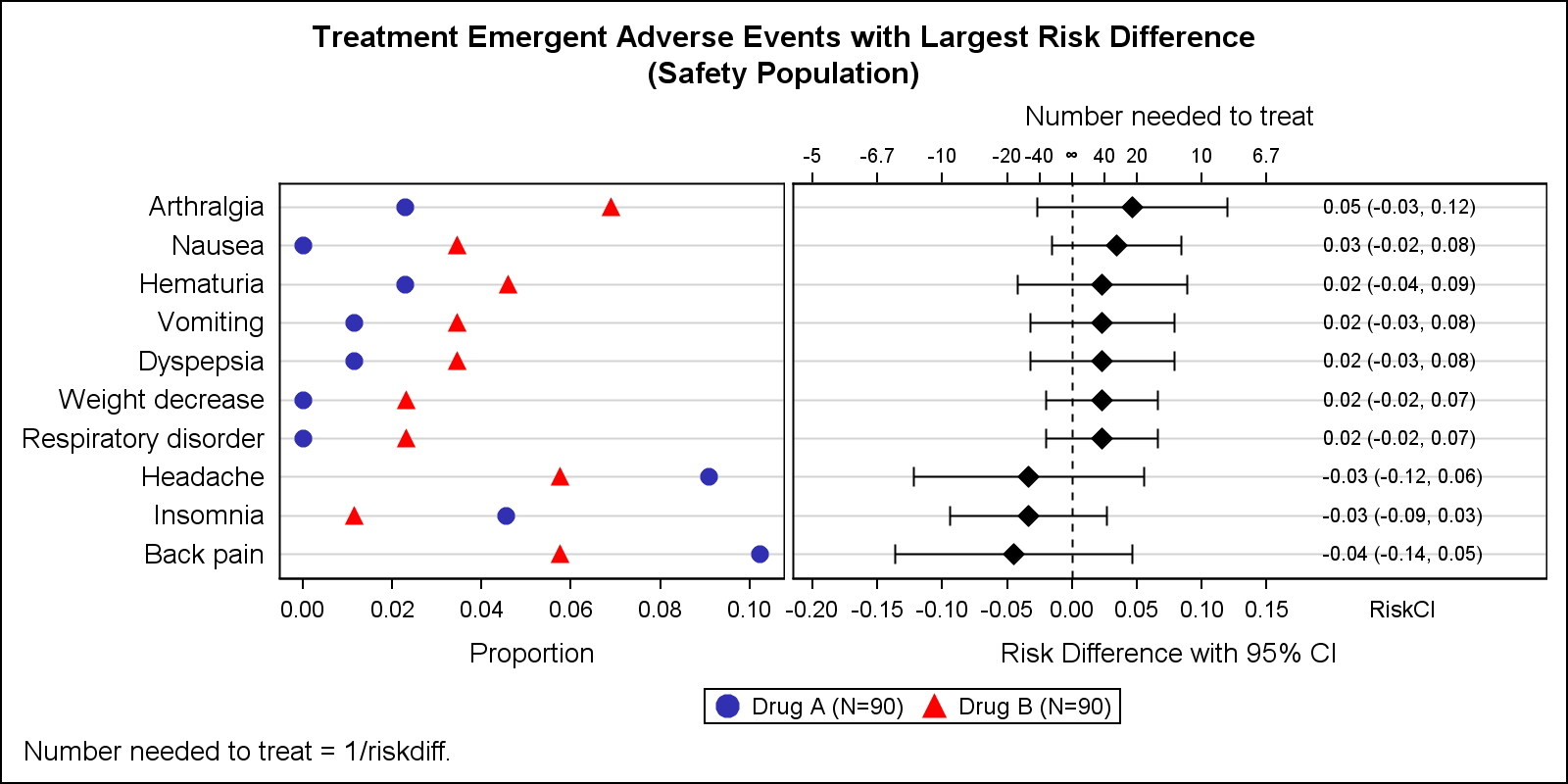
Search Results: sgplot (958)

Rick Wicklin 0
Popular posts from The DO Loop in 2015

I wrote 114 posts for The DO Loop blog in 2015. Which were the most popular with readers? In general, highly technical articles appeal to only a small group of readers, whereas less technical articles appeal to a larger audience. Consequently, many of my popular articles were related to data

Toby Text 0
SAS 9.4 - Weihnachtsbaum basteln (SAS Adventskalender 24. Türchen)

Beim adventlichen Weihnachtsstern Basteln am vierten Advent hob ich schon warnend den Finger und hielt Sie gemäß des Mottos „Save a Tree“ dazu an, beim Ausdruck  der Schnittmuster mit dem Papier ressourcenschonend umzugehen. Vor dem Hintergrund der in Paris erfolgreich verhandelten Begrenzungen des zukünftigen CO2-Ausstoßes,  muss man sich ja auch noch

Artificial Intelligence | Programming Tips
小林 泉 0
機械はあなたの娯楽までをも奪うのか?

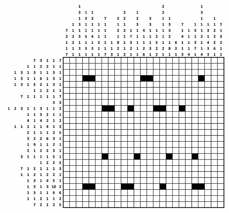
さて、今回ご紹介する例は、最近議論が活発な、「機械(コンピューター)が人間の作業を奪う(?)」お話です。 機械は人間から仕事(今回の例では、仕事ではなく娯楽と言ったほうが近いかもしれません)を奪ったことになるのでしょうか?それとも、真の楽しみを味わえるように、単に単純労働から開放してくれただけなのでしょうか? 昨今、人工知能がもたらす変化という文脈で行われている議論ですが、今回は、昔からある最適化アルゴリズムで、人間の仕事を奪います。皆さんでその意味を考えてみてください。 イギリスの諜報機関GCHQがクリスマスメッセージとして送った難解なパズルが公開されており、優秀な人たちを楽しませています。その第一問が、以下の「お絵かきロジック」です。日本でも一時期流行しました。イラストロジックなどとも言われ、私自身もトライした記憶があります。   このパズルそのものについては、他の情報源に頼って欲しいのですが、簡単に説明すると、それぞれのセルを黒か白で塗りつぶすパズルで、行と列に書かれている数字は、黒マスが連続している数を順番どおりに示している「手がかり」です。いくつかのセルはすでに黒く塗りつぶされていますが、それらはこのパズルの答えを一つに確定するために必要です。 一部の箇所は、それぞれの行や列の情報だけを見て解くことが可能です。例えば、7番目の行を見てみましょう。手がかりは、(7 1 1 1 1 1 7)です。すなわち、全部で 7 + 1 + 1 + 1 + 1 + 1 + 7 = 19 個の黒いセルが必要となり、最低ひとマスは間隔が空いていないといけないので、7個の固まりの間の個数を考慮すると、7-1=6 個の白マスが必要となります。この二つの数字を足すと、19 + 6 = 25 となり一行の列数とおなじ数にちょうどなります。したがって、この結果から直ちにこの行の全てがあきらかになります。 黒7, 白1, 黒1, 白1, ・・・ ついてきていますよね。 しかし、そうは簡単にいかない箇所のほうが多いでしょう。その場合には、手がかりから部分的にしか黒く塗りつぶせないことになります。例えば、一行目を見てください。ヒントから(7 + 3 + 1 + 1 + 7) + (5

Rick Wicklin 0
Lo, how a polar rose e'er blooming

Lo how a rose e'er blooming From tender stem hath sprung As I write this blog post, a radio station is playing Chrismas music. One of my favorite Christmas songs is the old German hymn that many of us know as "Lo, How a Rose E're Blooming." I was humming

Rick Wicklin 0
Overlay categories on a histogram

Recently Sanjay Matange blogged about how to color the bars of a histogram according to a gradient color ramp. Using the fact that bar charts and histograms look similar, he showed how to use PROC SGPLOT in SAS to plot a bar chart in which each bar is colored according

Data Visualization
Sanjay Matange 0
Boxplot with connect

This blog post is motivated by a post by a user on the communities page about creating a box plot with colored boxes by category and multiple connect lines. Normally, a box plot can be drawn by category, with a single connect line for one of the statistical values of

Data Visualization
Sanjay Matange 0
Axis Customizations

All axis customization features are always welcome.  Especially since SGPLOT statements can often be used to create non standard graphs, having the ability to customize the axes is important.  This article presents ways in which you can customize the discrete axes. By default, the x axis will try to display the

Data Visualization
Sanjay Matange 0
Broken Axis Redux

Often when the data includes some extreme difference in measures or some outliers, the plot of the data points can get skewed due to the need to accommodate the extreme outliers.  The bulk of the observations get squeezed into a smaller region of the plot.  While this may be useful

1 20 21 22 23 24 32