In the previous article I described a way to create a box plot with multiple connect lines using SAS 9.40M1 or later release . I created the graph using SGPLOT with VBOX and overlaid SERIES statements. Such an overlay of a basic plot on the VBOX statement is supported starting with SAS 9.40M1.
 If you have a SAS 9.3, you can create the same graph using SGAnnotate as shown on the right. In this case, we have displayed the colored boxes by using a VBOX statement with category and group roles set to "deathcause". As mentioned in the previous article, connect line cannot be drawn since each box belongs to a different group.
Note also I have abbreviated the long death cause names to avoid long rotated axis tick values, since SAS 9.3 does not have support for splitting the long tick values.
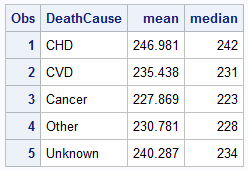 We run the MEANS procedure on the data to compute the mean and median values by "deathcause" as shown on the right. Now, instead of merging this data with the original data set, we need to create an annotation data set to define two "Polylines", one for mean * deathcause and one for median * death cause, and also the instructions needed to create the legend.
First, I transpose the data from a three column format to a group format as shown on the right. Now the data has observations for the stat value by deathcause and group. Group is either "Mean" or "Median".
 /*--Rearrange multi column to group--*/
data heartGroup;
length Group $6;
keep DeathCause Group Value;
set heart;
Group='Mean'; Value=Mean; output;
Group='Median'; Value=Median; output;
run;
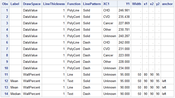
Now, I can use this data set and script the annotate functions and data I need to overlay the two connect lines using the "Polyline" function. I also script the "Line" and "Text" functions needed for the legend.
The code for scripting the SG annotate data set is shown below. Note, SGAnnotate data set is a bit different form the classic SAS/GRAPH annotate data set due to the difference in the features of the underlying graph system. However, many aspects have been retained for ease of transition.
 /*--Make SG Anno data set--*/
data sganno;
length Label $6 DrawSpace $12;
drop DeathCause Group Value;
set heartGroup end=last;
by group;
/*--Script out the Mean and Median polylines--*/
DrawSpace='DataValue';
LineThickness=1;
if first.group then Function='PolyLine';
else Function='PolyCont';
if group='Mean' then LinePattern='Solid';
else LinePattern='Dash';
XC1=deathcause; Y1=Value; output;
/*--Script out the Legend--*/
if last then do;
DrawSpace='WallPercent'; Width=50;
LinePattern='Solid';
Function='Line'; x1=80; y1=95; x2=90; y2=95; output;
Function='Text'; x1=90; y1=95; Label='Mean'; anchor='left'; output;
LinePattern='Dash';
Function='Line'; x1=80; y1=90; x2=90; y2=90; output;
Function='Text'; x1=90; y1=90; Label='Median'; anchor='left'; output;
end;
run;
The "Polyline" and "Polycont" functions are used to draw the connect lines for "Mean" and "Median" values by deathcause. DRAWSPACE=DataValue is used to interpret the x and y values in data space. Also, since the x axis values are discrete character, the column XC1 is used instead of X1. The "Line" and "Text" functions are used to display the legend using DRAWSPACE of WALLPERCENT. Care must be taken to correctly match the legend item attributes with the labels.
Full SAS9.3 program: Box_Connect_Anno


2 Comments
Sanjay,
This a fantastic graph. What if I want to insert the statistics just like using insertgroup statement in PROC boxplot?
Also how to change the colors of those boxes?
Hi Ethan. You can likely use the AxisTable statement to insert statistics on the boxs. You can also use the StyleAttrs statement to set the group colors.