When creating a statistical graphic such as a line plot or a scatter plot, it is sometimes important to preserve the aspect ratio of the data. For example, if the ranges of the X and Y variables are equal, it can be useful to display the data in a square region. This is important when you want to visualize the distance between points, as in certain multivariate statistics, or to visually compare variances. It is also important if you are plotting polygons and want a square to look like a square.
This article presents two ways to create ODS statistical graphics in SAS in which the scale of the data is preserved by the plot. You can use the ASPECT= option in PROC SGPLOT and the OVERLAYEQUATED layout in the Graph Template Language (GTL).
Data scale versus physical measurements of a graph
Usually the width and height of a graph does not depend on the data. By default, the size of an ODS statistical graphic in SAS is a certain number of pixels on the screen or a certain number of centimeters for graphs written to other ODS destinations (such as PDF or RTF). When you request a scatter plot, the minimum and maximum value of each coordinate is used to determine the range of the axes. However, the physical dimensions of the axes (in pixels or centimeters) depends on the titles, labels, tick marks, legends, margins, font sizes, and many other features.
For example, the following data has two variables. The X and Y variables both have a minimum value of 0 and a maximum value of 1. Therefore the range of each variable is 1. The default graph has a 4:3 ratio of width to height, so when you create a scatter plot, the physical lengths (in pixels) of the X and Y axes are not equal:
data S; /* XRange = YRange = [0, 1] */ input x y @@; datalines; -1 -1 -0.75 -0.5 -0.5 -0.75 -0.25 0 0 0.5 0.25 -0.25 0.5 0.75 0.75 0.25 1 1 ; ods graphics / reset; /* use default width and height */ title "Default Graph: 640 x 480 pixels"; title2 "Aspect Ratio 4:3"; proc sgplot data=S; scatter x=x y=y; xaxis grid; yaxis grid; run; |
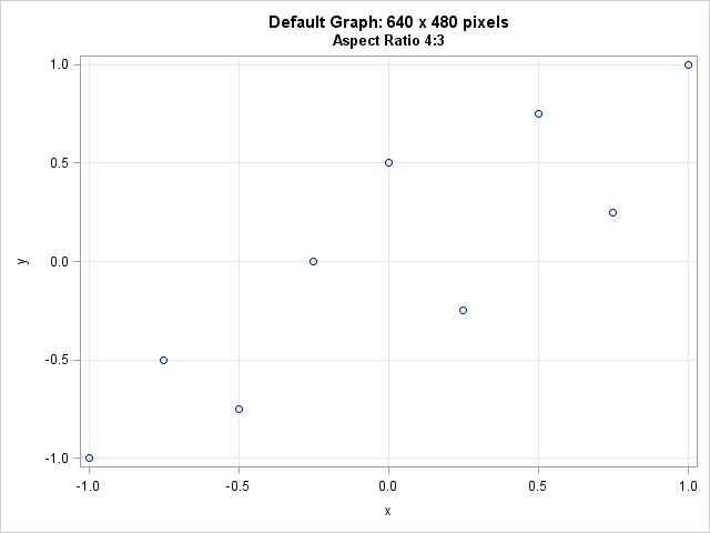
You can click on the graph to see the original size. The graph area occupies 640 x 480 pixels. However, because of labels and titles and such, the region that contains the data (also called the wall area) is about 555 pixels wide and 388 pixels tall, which is obviously not square. You can see that each cell in the grid represents a square with side length 0.5, but the cells do not appear square on the screen because of the aspect ratio of the graph.
Setting the aspect ratio
Prior to SAS 9.4, PROC SGPLOT did not provide an easy way to set the aspect ratio of the wall area. You had to use trial and error to adjust the width of the graph until the wall area looked approximately square. For example, you could start the process by submitting ODS GRAPHICS / WIDTH=400px HEIGHT=400px;.
However, in SAS 9.4 you can use the ASPECT= option on the PROC SGPLOT statement to tell PROC SGPLOT to make the wall area (data region) square, as follows:
title "Graph: 640 x 480 pixels"; title2 "Aspect Ratio 1:1"; proc sgplot data=S aspect=1; /* set physical dimensions of axes equal */ scatter x=x y=y; xaxis grid; yaxis grid; run; |
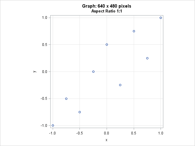
Although the graph size has not changed, the wall area (which contains the data) is now square. The wall area is approximately 370 pixels in both directions.
Notice that graph has a lot of white space to the left and right of the wall area. You can adjust the width of the graph to get rid of the extra space.
This technique also works for other aspect ratios. For example, if the range of the Y variable is 2, you can use ASPECT=2 to set the wall area to be twice as high as it is wide.
The wall area is square because the range of the X variable equals the range of the Y variable, and the margins in the wall area (set by using the OFFSETMIN= and OFFSETMAX= options) are also equal. If your X and Y ranges are not exactly equal, read on.
Setting the range of the axes
In practice, the range of the X axis might not exactly equal the range of the Y axis. In that case, you can use the MIN= and MAX= options on the XAXIS and YAXIS statements to set the ranges of each variable to a common range. For example, in principal component analysis, the principal component scores are often plotted on a common scale. The following call to PROC PRINCOMP creates variables PRIN1, PRIN2, and PRIN3 that contain the principal component scores for numerical variables in the Sashelp.Iris data set:
proc princomp data=Sashelp.Iris N=3 out=OutPCA noprint; var SepalWidth SepalLength PetalWidth PetalLength; run; proc means data=OutPCA N min max mean std; var Prin:; run; |
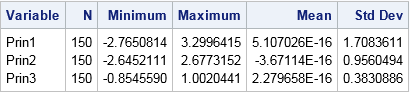
You can see that the range of the three variables are not equal. However, you can use the ASPECT=1 option to display the scores so that one unit in the horizontal direction is the same number of centimeters as one unit in the vertical direction. The MIN= and MAX= options are used so that the ranges of the X and Y variables are equal:
ods graphics / width=480px height=480px; title "Principal Component Scores"; title2 "Aspect Ratio 1:1"; proc sgplot data=OutPCA aspect=1; scatter x=Prin1 y=Prin2 / group=Species; xaxis grid min=-2.8 max=3.3; /* values=(-3 to 3) valueshint; */ yaxis grid min=-2.8 max=3.3; /* values=(-3 to 3) valueshint; */ run; |
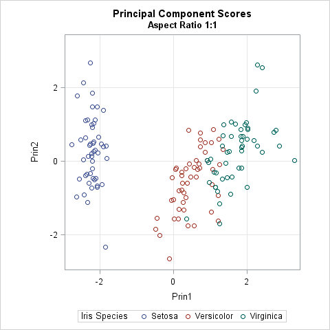
In spite of titles, legends, and labels, the wall area is a square. The width of the graph was reduced so that there is less blank space to the left and right of the wall area.
Notice the comments in the call to PROC SGPLOT. The comments indicate how you can explicitly set values for the axes, if necessary. You can use the VALUES= option to set the tick values. You can use the VALUESHINT option to tell PROC SGPLOT that these values are merely "hints": the tick values should not be used to extend the length of an axes beyond the range of the data.
Automating the process with GTL
I like PROC SGPLOT, but if you are running a version of SAS prior to 9.4, you can still obtain equated axes by using the GTL and PROC RENDER. The trick is to use the OVERLAYEQUATED layout, rather than the usual OVERLAY layout. The OVERLAYEQUATED layout ensures that the physical dimensions of the wall area is proportional to the aspect ratio of the data ranges. The following example uses the output from the PROC PRINCOMP analysis in the previous section:
proc template; /* scatter plot with equated axes */ define statgraph ScatterEquateTmplt; dynamic _X _Y _Title; /* dynamic variables */ begingraph; entrytitle _Title; /* specify title at run time (optional) */ layout overlayequated / /* units of x and y proportions as pixesl */ xaxisopts=(griddisplay=on) /* put X axis options here */ yaxisopts=(griddisplay=on); /* put Y axis options here */ scatterplot x=_X y=_Y; /* specify variables at run time */ endlayout; endgraph; end; run; proc sgrender data=outPCA template=ScatterEquateTmplt; dynamic _X='Prin1' _Y='Prin2' _Title="Equated Axes"; run; |
The output is not shown, but is similar to the graph in the previous section. The nice thing about using the GTL is that it supports the EQUATETYPE= option, which enables you to specify how to handle axes ranges that are not equal.
In summary, there are two ways to make sure that the physical dimensions of data area (wall area) of a graph accurately represents distances in the data coordinate system. You can use the GTL and the OVERLAYEQUATED layout, as shown in this section, or you can use the ASPECT= option in PROC SGPLOT if you have SAS 9.4. Although it is not always necessary to equate the X and Y axis, SAS supports it when you need it.

8 Comments
This is a very important issue, that most people don't think about when creating a graph.
Thanks for shedding some additional light on this topic!
Pingback: Lo, how a polar rose e'er blooming - The DO Loop
Pingback: Twelve posts from 2015 that deserve a second look - The DO Loop
Pingback: Banking to 45 degrees: Aspect ratios for time series plots
I find it strange that SAS will by default output a 4:3 ratio for scatter plots.. is there a way to make the default aspect ratio depend on the X and Y ranges themselves?
For time series, there are about a half dozen commonly used aspect ratios. They are discussed in the article "Banking to 45 degrees: Aspect ratios for time series plots." At the end of the program for that article, there is a little macro that you can use. However, SAS doesn't do this automatically since there is no agreement on the best aspect ratio to use for time series. For scatter plots, ASPECT=1 results in a graph that preserves the aspect ratio of the data.
I have a number of by-groups with wildly different ranges, so setting fixed min and max values is not an option. How can I get the axes to have equal ranges in a situation like this?
You can post your code and example data to the SAS Support Communities.