The SGPLOT procedure provides great tools to create all kinds of graphs for all domains from business to clinical. However, every so often, we need to create visuals that are not exactly graphs, but more like flow or network diagrams, or something entirely unique. Some users may have tools to create network diagrams easily, but let us see what we can do with Base SAS.
SGPLOT provides you ways to create such visuals, without the need for custom tools or annotate. If you can analyse your end result and break it down into component parts, you can often use the layering features of SGPLOT to create your graph. With SAS 9.4, we have been adding features to SGPLOT that help you in these tasks.
In this article, I will cover two such visuals, a process flow type graph and a Diagram. Questions about such visuals have been asked in recent posts to the communities page.
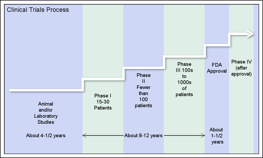 Here is a flow chart showing the Clinical Trials Approval process that I recently saw on the web showing the steps in the approval process. I created this using the SGPLOT procedure, by layering the appropriate plot statements to create the visual. Click on the graph for a more detailed view.
Let us break down the components of the visual and see how we can layer different SGPLOT plot statements to create the visual
- The visual shows the 6 steps in the process. I have created the 6 regions by date using a BLOCK plot.
- This is overlaid by a STEP plot showing the same steps in an incremental fashion. Note the arrow head at the end of the step plot. SAS 9.4M3 now provides you with an easy way to add arrowheads at the ends of any series or step plot. The matte skin provides a faint drop shadow.
- Each step of the process is labeled by a using a TEXT plot. The label is wrapped over multiple lines using options.
- The notes about the duration of each segment are displayed by a TEXT plot and a VECTOR plot. The third label is split over multiple lines by using an explicit split character.
Here is the SAS 9.40M3 SGPLOT code. Full code is attached in the link at the bottom:
proc sgplot data=process noautolegend;
block x=x block=Stage / filltype=alternate nooutline novalues <options>;
step x=x y=y / arrowheadpos=end lineattrs=(thickness=5 color=white) dataskin=matte;
text x=xs y=ys text=Stage / splitpolicy=split;
text x=xs y=yd text=Duration / splitchar='.' splitpolicy=splitalways;
vector x=x1 y=y1 / xorigin=x2 yorigin=y1;
inset "Clinical Trials Process" / position=topleft;
yaxis min=0 max=1 display=none;
xaxis offsetmin=0.02 offsetmax=0.02 display=none;
run;
 Now, let us review another example of a non-graph visual created using the SGPLOT procedure. This is really in response to a question on the communities page last month. The user wanted to create a diagram showing the relationship between providers and patients in this simple diagram. Click on the graph for a more detailed view.
The diagram layout is really simple. Since a complex layout does not need to be computed, we can use the SGPLOT procedure to create this one. The dataset is simply a combination of Node data and Link data. The node data shows 5 providers listed vertically and 5 patients by node id. These could be more or less. The link data is multi point series by link id. The links also have a "Response" value representing the number of visits represented visually as the line thickness.
- I use a BUBBLE plot to draw the nodes, placed explicitly as provided by the (x, y) coordinates provided in the data set.
- I used a SERIES plot to draw the connections by LinkId between the nodes. While I did this using hard coded values in the data, these can be computed based on connectivity using a Hash component.
- The thickness of each link is determined by the THICKRESP option.
- X2Axis is used to place the labels (tick values) at the top.
proc sgplot data=Diagram noautolegend nowall noborder;
series x=xl y=yl / group=link thickresp=ls thickmaxresp=5 thickmax=5 lineattrs=graphdatadefault x2axis;
bubble x=xn y=yn size=ns / bradiusmin=15 bradiusmax=16 datalabel=node datalabelpos=center
x2axis dataskin=gloss;
x2axis display=(nolabel noticks noline) offsetmin=0.2 offsetmax=0.2;
yaxis display=none;
run;
 SAS 9.40M3 also provides a new SPLINE statement. Here, to keep the example simple, I have added another vertex in between "Provider" and "Patient" called "Mid", and then suppressed its display on the X2Axis. Using the SPLINE statement instead of SERIES draws the curved links. See full code in the link below.
SAS 9.40M3 Code: Diagrams


2 Comments
Sanjoy, I enjoy your blog and use some of them for my own research presentations. I am trying to use the SAS from the example to plot trade flows between two countries. For example the third graph in the website, http://www.economist.com/blogs/graphicdetail/2015/10/global-trade-graphics. Also, is there a way to add colors to the graphs as well.
Yes, the graph you refer to is very similar to the example I show, and you could set up the data to create such a graph. You could use straight or curved links. You can also color the nodes or the links by group or by a response value.