Learn about the latest tips, tutorials, upcoming events and certifications
The top 10 posts from The DO Loop in 2017

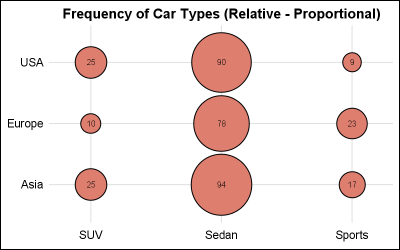
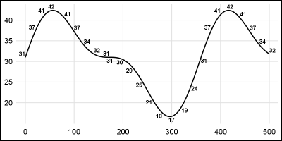
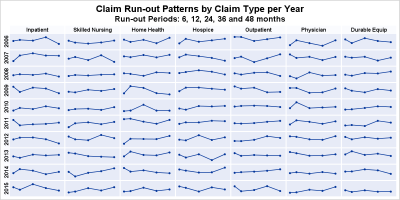
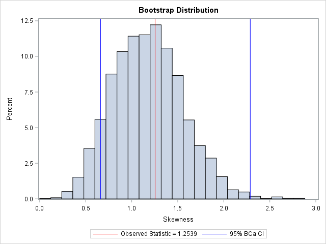
I wrote more than 100 posts for The DO Loop blog in 2017. The most popular articles were about SAS programming tips, statistical data analysis, and simulation and bootstrap methods. Here are the most popular articles from 2017 in each category. General SAS programming techniques INTCK and INTNX: Do you