Get the right information, with visual impact, to the people who need it
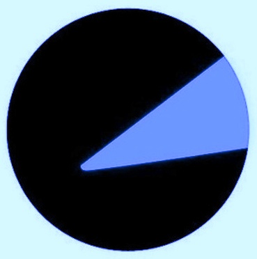
How to make your pie chart worse

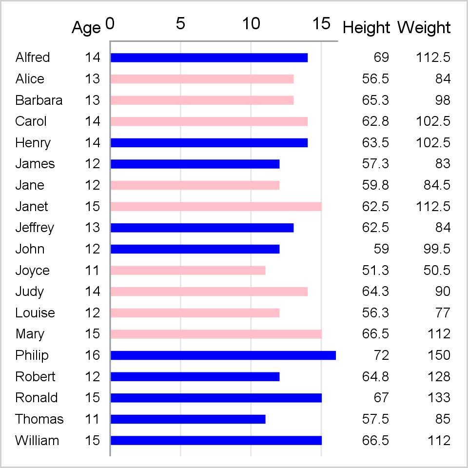
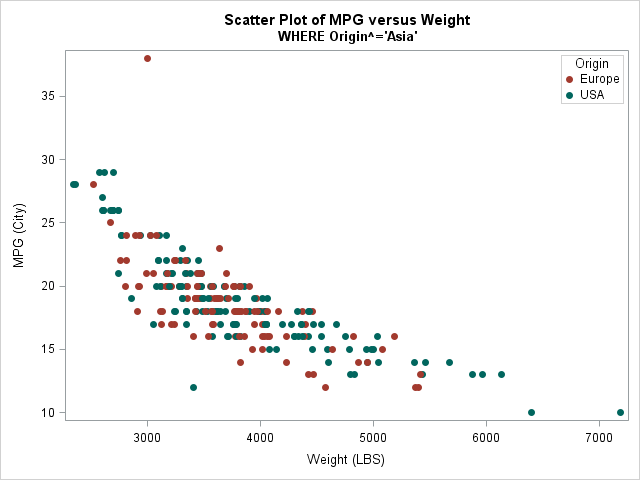
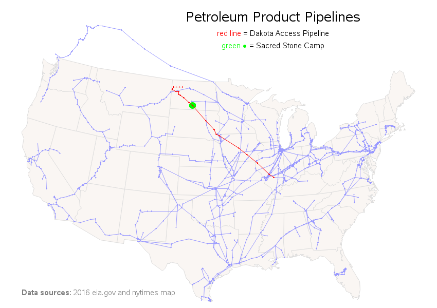
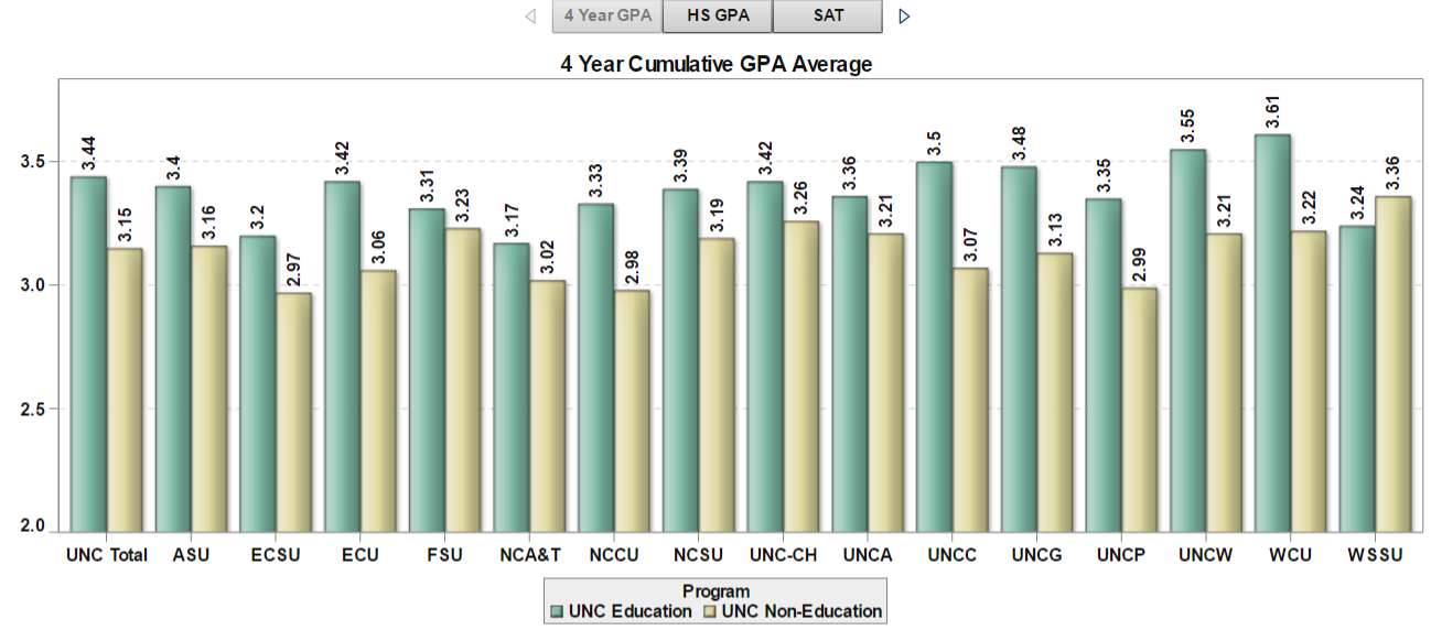
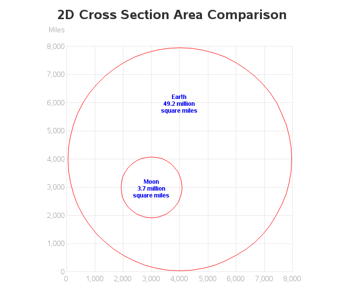
You have all seen, or perhaps even created, some really bad graphics: Cluttered, confusing, too small, incomprehensible. Or worse, the author may have committed one of the three unforgivable sins of data visualization by deceptively distorting a map, truncating the axis so as to misrepresent the data, or used double