Data Visualization

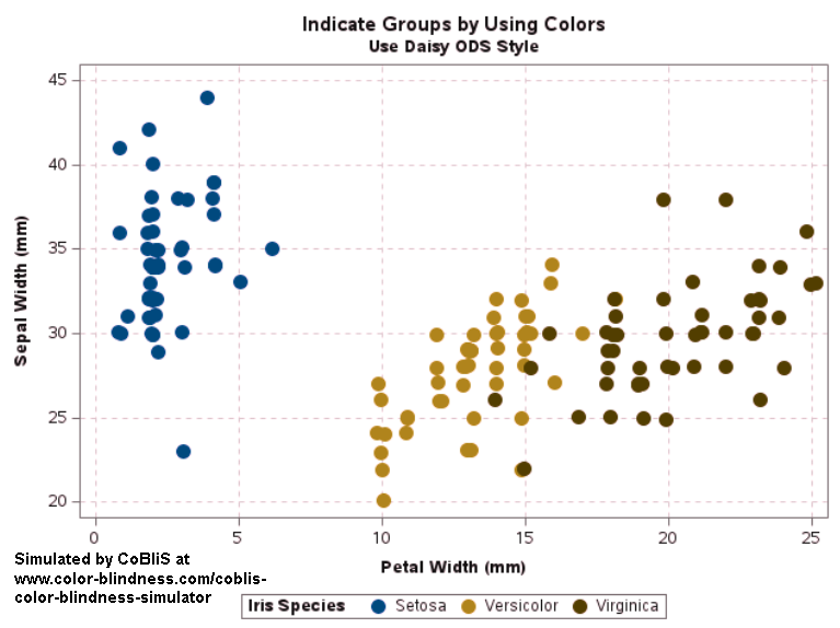
Get the right information, with visual impact, to the people who need it
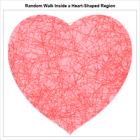
Data Visualization | Learn SAS | Programming Tips
SAS Korea 0
Proc SGplot으로 '멋진' 지도를 만드는 법

예술가들은 몇 가지 도구만으로도 멋진 그림을 그릴 수 있습니다. 물론, 물감, 색연필, 목탄 등 선호하는 도구는 저마다 다를 수 있겠지만 말이죠. SAS에서 멋진 그래프를 만드는 방법도 크게 다르지 않은데요, 오늘은 그 방법을 예를 들어 설명해보고자 합니다. SAS에서는 SAS/Graph Proc GMap을 사용하여 멋진 지도를 만들 수가 있습니다. GMap은 SAS가 지도 제작용으로 특별 개발한

Data Visualization
Sanjay Matange 0
Box plot legend

A grouped box plot created by SGPLOT VBOX / HBOX statement or GTL BOXPLOT statement will display groups within categories using group colors and puts the color swatches representing the group values in the legend.  This works well for a color graph created as shown below. title 'Distribution of Cholesterol

Analytics | Data Visualization
Chauffeur und Data Scientist günstig abzugeben

1901 prognostizierte Gottlieb Daimler: „Die weltweite Nachfrage nach Kraftfahrzeugen wird eine Million nicht überschreiten – allein schon aus Mangel an verfügbaren Chauffeuren." Heute fahren die meisten selber und das selbstfahrende Auto scheint auch greifbar nah. Chauffeure braucht heute kein Mensch mehr. Wie sieht das, bei immer mehr Self-Service-Analytics und Machine

Analytics | Data Visualization
Georgia Mariani 0
Data visualization helps University of Louisville achieve its 2020 strategic plan

When senior leaders at the University of Louisville (UofL) approached Vice Provost Bob Goldstein in early April 2016 with a request for a fully functioning data visualization platform by start of the 2016 fall semester—just four months away—he did not panic. Instead, Goldstein, along with Becky Patterson, Executive Director of

1 27 28 29 30 31 60

Back to Top