Get the right information, with visual impact, to the people who need it
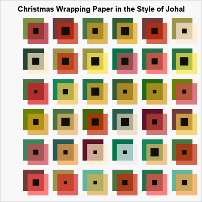
Art in SAS: Christmas wrapping paper

For Christmas 2021, I wrote an article about palettes of Christmas colors, chiefly shades of red, green, silver, and gold. One of my readers joked that she would like to use my custom palette to design her own Christmas wrapping paper! I remembered her jest when I saw some artwork