Data analysis can be used for many things ... how about finding other beers you might like, so you don't keep drinking the same old brand every time? Hang on tight - I think we're about to make a beer run!
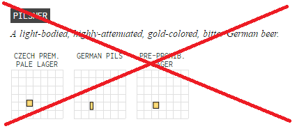
I recently read an interesting article on the Flowingdata website, where they graphically charted 100 beer styles. For each style, they drew a rectangle with the width representing the amount of alcohol by volume, and the height representing the bitterness (hoppiness). They colored the rectangle to try to represent the average color of the beer, and grouped the graphs by family. As you mouse over each of their graphs, it gives you a description of that style, and lists several different brands of beer from that style. Here's a screen-capture of the graphs for the family of beers in the Pilsner style, for example:
I found their graphs very interesting, but I also noticed a few things I would have done differently, using SAS graphs. Let me walk you though my changes and enhancements, and see if you like them!
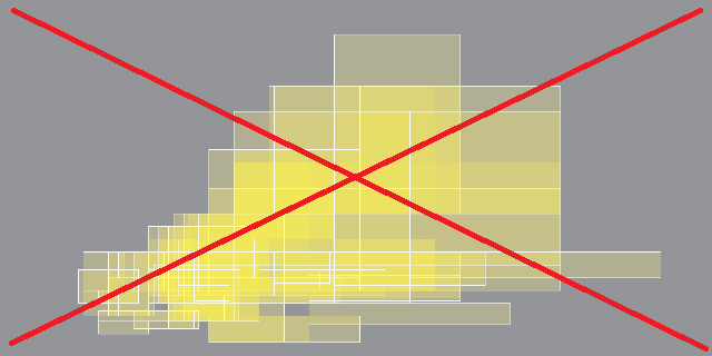
One thing that I found baffling was that they showed an overlay of all the beer style rectangles at the top of the Flowingdata article, but it was purely for artistic purposes. It had no axes or grid lines, and there was no way to tell which rectangle represented which style.
In my version, I used overlay graphs for their analytic power (rather than artistic power). I created an overlay graph for each style family, so you could see how consistent (or inconsistent) the beers from that family are. For example, here's my overlay graph, followed by the individual style graphs, for the Pilsner style family:
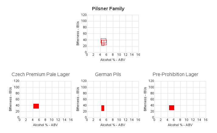
In the Flowingdata article, they omit the text & numeric labels along the axes of the individual style graphs, and just show the labels on a single graph at the top of the article. I found that I had to keep scrolling back up to the top to see what the axis values were, and then scrolling back down to the style graph I had been looking at (and hoping that I had correctly remembered the values). By comparison, in my version I fully labeled every graph - this makes them a little more cluttered, but a lot more usable.
The graphs were very small in the Flowingdata article, and therefore the data rectangles were sometimes just a visual 'speck' with more of the black border color than internal yellow/amber beer color. I made my graphs about twice as big, to allow you to see the data better. And on the topic of color - I decided to make all my polygons the same color, to make them easier to compare (I'm not sure that an average color for a particular beer style is very valuable to graph, and I wonder if the colors in the original graphs are actually representative of the beer colors?) Also, the lighter and darker rectangles in the Flowingdata graphs could distort the visual perception of their sizes.
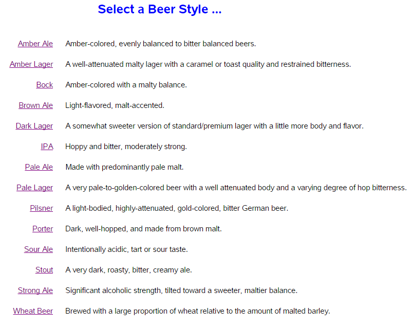
In their article, there was no way to navigate through the style families. You had to scroll up/down, and read all the family names, to find the family you were interested in (and the difficulty was compounded, because the names were not in alphabetical order). In my version, I create a list of all the style families, and let you click the style name to jump directly to those graphs.
When you hover your mouse over my graphs, you see the description of that style and list of several different brands of beer that are that style (similar to the Flowingdata graphs) ... but you can also click my graphs to launch a Google search for that beer style. The Google search returns some really nice information, and also pictures of the beer (I think the pictures provide much more accurate colors than the colors used in the Flowingdata polygons, if you want to really know what the beer looks like). And for a finishing touch, I add a footnote at the bottom of my graph, giving credit to the data source, and a link to the actual spreadsheet containing the data.
And now, with all this data, how might you use it to find new/different beers, similar to the ones you like? I invite you to tell me - in the comments section!
And what would my blog posts be without some randomly-related pictures from of my friends?!? This time, pictures of beer! ... or should that be 'pitchers' of beer!?! LOL (Thanks Beth, Paul, and Jason!)...


6 Comments
This reminds me of a very cool (but visually lacking) Beer Recommendation Engine that uses the power of statistics & big data to make sense of unstructured data: https://willnetsky.github.io/Beer-Recommender/
Interesting!
I suppose the data will become more and more unstructured as the evening goes on! ;-)
I'm sure somebody will be willing to put in the extra hours of hands-on research! :)
Nice work. I'm thirsty now. It appears all your data is from the source article you linked. Are you aware of where I can find a database of most beers commercially available in the context of what of the 100 styles they fit into?
The lists of example commercial beers for each style (in the spreadsheet/data I used) might be a good place to start. I don't know where you could find a definitive all-encompassing list though.