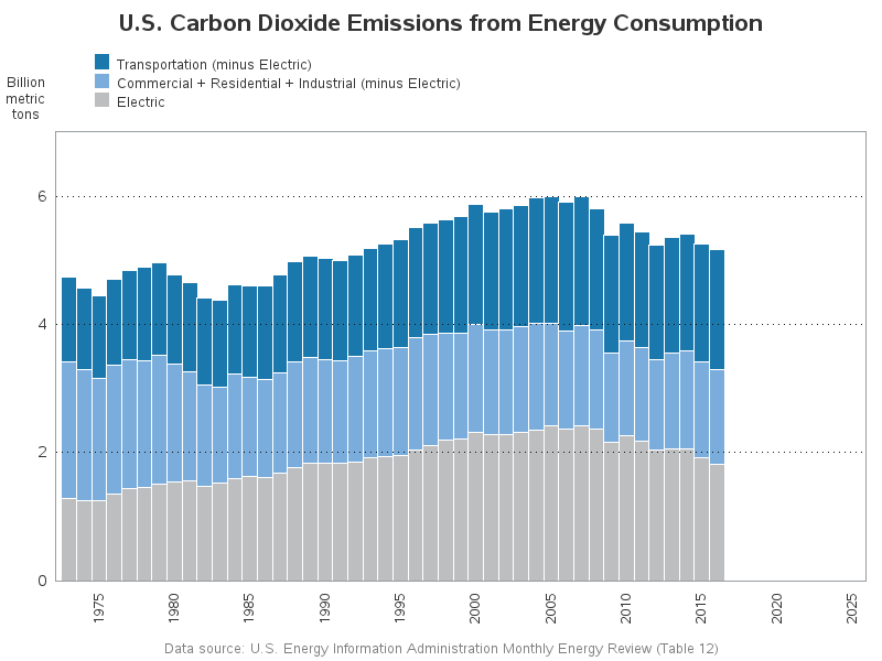
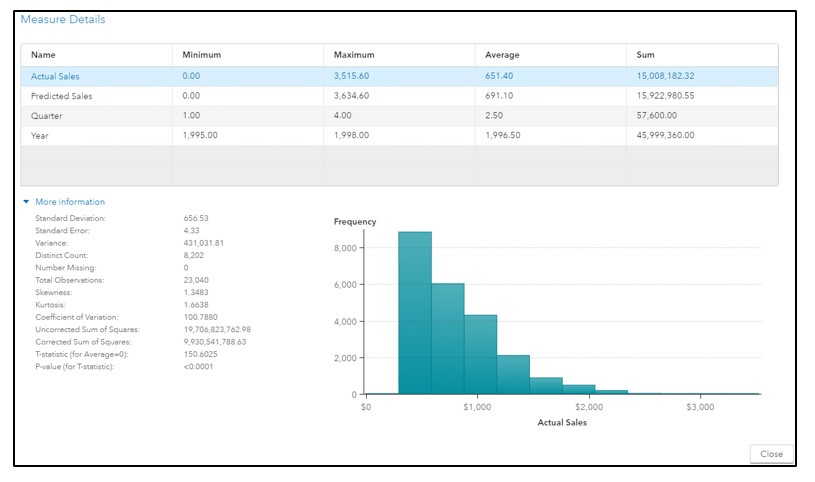
Get the right information, with visual impact, to the people who need it
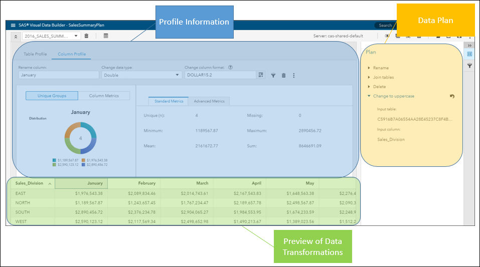
Basic ODS Graphics: Enabling, Selecting and Displaying Graphs

This post presents some basic aspects of ODS Graphics: enabling, selecting, and displaying graphs.