A customer asks if it possible to suppress part of the correlation loading plot in PROC PLS. The answer is "Yes!" In this blog, I will show you how to add expressions to graph templates. When the data object that underlies a graph is not quite in the form that you want, you might be able to use GTL expressions to produce precisely the graph that you want. You use expressions to make and display new columns from one or more existing columns. In this example, the new columns contain a subset of the information in the old columns, and that suppresses part of the graph.
The following steps run PROC PLS and display the correlation loading plot:
data pentaTrain;
   input obsnam $ S1 L1 P1 S2 L2 P2 S3 L3 P3 S4 L4 P4
                  S5 L5 P5  log_RAI @@;
   n = _n_;
   datalines;
VESSK    -2.6931 -2.5271 -1.2871  3.0777  0.3891 -0.0701
          1.9607 -1.6324  0.5746  1.9607 -1.6324  0.5746
          2.8369  1.4092 -3.1398                    0.00
VESAK    -2.6931 -2.5271 -1.2871  3.0777  0.3891 -0.0701
          1.9607 -1.6324  0.5746  0.0744 -1.7333  0.0902
          2.8369  1.4092 -3.1398                    0.28
VEASK    -2.6931 -2.5271 -1.2871  3.0777  0.3891 -0.0701
          0.0744 -1.7333  0.0902  1.9607 -1.6324  0.5746
          2.8369  1.4092 -3.1398                    0.20
VEAAK    -2.6931 -2.5271 -1.2871  3.0777  0.3891 -0.0701
          0.0744 -1.7333  0.0902  0.0744 -1.7333  0.0902
          2.8369  1.4092 -3.1398                    0.51
VKAAK    -2.6931 -2.5271 -1.2871  2.8369  1.4092 -3.1398
          0.0744 -1.7333  0.0902  0.0744 -1.7333  0.0902
          2.8369  1.4092 -3.1398                    0.11
VEWAK    -2.6931 -2.5271 -1.2871  3.0777  0.3891 -0.0701
         -4.7548  3.6521  0.8524  0.0744 -1.7333  0.0902
          2.8369  1.4092 -3.1398                    2.73
VEAAP    -2.6931 -2.5271 -1.2871  3.0777  0.3891 -0.0701
          0.0744 -1.7333  0.0902  0.0744 -1.7333  0.0902
         -1.2201  0.8829  2.2253                    0.18
VEHAK    -2.6931 -2.5271 -1.2871  3.0777  0.3891 -0.0701
          2.4064  1.7438  1.1057  0.0744 -1.7333  0.0902
          2.8369  1.4092 -3.1398                    1.53
VAAAK    -2.6931 -2.5271 -1.2871  0.0744 -1.7333  0.0902
          0.0744 -1.7333  0.0902  0.0744 -1.7333  0.0902
          2.8369  1.4092 -3.1398                   -0.10
GEAAK     2.2261 -5.3648  0.3049  3.0777  0.3891 -0.0701
          0.0744 -1.7333  0.0902  0.0744 -1.7333  0.0902
          2.8369  1.4092 -3.1398                   -0.52
LEAAK    -4.1921 -1.0285 -0.9801  3.0777  0.3891 -0.0701
          0.0744 -1.7333  0.0902  0.0744 -1.7333  0.0902
          2.8369  1.4092 -3.1398                    0.40
FEAAK    -4.9217  1.2977  0.4473  3.0777  0.3891 -0.0701
          0.0744 -1.7333  0.0902  0.0744 -1.7333  0.0902
          2.8369  1.4092 -3.1398                    0.30
VEGGK    -2.6931 -2.5271 -1.2871  3.0777  0.3891 -0.0701
          2.2261 -5.3648  0.3049  2.2261 -5.3648  0.3049
          2.8369  1.4092 -3.1398                   -1.00
VEFAK    -2.6931 -2.5271 -1.2871  3.0777  0.3891 -0.0701
         -4.9217  1.2977  0.4473  0.0744 -1.7333  0.0902
          2.8369  1.4092 -3.1398                    1.57
VELAK    -2.6931 -2.5271 -1.2871  3.0777  0.3891 -0.0701
         -4.1921 -1.0285 -0.9801  0.0744 -1.7333  0.0902
          2.8369  1.4092 -3.1398                    0.59
;

ods trace on;
ods graphics on;
proc pls data=pentaTrain;
   model log_RAI = S1-S5 L1-L5 P1-P5;
run; |
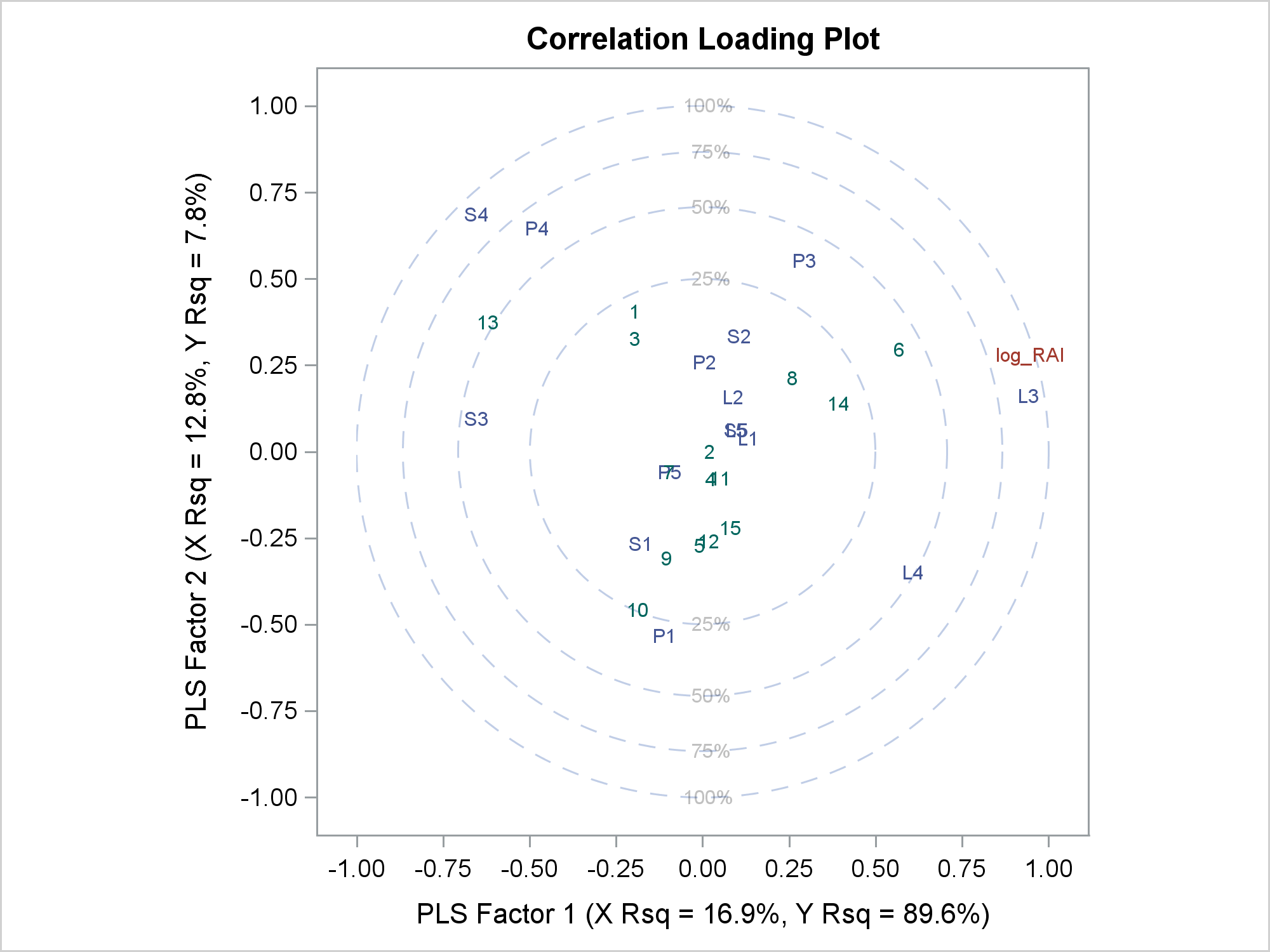
Click to enlarge.
The correlation loading plot contains the integers 1 to 15, which correspond to each of the observations in the input data set. This is the part of the plot that the customer wanted to remove. When the data set is large, these points might obscure other parts of the plot.
The preceding step has ODS TRACE output enabled, which displays the following in the SAS log:
Output Added: ------------- Name: CorrLoadPlot Label: Correlation Loading Plot for Factors 1 and 2 Template: Stat.PLS.Graphics.CorrLoadPlot Path: PLS.CorrLoadPlot ------------- |
We will use the graph and template names in subsequent steps. The next step creates a SAS data set from the data object that is used to make the correlation loading plot.
ods select none; proc pls data=pentaTrain; ods output CorrLoadPlot=clp; model log_RAI = S1-S5 L1-L5 P1-P5; run; ods select all; |
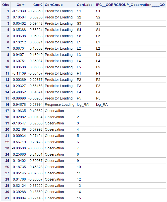
Normally, you would look at all of the variables, but in the interest of space, I am displaying only the most relevant ones.
proc print; var corr1 corr2 corrgroup corrlabel; run; |
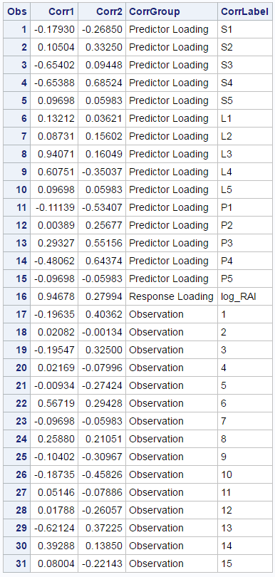
The data set contains a group variable CorrGroup. When the value of CorrGroup is 'Observation', then the observation numbers are displayed.
The following step deletes any local copies of the graph template that were left over from any previous work and then writes the template to a file temp.temp.
proc template; delete Stat.PLS.Graphics.CorrLoadPlot; source Stat.PLS.Graphics.CorrLoadPlot / file='temp.temp'; quit; |
Only one statement in the template uses the variable CorrGroup:
scatterplot x=CORRX y=CORRY / group=CORRGROUP Name="ScatterVars" markercharacter=CORRLABEL rolename=(_id1=_ID1 _id2=_ID2 _id3=_ID3 _id4=_ID4 _id5=_ID5) tip=(y x group markercharacter _id1 _id2 _id3 _id4 _id5) tiplabel=(y=CORRXLAB x=CORRYLAB group ="Corr Type" markercharacter="Corr ID"); |
This statement also specifies X=CORRX and Y=CORRY. CORRX and CORRY are dynamic variables, and their values are the data object column names Corr1 and Corr2. You can see that by examining the output from the following steps:
ods document name=mydoc(write); proc pls data=pentaTrain; ods select CorrLoadPlot; model log_RAI = S1-S5 L1-L5 P1-P5; run; ods document close; proc document name=MyDoc; list / levels=all; run; obdynam \PLS#1\CorrLoadPlot#1; quit; |
The table is not shown here, but in it you will find the two name/value pairs (CORRX, Corr1) and (CORRY, Corr2).
You can use an editor to edit the graph template to suppress the observation numbers by setting their coordinates to missing. You can instead use a DATA step to perform the same edits. The DATA step gives you reproducible results, so that is the method that I use.
data _null_;
   infile 'temp.temp';
   input;
   if _n_ = 1 then call execute('proc template;');
   if index(_infile_, 'CORRGROUP') then do;
      _infile_ = tranwrd(_infile_, 'x=CORRX ',
                         "x=eval(ifn(corrgroup = 'Observation', ., corrx)) ");
      _infile_ = tranwrd(_infile_, 'y=CORRY ',
                         "y=eval(ifn(corrgroup = 'Observation', ., corry)) ");
   end;
   call execute(_infile_);
run; |
The DATA step reads the graph template from the file temp.temp. The CALL EXECUTE statements write code to a buffer and then submit that code to SAS when the DATA step concludes. In this case, the DATA step submits a PROC TEMPLATE statement, a statement that has two modified options, and all of the other statements that are stored in the template file. When the DATA step finds an X=CORRX option it replaces it with:
x=eval(ifn(corrgroup = 'Observation', ., corrx)) |
Similarly, it replaces y=CORRY with:
y=eval(ifn(corrgroup = 'Observation', ., corry)) |
The expressions substitute missing values for the X and Y coordinates of the points that are suppressed. Each expression consists of the EVAL function (which is required) and an IFN function. Each IFN function returns a mssing value (when corrgroup = 'Observation') or the original value. Many expressions that can appear in assignment statements in a DATA step can also appear in a GTL expression.
Code like this cannot be written in a vacuum. I had to look at the template and the data object to determine which changes were needed. Care must be taken to only change the right parts of the template. This template has the options Y=CORRXLAB and X=CORRYLAB, so you must ensure that you do not change them. The trailing blank at the end of the second argument of each TRANWRD (translate word) function ensures that only the correct values are replaced.
The following step creates the graph using the modified template.
proc pls data=pentaTrain; model log_RAI = S1-S5 L1-L5 P1-P5; run; |
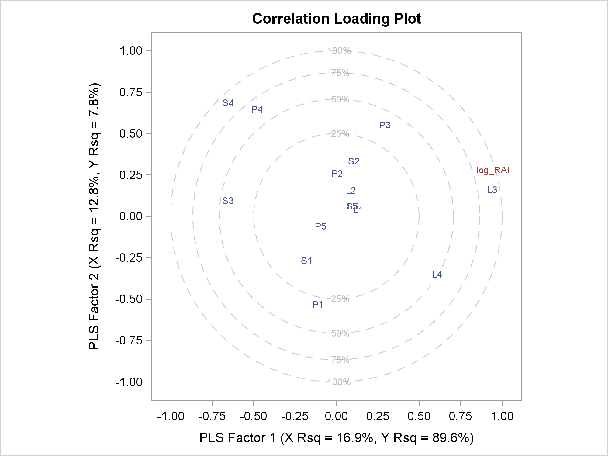
This graph is the same as the previous graph except that now the observation numbers are suppressed.
As is often the case, you could make the change a different way. Here, the variable CORRLABEL (which only appears in the option MARKERCHARACTER=CORRLABEL) is replaced by an expression that changes the marker instead of the coordinates:
data _null_;
   infile 'temp.temp';
   input;
   if _n_ = 1 then call execute('proc template;');
   _infile_ = tranwrd(_infile_, 'CORRLABEL',
                      "eval(ifc(corrgroup = 'Observation', ' ', corrlabel)) ");
   call execute(_infile_);
run; |
The following step makes the same graph as before; the observation numbers are suppressed.
proc pls data=pentaTrain; ods output CorrLoadPlot=clp; model log_RAI = S1-S5 L1-L5 P1-P5; run; |
This step also makes an output data set from the data object. The following step displays some of the variables.
proc print; var corr1 corr2 corrgroup corrlabel ifc:; run; |
The last column has missing values for the observations that are suppressed. If you looked at additional columns, you would see many other missing values. This is common in graph data objects. Some columns might contain more observations to plot and some might contain fewer. Observations are used if values in all of the relevant columns are nonmissing and are otherwise ignored. The data object can be composed of several rectangles of different sizes. Missing values fill in the gaps.
The last column has a manufactured name. The name is manufactured from the names in the expression, and the values contain the results of the expression evaluation. The new column contains the right subset of the CorrLabel column. The first customization has two expressions, so that data object (not shown) has two manufactured columns. Procedures use expressions too. When you look at the data set that was made from a graph data object, shorter mixed-case names come from the procedure and longer upper-case names that have underscores come from expressions.
Expressions provide a convenient way to customize the graphs that come out of analytical procedures. If you cannot make the information that you need from expressions, see the post Fit Plot Customizations or the other sources listed below. Expressions can only be used in the GTL and not in PROC SGPLOT. If you want to modify the input to PROC SGPLOT, you must use a DATA step.
Some of the customization techniques that I have used here will look familiar to anyone who has seen some of my recent presentations, blogs, or other works. For more information about highly customized graphs, see Highly Customized Graphs Using ODS Graphics and Chapter 7 of Advanced ODS Graphics Examples.