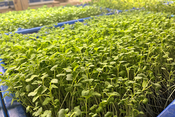
English

Rick Wicklin 0
Overlay categories on a histogram

Recently Sanjay Matange blogged about how to color the bars of a histogram according to a gradient color ramp. Using the fact that bar charts and histograms look similar, he showed how to use PROC SGPLOT in SAS to plot a bar chart in which each bar is colored according

Data Management
David Loshin 0
Big data integration as a service

I've seen a number of articles and webinars recently that discuss data integration as a cloud-based service. So I thought it was worth exploring what this really means in the context of big data – specifically when the objective is to exploit many sources of streaming data for analytics. My initial reaction

Data Visualization
Sanjay Matange 0
Boxplot with connect

This blog post is motivated by a post by a user on the communities page about creating a box plot with colored boxes by category and multiple connect lines. Normally, a box plot can be drawn by category, with a single connect line for one of the statistical values of

Rick Wicklin 0
Arrange matrices and graphs in a gridded layout

Last week my colleague Chris Hemedinger published a blog post that described how to use the ODS LAYOUT GRIDDED statement to arrange tables and graphs in a panel. The statement was introduced in SAS 9.4m1 (December 2013). Gridded layout is supported for HTML, POWERPOINT, and the PRINTER family of destinations

Russ Albright 0
Focusing your Text Mining with Search Queries

Recently, I have been thinking about how search can play more of a part in discovery and exploration with SAS Text Miner. Unsupervised text discovery usually begins with a look at the frequent or highly weighted terms in the collection, perhaps includes some edits to the synonym and stop lists,

1 204 205 206 207 208 321