If you use a GPS system or a mapping app on your phone, you're familiar with geospatial intelligence. But did you know this same technology can be used to map the spread of diseases, to understand the spread of wildfires, to visualize environmental issues - and much more?
The proliferation of geospatial intelligence data has become ubiquitous in our lives and and geospatial capabilities are changing the world as we know it. Nowhere is that more evident than at GEOINT 2015, where my SAS colleagues and I are attending and exhibiting this week. Hosted and produced by the United States Geospatial Intelligence Foundation (USGIF), the annual GEOINT Symposium is the nation’s largest gathering of intelligence professionals and the preeminent intelligence event of the year.
There is eye candy everywhere. Ginormous displays of high resolution maps compete for attention throughout the exhibit hall. You don’t see this much technological glitz outside Hollywood. Geospatial technology is by nature so visual and the innovations so magnificent that attendees have a hard time not being wowed.
There are lots of “A-has!” when data is superimposed on top of maps with geolocation coordinates and served up for the audience to see. But, think about how much richer the analysis could be if underlying multiple data sources, including open source information, could be brought together so analysts could understand what it means at a deeper level. Not only could you get answers to complex questions, but predictive and prescriptive analytics could be used to better guide decision making.
At the SAS booth (8152), we are demonstrating what’s beneath the dots and where geospatial analysis and visual analytics intersect. We’re using open data from public health surveillance records to demonstrate how you can monitor and evaluate indicators that point to problem areas where public health officials can take action to prevent diseases and outbreaks. Alerts can be generated and used as an early warning system and to document the impact of an intervention.
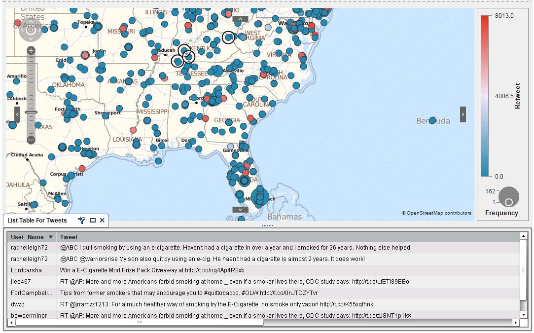
We’re demonstrating SAS Visual Analytics to show how easy it is to use and perform exploration of the large data sets representative of this community. Users can dig deeper into their data – structured or unstructured, open source or your own – to see patterns in the data and how they unfold over time.
Social media data, enhanced with geolocation coordinates, provide an additional layer of timely and relevant data never seen before. It’s amazing how much information can be gleaned from open source feeds like Twitter.
One thing I want visitors to our booth to know is that you don’t have to be a data scientist or statistician to use SAS Visual Analytics. Coding is not necessary. You can quickly learn it and get answers to your complex questions using data of any size – including big data in Hadoop.