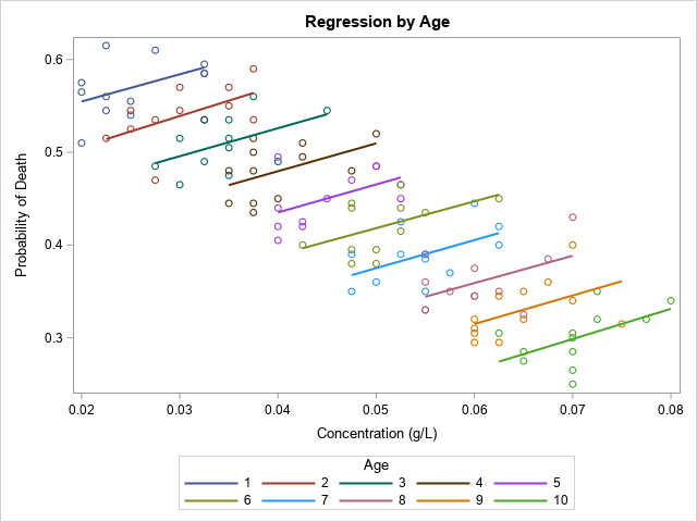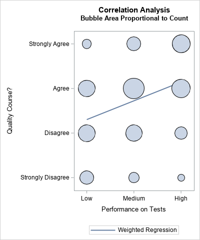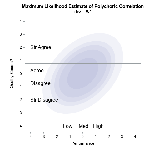
In 2023, I wrote 90 articles for The DO Loop blog. My most popular articles were about SAS programming, data visualization, and statistics. In addition, several "general interest" articles were popular, including my article for Pi Day and an article about AI chatbots. If you missed any of these articles,


